Brutalism
Brutalist design with raw, unpolished, stark aesthetic. Ideal for creative portfolio, design agency, experimental blog, digital art. AI-ready template.
Use case: Creative portfolio, Design agency, Experimental blog, Digital art
Historical Context
Raízes na arquitetura brutalista dos anos 1950 (brutus = bruto). Web Brutalism rejeita ornamentação, celebrando crua funcionalidade e anti-design.
Technical Specs
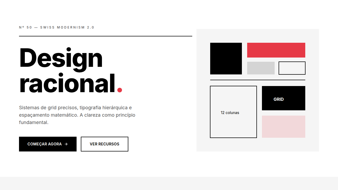
Colors
Primary
Secondary
Effects
No smooth transitions (instant), sharp corners (0px), bold typography (700+), visible grid, large blocks
Light/Dark
✓ Full / ✓ Full
CSS
border-radius: 0px, transition: none or 0s, font-family: system-ui or monospace, font-weight: 700+, border: visible 2-4px, colors: #FF0000, #0000FF, #FFFF00, #000000, #FFFFFF
Variables
--border-radius: 0px, --transition-duration: 0s, --font-weight: 700-900, --colors: primary only, --border-style: visible, --grid-visible: true
Checklist
☐ No border-radius (0px), ☐ No transitions (instant), ☐ Bold typography (700+), ☐ Pure primary colors used, ☐ Visible grid/borders, ☐ Asymmetric layout intentional
DESIGN.md
Design System: Brutalism
1. Visual Theme & Atmosphere
Brutalist design with raw, unpolished, stark aesthetic. Ideal for creative portfolio, design agency, experimental blog, digital art. AI-ready template.
- Density: 5/10 — Balanced
- Variance: 7/10 — Dynamic
- Motion: 4/10 — Subtle
2. Color Palette & Roles
- Red (#FF0000) — Error states, destructive actions
- Blue (#0000FF) — Accent highlight, links and focus states
- Yellow (#FFFF00) — Warning states, attention indicators
- Black (#000000) — Dark surface, primary background
- White (#FFFFFF) — Light surface, card backgrounds
- Neon Green (#00FF00) — Success states, positive indicators
- Hot Pink (#FF00FF) — Primary text color
3. Typography Rules
- Display / Hero: system-ui or monospace — Weight 700, tight tracking, used for headline impact
- Body: system-ui or monospace — Weight 400, 16px/1.6 line-height, max 72ch per line
- UI Labels / Captions: system-ui or monospace — 0.875rem, weight 500, slight letter-spacing
- Monospace: system-ui or monospace — Used for code, metadata, and technical values
Scale:
- Hero: clamp(2.5rem, 5vw, 4rem)
- H1: 2.25rem
- H2: 1.5rem
- Body: 1rem / 1.6
- Small: 0.875rem
4. Component Stylings
- Primary Button: Sharp edges (0px) shape. Accent color fill. Hover: 8% darken + subtle lift shadow. Active: -1px translate tactile press. Font weight 600. No outer glows.
- Secondary / Ghost Button: Outline variant. 1.5px border in muted color. Text in primary color. Hover: subtle background fill.
- Cards: Sharp edges (0px) corners. Surface background. Subtle shadow (0 2px 12px rgba(0,0,0,0.06)). 1px border stroke.
- Inputs: Label above input. 1px border stroke. Focus ring: 2px accent color offset 2px. Error text below in semantic red. No floating labels.
- Navigation: Primary surface background. Active item: accent color indicator. Font weight 500 when active.
- Skeletons: Shimmer animation matching component dimensions. No circular spinners.
- Empty States: Icon-based composition with descriptive text and action button.
5. Layout Principles
- Grid: CSS Grid primary. Max-width containment: 1280px centered with 1.5rem side padding.
- Spacing rhythm: Balanced. Base unit: 0.5rem (8px).
- Section vertical gaps: clamp(4rem, 8vw, 8rem).
- Hero layout: Asymmetric composition.
- Feature sections: Asymmetric grid with varied card sizes. No 3-equal-columns.
- Mobile collapse: All multi-column layouts collapse below 768px. No horizontal overflow.
- z-index contract: base (0) / sticky-nav (100) / overlay (200) / modal (300) / toast (500).
6. Motion & Interaction
- Physics: Ease-out curves, 200-300ms duration. Smooth and predictable.
- Entry animations: Fade + translate-Y (16px → 0) over 420ms ease-out. Staggered cascades for lists: 80ms between items.
- Hover states: Subtle color shift + shadow adjustment over 200ms.
- Page transitions: Fade only (200ms).
- Performance: Only transform and opacity animated. No layout-triggering properties.
7. Anti-Patterns (Banned)
- No emojis in UI — use icon system only (Lucide, Heroicons)
- No pure black (#000000) — use off-black or charcoal variants
- No oversaturated accent colors (saturation cap: 80%)
- No 3-column equal-width feature layouts — use zig-zag or asymmetric grid
- No
h-screen— usemin-h-[100dvh] - No AI copywriting clichés: "Elevate", "Seamless", "Unleash", "Next-Gen"
- No broken external image links — use picsum.photos or inline SVG
- No generic lorem ipsum in demos
AI Prompt
Act as a Senior Frontend Engineer and Expert UI Designer. Your task is to code a complete Landing Page on the first attempt.
- Landing Page Theme:
- Sections to add:
Generate the final code immediately following these definitions:
Style
- Name: Brutalism
- Type: Raw, Unpolished, High-Contrast, Anti-Design
- Keywords: Raw, unpolished, stark, high contrast, plain text, default fonts, visible borders, asymmetric, anti-design
- Era: 1950s Brutalist
- Light/Dark: ✓ Full / ✓ Full
Color Palette
- Primary: Primary: Red #FF0000, Blue #0000FF, Yellow #FFFF00, Black #000000, White #FFFFFF
- Secondary: Limited: Neon Green #00FF00, Hot Pink #FF00FF, minimal secondary
Visual Effects
No smooth transitions (instant), sharp corners (0px), bold typography (700+), visible grid, large blocks
AI Visual Direction
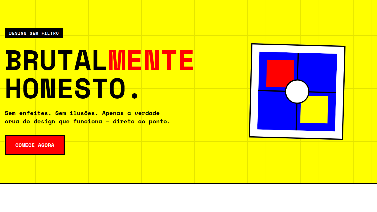
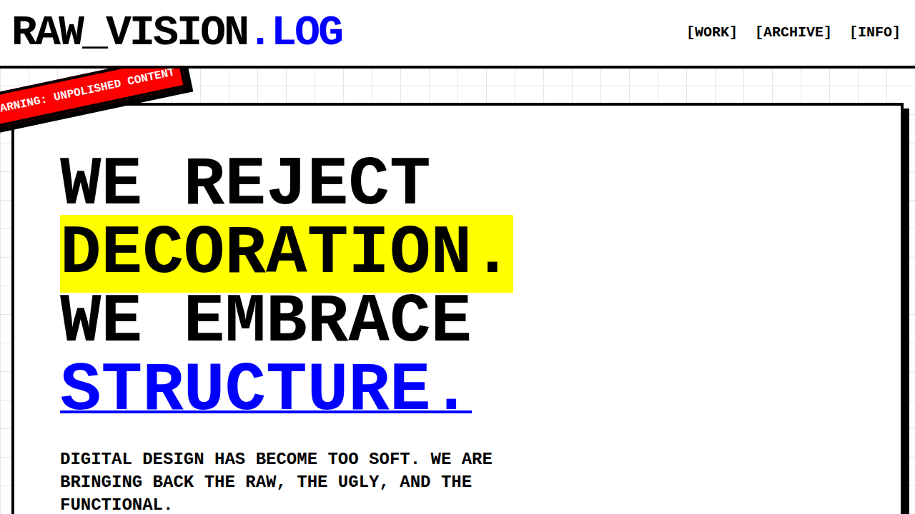
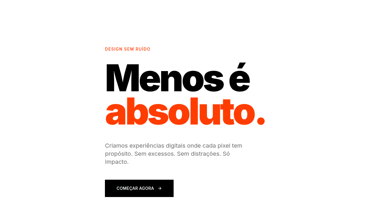
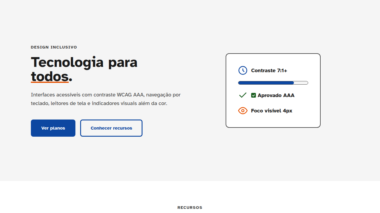
Create a brutalist design with raw, unpolished, stark aesthetic. Use pure primary colors (red, blue, yellow), black & white, no smooth transitions (instant), sharp corners, bold large typography, visible grid lines, default system fonts, intentional 'broken' design elements.
CSS Technical
border-radius: 0px, transition: none or 0s, font-family: system-ui or monospace, font-weight: 700+, border: visible 2-4px, colors: #FF0000, #0000FF, #FFFF00, #000000, #FFFFFFDesign System Variables
--border-radius: 0px, --transition-duration: 0s, --font-weight: 700-900, --colors: primary only, --border-style: visible, --grid-visible: trueImplementation Checklist
- ☐ No border-radius (0px)
- ☐ No transitions (instant)
- ☐ Bold typography (700+)
- ☐ Pure primary colors used
- ☐ Visible grid/borders
- ☐ Asymmetric layout intentional
Execution Rules
- Strictly follow the defined visual style.
- Use high-quality inline SVG icons (Heroicons or Lucide style) — NEVER use emojis as icons.
- Add
cursor-pointerand smoothhoverstates (transition-all) on all interactive elements. - Required Page Structure:
- Navbar (Logo + Links + CTA)
- Hero Section (Impactful Headline + Subtitle + 2 buttons + 3D/Abstract visual element via CSS)
- Features (3 cards with icons)
- Testimonials (3 cards)
- Pricing (3 tiers, highlight the middle one)
- Final CTA
- Full Footer with social links, privacy policy, terms of use, contact and SEO links.
- All text content must be in English.
- The visual must be CLEARLY distinct — do not create a "default Bootstrap" design. Force the use of the provided design system variables.
- Use
<style>tags in the head for custom classes (especially for complex backdrop-filter effects and animations) that Tailwind CDN doesn't cover. - Full Responsiveness: Layout must adapt perfectly to Mobile, Tablet and Desktop (vertical stack on mobile).
- Include basic SEO, Viewport and Open Graph meta tags in
<head>. - Footer must contain: Copyright 2026, Secondary navigation links and Social media icons.
- Make the creative decisions needed to deliver the complete, functional result now.
Related
Last synced: 4/1/2026