Minimalist React Hero with Motion
Minimalist, high-end React hero section using Tailwind CSS v4 and the Motion library. Ideal for saas landing pages, ferramentas de gestão remota, startups premium, produtos digitais high-end. AI-ready template.
Use case: SaaS landing pages, Ferramentas de gestão remota, Startups premium, Produtos digitais high-end
Historical Context
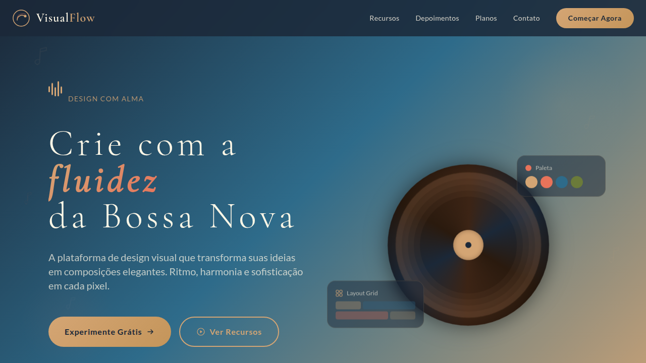
Inspirado no design editorial moderno de SaaS premium como Linear, Vercel e Raycast. Combina tipografia serifada com sans-serif, vídeo de fundo com gradiente e micro-animações para criar uma experiência de hero section sofisticada e conversível.
Technical Specs
Colors
Primary
Secondary
Effects
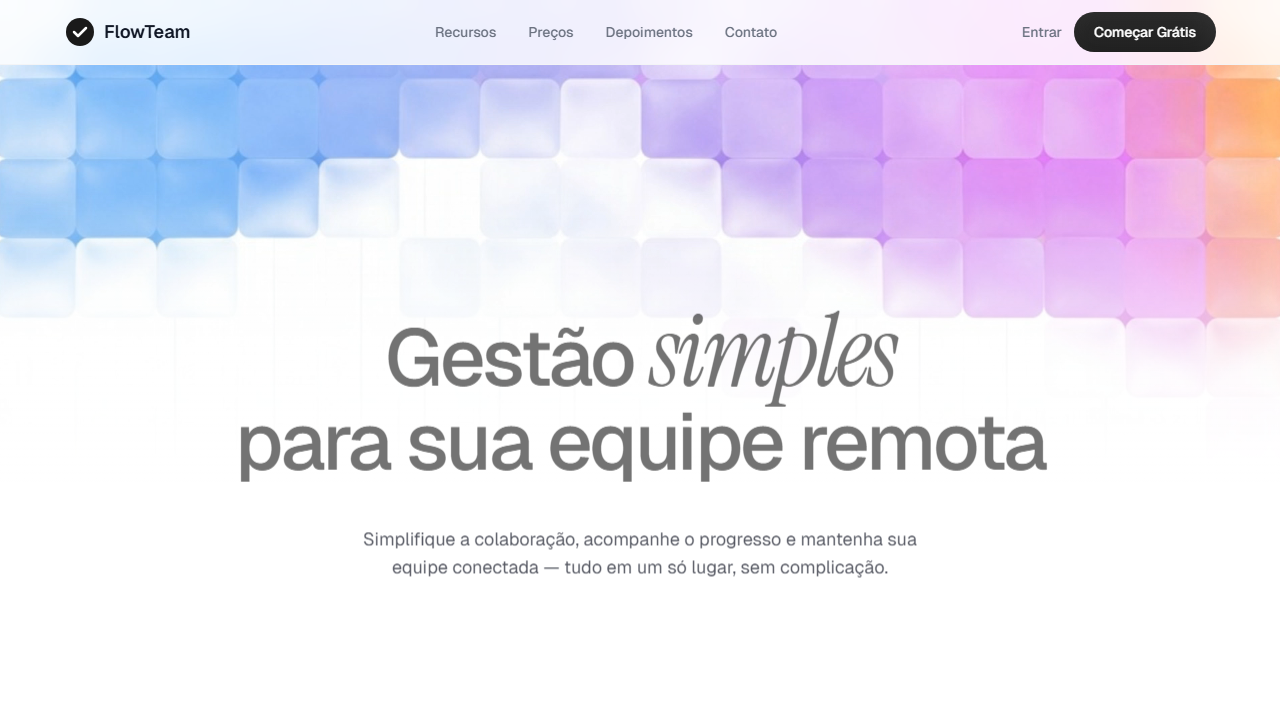
Vídeo de fundo invertido verticalmente (scaleY(-1)), gradiente branco sobreposto (from-[26.416%] to-[66.943%]), animações staggered fade-and-slide-up via Motion library, sombra multi-camada no botão CTA (inset shadows), input com sombra suave (0px 10px 40px 5px)
Light/Dark
✓ Full / ✗ No
CSS
video: w-full h-full object-cover [transform:scaleY(-1)]; gradient overlay: absolute inset-0 bg-gradient-to-b from-[26.416%] from-[rgba(255,255,255,0)] to-[66.943%] to-white; heading: font-family Geist, font-weight 500, letter-spacing -0.04em, font-size 80px; accent word: font-family 'Instrument Serif', font-style italic, font-size 100px; input container: border-radius 40px, bg-[#fcfcfc], box-shadow 0px 10px 40px 5px rgba(194,194,194,0.25); CTA button: shadow-[inset_-4px_-6px_25px_0px_rgba(201,201,201,0.08),inset_4px_4px_10px_0px_rgba(29,29,29,0.24)]; content: pt-[290px] max-w-[1200px] gap-8
Variables
--font-heading: 'Geist', sans-serif; --font-accent: 'Instrument Serif', serif; --color-text: #373a46; --color-bg: #FFFFFF; --color-input-bg: #fcfcfc; --color-button-dark: #1a1a1a; --radius-input: 40px; --shadow-input: 0px 10px 40px 5px rgba(194,194,194,0.25); --shadow-button: inset -4px -6px 25px 0px rgba(201,201,201,0.08), inset 4px 4px 10px 0px rgba(29,29,29,0.24); --spacing-top: 290px; --max-width: 1200px
Checklist
☐ Vídeo de fundo com scaleY(-1) e object-cover, ☐ Gradiente branco sobreposto com stops corretos, ☐ Tipografia Geist 80px + Instrument Serif italic 100px, ☐ Input arredondado 40px com sombra suave, ☐ Botão CTA com sombra inset multi-camada, ☐ Animações staggered via Motion library, ☐ Social proof com badge de reviews, ☐ Padding-top 290px editorial, ☐ Responsivo
DESIGN.md
Design System: Minimalist React Hero with Motion
1. Visual Theme & Atmosphere
Minimalist, high-end React hero section using Tailwind CSS v4 and the Motion library. Ideal for saas landing pages, ferramentas de gestão remota, startups premium, produtos digitais high-end. AI-ready template.
- Density: 3/10 — Airy
- Variance: 2/10 — Structured
- Motion: 8/10 — Cinematic
2. Color Palette & Roles
- White (#FFFFFF) — Light surface, card backgrounds
- Slate (#373a46) — Secondary surface or text color
- Background (#fcfcfc) — Primary background surface
- Dark Button Gradient (#1a1a1a) — Deep contrast surface
- to (#2d2d2d) — Extended palette, decorative use
- Soft Shadow (rgba(194,194,194,0.25)) — Extended palette, decorative use
- Border (rgba(0,0,0,0.08)) — Extended palette, decorative use
3. Typography Rules
- Display / Hero: Instrument Serif — Weight 700, tight tracking, used for headline impact
- Accent: Geist — Used for decorative or emphasis text
- Body: Instrument Serif — Weight 400, 16px/1.6 line-height, max 72ch per line
- UI Labels / Captions: Instrument Serif — 0.875rem, weight 500, slight letter-spacing
- Monospace: JetBrains Mono — Used for code, metadata, and technical values
Scale:
- Hero: clamp(2.5rem, 5vw, 4rem)
- H1: 2.25rem
- H2: 1.5rem
- Body: 1rem / 1.6
- Small: 0.875rem
4. Component Stylings
- Primary Button: Subtly rounded (0.5rem) shape. Accent color fill. Hover: 8% darken + subtle lift shadow. Active: -1px translate tactile press. Font weight 600. No outer glows.
- Secondary / Ghost Button: Outline variant. 1.5px border in muted color. Text in primary color. Hover: subtle background fill.
- Cards: Subtly rounded (0.5rem) corners. Surface background. Subtle shadow (0 2px 12px rgba(0,0,0,0.06)). 1px border stroke.
- Inputs: Label above input. 1px border stroke. Focus ring: 2px accent color offset 2px. Error text below in semantic red. No floating labels.
- Navigation: Primary surface background. Active item: accent color indicator. Font weight 500 when active.
- Skeletons: Shimmer animation matching component dimensions. No circular spinners.
- Empty States: Icon-based composition with descriptive text and action button.
5. Layout Principles
- Grid: CSS Grid primary. Max-width containment: 1280px centered with 1.5rem side padding.
- Spacing rhythm: Balanced. Base unit: 0.5rem (8px).
- Section vertical gaps: clamp(4rem, 8vw, 8rem).
- Hero layout: Split-screen (text left, visual right).
- Feature sections: Zig-zag alternating text+image rows. No 3-equal-columns.
- Mobile collapse: All multi-column layouts collapse below 768px. No horizontal overflow.
- z-index contract: base (0) / sticky-nav (100) / overlay (200) / modal (300) / toast (500).
6. Motion & Interaction
- Physics: Spring — stiffness 120, damping 20. Confident, weighted transitions.
- Entry animations: Fade + translate-Y (16px → 0) over 540ms ease-out. Staggered cascades for lists: 120ms between items.
- Hover states: Scale(1.03) + shadow lift over 200ms.
- Page transitions: Fade + slide (300ms).
- Performance: Only transform and opacity animated. No layout-triggering properties.
7. Anti-Patterns (Banned)
- No emojis in UI — use icon system only (Lucide, Heroicons)
- No decorative gradients — flat color only
- No shadows heavier than 0 2px 8px rgba(0,0,0,0.08)
- No pure black (#000000) — use off-black or charcoal variants
- No oversaturated accent colors (saturation cap: 80%)
- No 3-column equal-width feature layouts — use zig-zag or asymmetric grid
- No
h-screen— usemin-h-[100dvh] - No AI copywriting clichés: "Elevate", "Seamless", "Unleash", "Next-Gen"
- No broken external image links — use picsum.photos or inline SVG
- No generic lorem ipsum in demos
AI Prompt
Act as a Senior Frontend Engineer and Expert UI Designer. Your task is to code a complete Landing Page on the first attempt.
- Landing Page Theme:
- Sections to add:
Generate the final code immediately following these definitions:
Style
- Name: Minimalist React Hero with Motion
- Type: Minimalist, High-End, Editorial, Spacious
- Keywords: minimalist, high-end, React, Tailwind CSS v4, Motion library, hero section, editorial, spacious, video background, staggered animation, social proof
- Era: 2020s Modern SaaS
- Light/Dark: ✓ Full / ✗ No
Color Palette
- Primary: White #FFFFFF, Slate #373a46, Background #fcfcfc
- Secondary: Dark Button Gradient #1a1a1a to #2d2d2d, Soft Shadow rgba(194,194,194,0.25), Border rgba(0,0,0,0.08)
Visual Effects
Vídeo de fundo invertido verticalmente (scaleY(-1)), gradiente branco sobreposto (from-[26.416%] to-[66.943%]), animações staggered fade-and-slide-up via Motion library, sombra multi-camada no botão CTA (inset shadows), input com sombra suave (0px 10px 40px 5px)
AI Visual Direction
Create a minimalist, high-end React hero section using Tailwind CSS v4 and the Motion library. Layout: min-h-screen, centered, heavy top padding of exactly 290px, max-w-[1200px], vertical gap of 32px. Background: use video https://d8j0ntlcm91z4.cloudfront.net/user_38xzZboKViGWJOttwIXH07lWA1P/hf_20260302_085640_276ea93b-d7da-4418-a09b-2aa5b490e838.mp4 vertically flipped with scaleY(-1) and object-cover. Apply white gradient overlay from-[26.416%] from-[rgba(255,255,255,0)] to-[66.943%] to-white. Typography: Geist font medium weight tracking -0.04em for heading at 80px desktop, 'Instrument Serif' italic at 100px for the word 'management'. Description: Geist 18px 80% opacity slate #373a46 max-w-554px. Email input: rounded-[40px] bg-[#fcfcfc] thin border soft shadow. CTA button: dark multi-layered gradient with complex inner shadow. Social proof: '1,020+ Reviews' badge with star/brand icons. Animations: Motion staggered fade-and-slide-up for heading, description, and email input block.
CSS Technical
video: w-full h-full object-cover [transform:scaleY(-1)]; gradient overlay: absolute inset-0 bg-gradient-to-b from-[26.416%] from-[rgba(255,255,255,0)] to-[66.943%] to-white; heading: font-family Geist, font-weight 500, letter-spacing -0.04em, font-size 80px; accent word: font-family 'Instrument Serif', font-style italic, font-size 100px; input container: border-radius 40px, bg-[#fcfcfc], box-shadow 0px 10px 40px 5px rgba(194,194,194,0.25); CTA button: shadow-[inset_-4px_-6px_25px_0px_rgba(201,201,201,0.08),inset_4px_4px_10px_0px_rgba(29,29,29,0.24)]; content: pt-[290px] max-w-[1200px] gap-8Design System Variables
--font-heading: 'Geist', sans-serif; --font-accent: 'Instrument Serif', serif; --color-text: #373a46; --color-bg: #FFFFFF; --color-input-bg: #fcfcfc; --color-button-dark: #1a1a1a; --radius-input: 40px; --shadow-input: 0px 10px 40px 5px rgba(194,194,194,0.25); --shadow-button: inset -4px -6px 25px 0px rgba(201,201,201,0.08), inset 4px 4px 10px 0px rgba(29,29,29,0.24); --spacing-top: 290px; --max-width: 1200pxImplementation Checklist
- ☐ Vídeo de fundo com scaleY(-1) e object-cover
- ☐ Gradiente branco sobreposto com stops corretos
- ☐ Tipografia Geist 80px + Instrument Serif italic 100px
- ☐ Input arredondado 40px com sombra suave
- ☐ Botão CTA com sombra inset multi-camada
- ☐ Animações staggered via Motion library
- ☐ Social proof com badge de reviews
- ☐ Padding-top 290px editorial
- ☐ Responsivo
Execution Rules
- Strictly follow the defined visual style.
- Use high-quality inline SVG icons (Heroicons or Lucide style) — NEVER use emojis as icons.
- Add
cursor-pointerand smoothhoverstates (transition-all) on all interactive elements. - Required Page Structure:
- Navbar (Logo + Links + CTA)
- Hero Section (Impactful Headline + Subtitle + 2 buttons + 3D/Abstract visual element via CSS)
- Features (3 cards with icons)
- Testimonials (3 cards)
- Pricing (3 tiers, highlight the middle one)
- Final CTA
- Full Footer with social links, privacy policy, terms of use, contact and SEO links.
- All text content must be in English.
- The visual must be CLEARLY distinct — do not create a "default Bootstrap" design. Force the use of the provided design system variables.
- Use
<style>tags in the head for custom classes (especially for complex backdrop-filter effects and animations) that Tailwind CDN doesn't cover. - Full Responsiveness: Layout must adapt perfectly to Mobile, Tablet and Desktop (vertical stack on mobile).
- Include basic SEO, Viewport and Open Graph meta tags in
<head>. - Footer must contain: Copyright 2026, Secondary navigation links and Social media icons.
- Make the creative decisions needed to deliver the complete, functional result now.
Related
Last synced: 4/1/2026