Replicate Blaze Gallery
Replicate-inspired explosive landing page. Ideal for plataformas de modelos ai, apis de ml, comunidades developer, marketplaces de ai. AI-ready template.
Use case: Plataformas de modelos AI, APIs de ML, Comunidades developer, Marketplaces de AI
Historical Context
Inspirado no design do Replicate, que combina energia de festival com credibilidade developer usando tipografia massiva e geometria pill.
Technical Specs
Colors
Primary
Secondary
Effects
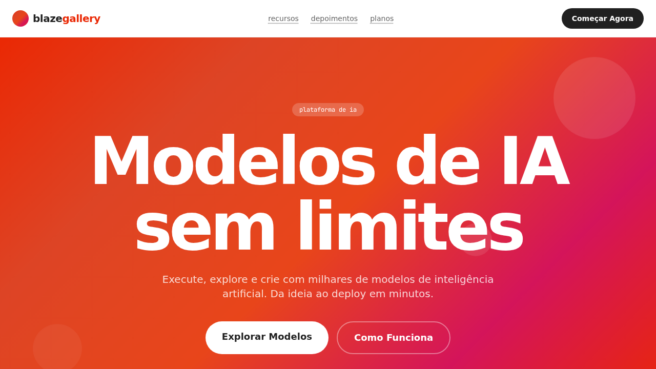
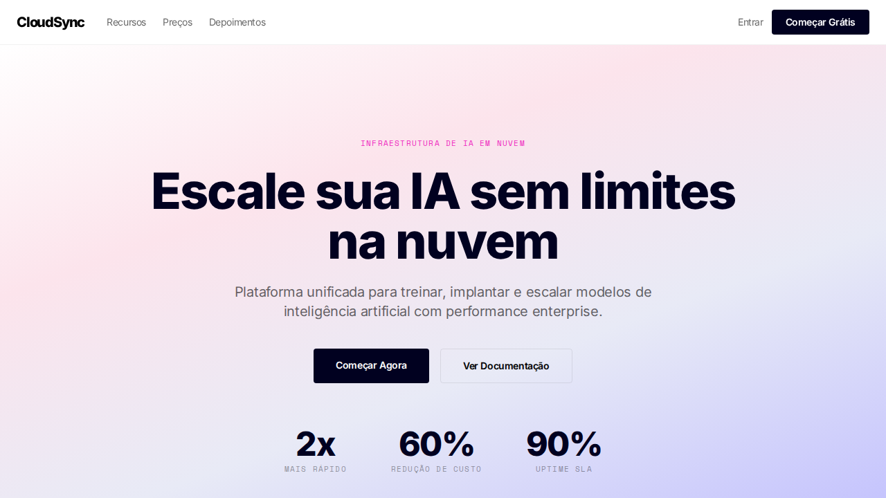
Hero explosivo com gradiente laranja-vermelho-magenta-rosa (#ea2804 âncora). Tipografia display massiva (até 128px) em font heavy bold. Geometria exclusivamente pill (9999px) em TUDO. Alto contraste preto (#202020) e branco. Galeria de modelos AI com imagens geradas. Links com underline pontilhado. Badges verdes (#2b9a66) para status. Manifesto de fechamento 'Imagine o que você pode construir' em 128px. Tags lowercase (text-transform: lowercase).
Light/Dark
✓ Full / ✗ Not Recommended
CSS
background:#ffffff;color:#202020;accent:#ea2804;border-radius:9999px everything;font-family:system-ui display,sans-serif body,monospace code;font-weight:700 display;font-size:128px max;text-transform:lowercase tags
Variables
--bg:#ffffff;--text:#202020;--brand:#ea2804;--secondary:#dd4425;--green:#2b9a66;--github:#24292e;--gray:#646464;--silver:#bbbbbb;--radius:9999px
Checklist
☐ Hero gradiente explosivo, ☐ Display até 128px weight 700, ☐ Pill 9999px em tudo, ☐ Alto contraste, ☐ Galeria de modelos AI, ☐ Links pontilhados, ☐ Badges verdes, ☐ Tags lowercase, ☐ Responsivo
DESIGN.md
Design System: Replicate Blaze Gallery
1. Visual Theme & Atmosphere
Replicate-inspired explosive landing page. Ideal for plataformas de modelos ai, apis de ml, comunidades developer, marketplaces de ai. AI-ready template.
- Density: 5/10 — Balanced
- Variance: 4/10 — Moderate
- Motion: 4/10 — Subtle
2. Color Palette & Roles
- Escuro (#202020) — Dark surface, primary background
- Branco (#ffffff) — Light surface, card backgrounds
- Vermelho Brand (#ea2804) — Primary accent, CTAs and interactive elements
- Vermelho Secundário (#dd4425) — Error states, destructive actions
- Verde Status (#2b9a66) — Success states, positive indicators
- GitHub Dark (#24292e) — Deep contrast surface
- Cinza (#646464) — Secondary text, borders, muted elements
- Silver (#bbbbbb) — Extended palette, decorative use
3. Typography Rules
- Display / Hero: system-ui display — Weight 700, tight tracking, used for headline impact
- Body: system-ui display — Weight 400, 16px/1.6 line-height, max 72ch per line
- UI Labels / Captions: system-ui display — 0.875rem, weight 500, slight letter-spacing
- Monospace: JetBrains Mono — Used for code, metadata, and technical values
Scale:
- Hero: clamp(2.5rem, 5vw, 4rem)
- H1: 2.25rem
- H2: 1.5rem
- Body: 1rem / 1.6
- Small: 0.875rem
4. Component Stylings
- Primary Button: Pill-shaped (9999px) shape. Accent color fill. Hover: 8% darken + subtle lift shadow. Active: -1px translate tactile press. Font weight 600. No outer glows.
- Secondary / Ghost Button: Outline variant. 1.5px border in muted color. Text in primary color. Hover: subtle background fill.
- Cards: Pill-shaped (9999px) corners. Surface background. Subtle shadow (0 2px 12px rgba(0,0,0,0.06)). 1px border stroke.
- Inputs: Label above input. 1px border stroke. Focus ring: 2px accent color offset 2px. Error text below in semantic red. No floating labels.
- Navigation: Primary surface background. Active item: accent color indicator. Font weight 500 when active.
- Skeletons: Shimmer animation matching component dimensions. No circular spinners.
- Empty States: Icon-based composition with descriptive text and action button.
5. Layout Principles
- Grid: CSS Grid primary. Max-width containment: 1280px centered with 1.5rem side padding.
- Spacing rhythm: Balanced. Base unit: 0.5rem (8px).
- Section vertical gaps: clamp(4rem, 8vw, 8rem).
- Hero layout: Split-screen (text left, visual right).
- Feature sections: Zig-zag alternating text+image rows. No 3-equal-columns.
- Mobile collapse: All multi-column layouts collapse below 768px. No horizontal overflow.
- z-index contract: base (0) / sticky-nav (100) / overlay (200) / modal (300) / toast (500).
6. Motion & Interaction
- Physics: Ease-out curves, 200-300ms duration. Smooth and predictable.
- Entry animations: Fade + translate-Y (16px → 0) over 420ms ease-out. Staggered cascades for lists: 80ms between items.
- Hover states: Subtle color shift + shadow adjustment over 200ms.
- Page transitions: Fade only (200ms).
- Performance: Only transform and opacity animated. No layout-triggering properties.
7. Anti-Patterns (Banned)
- No emojis in UI — use icon system only (Lucide, Heroicons)
- No pure black (#000000) — use off-black or charcoal variants
- No oversaturated accent colors (saturation cap: 80%)
- No 3-column equal-width feature layouts — use zig-zag or asymmetric grid
- No
h-screen— usemin-h-[100dvh] - No AI copywriting clichés: "Elevate", "Seamless", "Unleash", "Next-Gen"
- No broken external image links — use picsum.photos or inline SVG
- No generic lorem ipsum in demos
AI Prompt
Act as a Senior Frontend Engineer and Expert UI Designer. Your task is to code a complete Landing Page on the first attempt.
- Landing Page Theme:
- Sections to add:
Generate the final code immediately following these definitions:
Style
- Name: Replicate Blaze Gallery
- Type: Explosive Gradient Hero, Heavy Display Font, All-Pill Geometry, Developer Community, AI Gallery
- Keywords: replicate, blaze, gradient hero, heavy display, all-pill, developer community, rb-freigeist, basier-square, JetBrains Mono, model gallery
- Era: 2024-2026 AI Model Playground
- Light/Dark: ✓ Full / ✗ Not Recommended
Color Palette
- Primary: Escuro #202020, Branco #ffffff, Vermelho Brand #ea2804, Vermelho Secundário #dd4425
- Secondary: Verde Status #2b9a66, GitHub Dark #24292e, Cinza #646464, Silver #bbbbbb
Visual Effects
Hero explosivo com gradiente laranja-vermelho-magenta-rosa (#ea2804 âncora). Tipografia display massiva (até 128px) em font heavy bold. Geometria exclusivamente pill (9999px) em TUDO. Alto contraste preto (#202020) e branco. Galeria de modelos AI com imagens geradas. Links com underline pontilhado. Badges verdes (#2b9a66) para status. Manifesto de fechamento 'Imagine o que você pode construir' em 128px. Tags lowercase (text-transform: lowercase).
AI Visual Direction
Design a Replicate-inspired explosive landing page. Hero with orange-red-magenta gradient (#ea2804 anchor). Massive display typography up to 128px weight 700. Exclusively pill-shaped geometry (9999px) on EVERYTHING. High-contrast dark (#202020) and white palette. AI model gallery with generated images. Dotted-underline links. Green status badges (#2b9a66). Closing manifesto at 128px. Lowercase tags. basier-square for body, JetBrains Mono for code.
CSS Technical
background:#ffffff;color:#202020;accent:#ea2804;border-radius:9999px everything;font-family:system-ui display,sans-serif body,monospace code;font-weight:700 display;font-size:128px max;text-transform:lowercase tagsDesign System Variables
--bg:#ffffff;--text:#202020;--brand:#ea2804;--secondary:#dd4425;--green:#2b9a66;--github:#24292e;--gray:#646464;--silver:#bbbbbb;--radius:9999pxImplementation Checklist
- ☐ Hero gradiente explosivo
- ☐ Display até 128px weight 700
- ☐ Pill 9999px em tudo
- ☐ Alto contraste
- ☐ Galeria de modelos AI
- ☐ Links pontilhados
- ☐ Badges verdes
- ☐ Tags lowercase
- ☐ Responsivo
Execution Rules
- Strictly follow the defined visual style.
- Use high-quality inline SVG icons (Heroicons or Lucide style) — NEVER use emojis as icons.
- Add
cursor-pointerand smoothhoverstates (transition-all) on all interactive elements. - Required Page Structure:
- Navbar (Logo + Links + CTA)
- Hero Section (Impactful Headline + Subtitle + 2 buttons + 3D/Abstract visual element via CSS)
- Features (3 cards with icons)
- Testimonials (3 cards)
- Pricing (3 tiers, highlight the middle one)
- Final CTA
- Full Footer with social links, privacy policy, terms of use, contact and SEO links.
- All text content must be in English.
- The visual must be CLEARLY distinct — do not create a "default Bootstrap" design. Force the use of the provided design system variables.
- Use
<style>tags in the head for custom classes (especially for complex backdrop-filter effects and animations) that Tailwind CDN doesn't cover. - Full Responsiveness: Layout must adapt perfectly to Mobile, Tablet and Desktop (vertical stack on mobile).
- Include basic SEO, Viewport and Open Graph meta tags in
<head>. - Footer must contain: Copyright 2026, Secondary navigation links and Social media icons.
- Make the creative decisions needed to deliver the complete, functional result now.
Related
Last synced: 4/1/2026