SpaceX Cinematic Void
SpaceX-inspired cinematic void landing page. Ideal for aeroespacial, tecnologia espacial, marcas futuristas, engenharia avançada. AI-ready template.
Use case: Aeroespacial, Tecnologia espacial, Marcas futuristas, Engenharia avançada
Historical Context
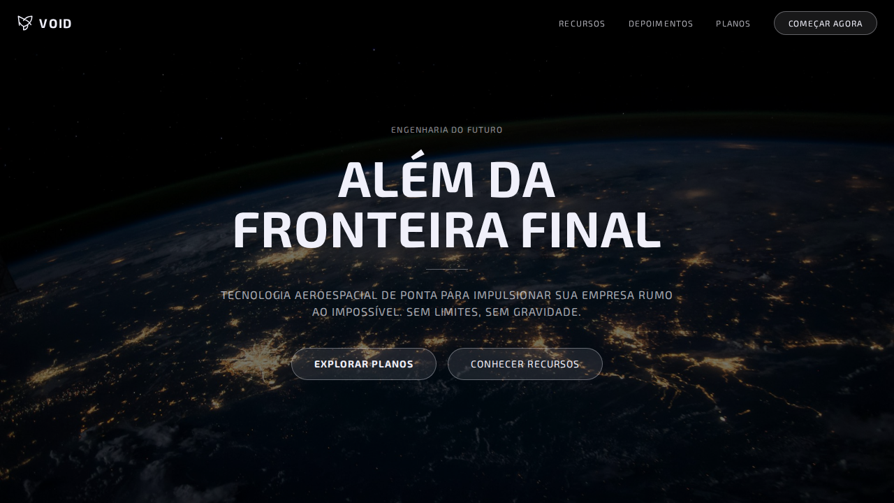
Inspirado no design da SpaceX, que é uma exposição fotográfica com sistema tipográfico e um único botão — a interface desaparece atrás da fotografia.
Technical Specs
Colors
Primary
Effects
Canvas preto puro (#000000) com fotografia full-viewport (100vh) como elemento de design primário. Texto branco espectral (#f0f0fa) com leve tint blue-violet como luz estelar. TUDO em uppercase com letter-spacing positivo (0.96px-1.17px) — estética de stencil aeroespacial. D-DIN industrial com herança DIN alemã. Ghost button único: rgba(240,240,250,0.1) background com borda espectral. Zero sombras, zero cards, zero containers — texto diretamente sobre fotografia. Cada seção é uma cena cinematográfica full-viewport.
Light/Dark
✗ Not Recommended / ✓ Full
CSS
background:#000000;color:#f0f0fa;border-radius:32px ghost button only;box-shadow:none;font-family:'D-DIN',Arial,Verdana;text-transform:uppercase;letter-spacing:0.96px display,1.17px nav;line-height:1.00 display;background-size:cover
Variables
--bg:#000000;--text:#f0f0fa;--ghost-bg:rgba(240,240,250,0.1);--ghost-border:rgba(240,240,250,0.35);--overlay:rgba(0,0,0,0.5);--radius-ghost:32px;--shadow:none
Checklist
☐ Preto puro com fotografia full-viewport, ☐ Branco espectral #f0f0fa, ☐ TUDO uppercase, ☐ Letter-spacing positivo 0.96-1.17px, ☐ Ghost button único, ☐ Zero sombras/cards/containers, ☐ Overlay escuro para legibilidade, ☐ Seções 100vh, ☐ Responsivo
DESIGN.md
Design System: SpaceX Cinematic Void
1. Visual Theme & Atmosphere
SpaceX-inspired cinematic void landing page. Ideal for aeroespacial, tecnologia espacial, marcas futuristas, engenharia avançada. AI-ready template.
- Density: 5/10 — Balanced
- Variance: 4/10 — Moderate
- Motion: 8/10 — Cinematic
2. Color Palette & Roles
- Preto Espacial (#000000) — Dark surface, primary background
- Branco Espectral (#f0f0fa) — Light surface, card backgrounds
- Ghost Surface (rgba(240,240,250,0.1)) — Supporting palette color
- Ghost Border (rgba(240,240,250,0.35)) — Supporting palette color
- Overlay (rgba(0,0,0,0.5)) — Extended palette, decorative use
3. Typography Rules
- Display / Hero: D-DIN — Weight 700, tight tracking, used for headline impact
- Body: D-DIN — Weight 400, 16px/1.6 line-height, max 72ch per line
- UI Labels / Captions: D-DIN — 0.875rem, weight 500, slight letter-spacing
- Monospace: JetBrains Mono — Used for code, metadata, and technical values
Scale:
- Hero: clamp(2.5rem, 5vw, 4rem)
- H1: 2.25rem
- H2: 1.5rem
- Body: 1rem / 1.6
- Small: 0.875rem
4. Component Stylings
- Primary Button: Rounded (32px ghost button only) shape. Accent color fill. Hover: 8% darken + subtle lift shadow. Active: -1px translate tactile press. Font weight 600. No outer glows.
- Secondary / Ghost Button: Outline variant. 1.5px border in muted color. Text in primary color. Hover: subtle background fill.
- Cards: Rounded (32px ghost button only) corners. Surface background. Subtle shadow (0 2px 12px rgba(0,0,0,0.06)). 1px border stroke.
- Inputs: Label above input. 1px border stroke. Focus ring: 2px accent color offset 2px. Error text below in semantic red. No floating labels.
- Navigation: Primary surface background. Active item: accent color indicator. Font weight 500 when active.
- Skeletons: Shimmer animation matching component dimensions. No circular spinners.
- Empty States: Icon-based composition with descriptive text and action button.
5. Layout Principles
- Grid: CSS Grid primary. Max-width containment: 1280px centered with 1.5rem side padding.
- Spacing rhythm: Balanced. Base unit: 0.5rem (8px).
- Section vertical gaps: clamp(4rem, 8vw, 8rem).
- Hero layout: Split-screen (text left, visual right).
- Feature sections: Zig-zag alternating text+image rows. No 3-equal-columns.
- Mobile collapse: All multi-column layouts collapse below 768px. No horizontal overflow.
- z-index contract: base (0) / sticky-nav (100) / overlay (200) / modal (300) / toast (500).
6. Motion & Interaction
- Physics: Spring — stiffness 120, damping 20. Confident, weighted transitions.
- Entry animations: Fade + translate-Y (16px → 0) over 540ms ease-out. Staggered cascades for lists: 120ms between items.
- Hover states: Scale(1.03) + shadow lift over 200ms.
- Page transitions: Fade + slide (300ms).
- Performance: Only transform and opacity animated. No layout-triggering properties.
7. Anti-Patterns (Banned)
- No emojis in UI — use icon system only (Lucide, Heroicons)
- No pure black (#000000) — use off-black or charcoal variants
- No oversaturated accent colors (saturation cap: 80%)
- No 3-column equal-width feature layouts — use zig-zag or asymmetric grid
- No
h-screen— usemin-h-[100dvh] - No AI copywriting clichés: "Elevate", "Seamless", "Unleash", "Next-Gen"
- No broken external image links — use picsum.photos or inline SVG
- No generic lorem ipsum in demos
AI Prompt
Act as a Senior Frontend Engineer and Expert UI Designer. Your task is to code a complete Landing Page on the first attempt.
- Landing Page Theme:
- Sections to add:
Generate the final code immediately following these definitions:
Style
- Name: SpaceX Cinematic Void
- Type: Pure Black Void, Full-Viewport Photography, D-DIN Industrial, Universal Uppercase, Ghost Buttons, Zero Everything
- Keywords: spacex, cinematic, void, D-DIN, industrial, uppercase, positive tracking, ghost buttons, full-viewport, spectral white, aerospace stencil, zero shadows
- Era: 2024-2026 Aerospace Engineering
- Light/Dark: ✗ Not Recommended / ✓ Full
Color Palette
- Primary: Preto Espacial #000000, Branco Espectral #f0f0fa, Ghost Surface rgba(240,240,250,0.1), Ghost Border rgba(240,240,250,0.35)
- Secondary: Overlay rgba(0,0,0,0.5), Branco 100% var(--white-100)
Visual Effects
Canvas preto puro (#000000) com fotografia full-viewport (100vh) como elemento de design primário. Texto branco espectral (#f0f0fa) com leve tint blue-violet como luz estelar. TUDO em uppercase com letter-spacing positivo (0.96px-1.17px) — estética de stencil aeroespacial. D-DIN industrial com herança DIN alemã. Ghost button único: rgba(240,240,250,0.1) background com borda espectral. Zero sombras, zero cards, zero containers — texto diretamente sobre fotografia. Cada seção é uma cena cinematográfica full-viewport.
AI Visual Direction
Design a SpaceX-inspired cinematic void landing page. Pure black (#000000) with full-viewport photography as primary design element. Spectral white (#f0f0fa) text — slight blue-violet tint like starlight. ALL text uppercase with positive letter-spacing (0.96px-1.17px). D-DIN industrial font at 48px weight 700 for hero. Single ghost button: rgba(240,240,250,0.1) background, 1px solid rgba(240,240,250,0.35) border, 32px radius. Zero shadows, zero cards, zero containers. Dark gradient overlay rgba(0,0,0,0.5) for text legibility. Each section is 100vh cinematic scene.
CSS Technical
background:#000000;color:#f0f0fa;border-radius:32px ghost button only;box-shadow:none;font-family:'D-DIN',Arial,Verdana;text-transform:uppercase;letter-spacing:0.96px display,1.17px nav;line-height:1.00 display;background-size:coverDesign System Variables
--bg:#000000;--text:#f0f0fa;--ghost-bg:rgba(240,240,250,0.1);--ghost-border:rgba(240,240,250,0.35);--overlay:rgba(0,0,0,0.5);--radius-ghost:32px;--shadow:noneImplementation Checklist
- ☐ Preto puro com fotografia full-viewport
- ☐ Branco espectral #f0f0fa
- ☐ TUDO uppercase
- ☐ Letter-spacing positivo 0.96-1.17px
- ☐ Ghost button único
- ☐ Zero sombras/cards/containers
- ☐ Overlay escuro para legibilidade
- ☐ Seções 100vh
- ☐ Responsivo
Execution Rules
- Strictly follow the defined visual style.
- Use high-quality inline SVG icons (Heroicons or Lucide style) — NEVER use emojis as icons.
- Add
cursor-pointerand smoothhoverstates (transition-all) on all interactive elements. - Required Page Structure:
- Navbar (Logo + Links + CTA)
- Hero Section (Impactful Headline + Subtitle + 2 buttons + 3D/Abstract visual element via CSS)
- Features (3 cards with icons)
- Testimonials (3 cards)
- Pricing (3 tiers, highlight the middle one)
- Final CTA
- Full Footer with social links, privacy policy, terms of use, contact and SEO links.
- All text content must be in English.
- The visual must be CLEARLY distinct — do not create a "default Bootstrap" design. Force the use of the provided design system variables.
- Use
<style>tags in the head for custom classes (especially for complex backdrop-filter effects and animations) that Tailwind CDN doesn't cover. - Full Responsiveness: Layout must adapt perfectly to Mobile, Tablet and Desktop (vertical stack on mobile).
- Include basic SEO, Viewport and Open Graph meta tags in
<head>. - Footer must contain: Copyright 2026, Secondary navigation links and Social media icons.
- Make the creative decisions needed to deliver the complete, functional result now.
Related
Last synced: 4/1/2026