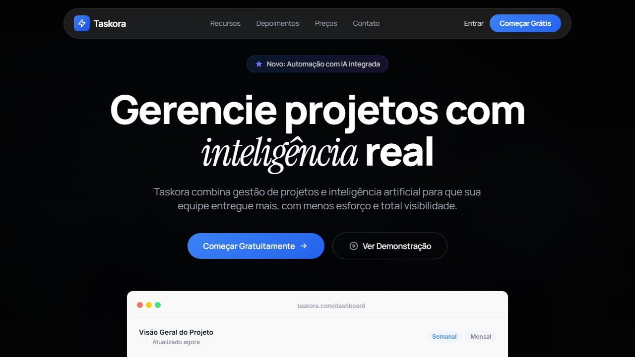
Taskora SaaS Hero
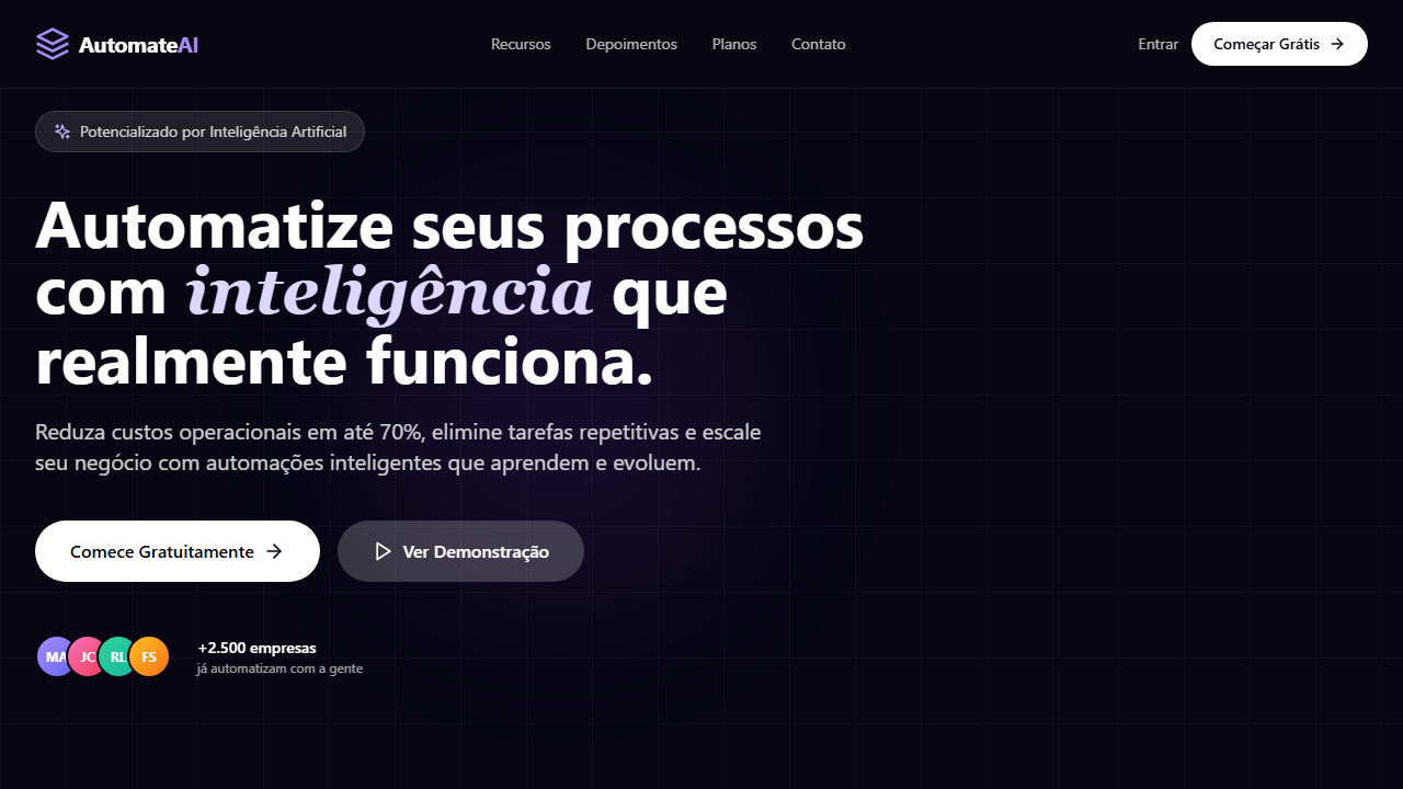
Dark SaaS hero with background video at opacity-50 and gradient overlay fading to background color. Ideal for produtos saas, plataformas de gestão de projetos, ferramentas de produtividade, dashboards analíticos. AI-ready template.
Use case: Produtos SaaS, Plataformas de gestão de projetos, Ferramentas de produtividade, Dashboards analíticos
Historical Context
Segue a tendência product-led growth de SaaS modernos, onde o hero section exibe o produto real como prova visual, combinado com animações de entrada sofisticadas.
Technical Specs
Colors
Primary
Secondary
Effects
VÍDEO: Vídeo abstrato escuro com partículas luminosas ou formas geométricas flutuantes em tons de azul e roxo sobre fundo preto. Movimento sutil e orgânico criando atmosfera tecnológica e sofisticada. Exibido com opacity 50% e gradient overlay (black/60 para #050505) que funde suavemente o vídeo no fundo escuro da página. | EFEITOS CSS: Vídeo de fundo com opacity-50 e gradient overlay (black/60 para #050505), navbar flutuante pill glassmorphism (bg-white/10, backdrop-blur-md), animações staggered de entrada (fade-up + slide) via Framer Motion, headline massiva com palavra em Instrument Serif italic, dashboard mockup light mode contrastando com hero dark, badge pill com ícone estrela gradiente azul
Light/Dark
✗ Not Recommended / ✓ Full
CSS
background: #050505, video: opacity-50 with gradient overlay, backdrop-filter: blur(12px), background: rgba(255,255,255,0.1), font-family: 'Manrope' body / 'Instrument Serif' italic accent / 'Inter' dashboard, font-size: clamp(3rem, 8vw, 80px), animation: staggered fade-up, dashboard: bg-[#F9F9FA]
Variables
--bg-primary: #050505, --text-primary: #FFFFFF, --text-muted: #9CA3AF, --glass-bg: rgba(255,255,255,0.1), --blur: 12px, --font-body: 'Manrope', --font-accent: 'Instrument Serif', --font-ui: 'Inter', --dashboard-bg: #F9F9FA
Checklist
☐ Vídeo de fundo opacity-50 com gradient overlay, ☐ Navbar flutuante pill glassmorphism, ☐ Badge pill com estrela gradiente, ☐ Headline massiva com palavra em serif italic, ☐ Animações staggered de entrada, ☐ Dashboard mockup light mode, ☐ Mobile hamburger glassmorphism, ☐ Responsivo
DESIGN.md
Design System: Taskora SaaS Hero
1. Visual Theme & Atmosphere
Dark SaaS hero with background video at opacity-50 and gradient overlay fading to background color. Ideal for produtos saas, plataformas de gestão de projetos, ferramentas de produtividade, dashboards analíticos. AI-ready template.
- Density: 8/10 — Dense
- Variance: 4/10 — Moderate
- Motion: 8/10 — Cinematic
2. Color Palette & Roles
- Preto Base (#050505) — Primary background surface
- Branco (#FFFFFF) — Light surface, card backgrounds
- Cinza Texto (#9CA3AF) — Primary text color
- Azul Gradiente (#3B82F6) — Accent highlight, links and focus states
- Dashboard Claro (#F9F9FA) — Extended palette, decorative use
- Verde Trend (#22C55E) — Success states, positive indicators
- Vermelho Trend (#EF4444) — Error states, destructive actions
- Vidro Navbar (rgba(255,255,255,0.1)) — Extended palette, decorative use
3. Typography Rules
- Display / Hero: Manrope — Weight 700, tight tracking, used for headline impact
- Accent: Instrument Serif — Used for decorative or emphasis text
- Body: Manrope — Weight 400, 16px/1.6 line-height, max 72ch per line
- UI Labels / Captions: Manrope — 0.875rem, weight 500, slight letter-spacing
- Monospace: JetBrains Mono — Used for code, metadata, and technical values
Scale:
- Hero: clamp(2.5rem, 5vw, 4rem)
- H1: 2.25rem
- H2: 1.5rem
- Body: 1rem / 1.6
- Small: 0.875rem
4. Component Stylings
- Primary Button: Subtly rounded (0.5rem) shape. Accent color fill. Hover: 8% darken + subtle lift shadow. Active: -1px translate tactile press. Font weight 600. No outer glows.
- Secondary / Ghost Button: Outline variant. 1.5px border in muted color. Text in primary color. Hover: subtle background fill.
- Cards: Subtly rounded (0.5rem) corners. Surface background. Subtle shadow (0 2px 12px rgba(0,0,0,0.06)). 1px border stroke.
- Inputs: Label above input. 1px border stroke. Focus ring: 2px accent color offset 2px. Error text below in semantic red. No floating labels.
- Navigation: Primary surface background. Active item: accent color indicator. Font weight 500 when active.
- Skeletons: Shimmer animation matching component dimensions. No circular spinners.
- Empty States: Icon-based composition with descriptive text and action button.
5. Layout Principles
- Grid: CSS Grid primary. Max-width containment: 1280px centered with 1.5rem side padding.
- Spacing rhythm: Balanced. Base unit: 0.5rem (8px).
- Section vertical gaps: clamp(4rem, 8vw, 8rem).
- Hero layout: Split-screen (text left, visual right).
- Feature sections: Zig-zag alternating text+image rows. No 3-equal-columns.
- Mobile collapse: All multi-column layouts collapse below 768px. No horizontal overflow.
- z-index contract: base (0) / sticky-nav (100) / overlay (200) / modal (300) / toast (500).
6. Motion & Interaction
- Physics: Spring — stiffness 120, damping 20. Confident, weighted transitions.
- Entry animations: Fade + translate-Y (16px → 0) over 540ms ease-out. Staggered cascades for lists: 120ms between items.
- Hover states: Scale(1.03) + shadow lift over 200ms.
- Page transitions: Fade + slide (300ms).
- Performance: Only transform and opacity animated. No layout-triggering properties.
7. Anti-Patterns (Banned)
- No emojis in UI — use icon system only (Lucide, Heroicons)
- No pure white (#FFFFFF) backgrounds — use off-white or dark surfaces
- No oversaturated accent colors (saturation cap: 80%)
- No 3-column equal-width feature layouts — use zig-zag or asymmetric grid
- No
h-screen— usemin-h-[100dvh] - No AI copywriting clichés: "Elevate", "Seamless", "Unleash", "Next-Gen"
- No broken external image links — use picsum.photos or inline SVG
- No generic lorem ipsum in demos
AI Prompt
Act as a Senior Frontend Engineer and Expert UI Designer. Your task is to code a complete Landing Page on the first attempt.
- Landing Page Theme:
- Sections to add:
Generate the final code immediately following these definitions:
Style
- Name: Taskora SaaS Hero
- Type: SaaS, Dark Mode, Dashboard Preview, Staggered Animations
- Keywords: SaaS, dark mode, dashboard mockup, staggered animations, Framer Motion, glassmorphism navbar, Instrument Serif italic, product shot, badge com estrela
- Era: 2024-2026 SaaS Product-Led
- Light/Dark: ✗ Not Recommended / ✓ Full
Color Palette
- Primary: Preto Base #050505, Branco #FFFFFF, Cinza Texto #9CA3AF, Azul Gradiente #3B82F6
- Secondary: Vidro Navbar rgba(255,255,255,0.1), Dashboard Claro #F9F9FA, Verde Trend #22C55E, Vermelho Trend #EF4444
Visual Effects
VÍDEO: Vídeo abstrato escuro com partículas luminosas ou formas geométricas flutuantes em tons de azul e roxo sobre fundo preto. Movimento sutil e orgânico criando atmosfera tecnológica e sofisticada. Exibido com opacity 50% e gradient overlay (black/60 para #050505) que funde suavemente o vídeo no fundo escuro da página. | EFEITOS CSS: Vídeo de fundo com opacity-50 e gradient overlay (black/60 para #050505), navbar flutuante pill glassmorphism (bg-white/10, backdrop-blur-md), animações staggered de entrada (fade-up + slide) via Framer Motion, headline massiva com palavra em Instrument Serif italic, dashboard mockup light mode contrastando com hero dark, badge pill com ícone estrela gradiente azul
AI Visual Direction
Design a dark SaaS hero with background video at opacity-50 and gradient overlay fading to background color. Floating pill navbar with glassmorphism (bg-white/10 backdrop-blur-md). Pill badge with star icon blue gradient fill. Massive headline up to 80px with one word in Instrument Serif italic. Staggered entrance animations via Framer Motion. Light mode dashboard preview mockup below CTA contrasting with dark hero.
CSS Technical
background: #050505, video: opacity-50 with gradient overlay, backdrop-filter: blur(12px), background: rgba(255,255,255,0.1), font-family: 'Manrope' body / 'Instrument Serif' italic accent / 'Inter' dashboard, font-size: clamp(3rem, 8vw, 80px), animation: staggered fade-up, dashboard: bg-[#F9F9FA]Design System Variables
--bg-primary: #050505, --text-primary: #FFFFFF, --text-muted: #9CA3AF, --glass-bg: rgba(255,255,255,0.1), --blur: 12px, --font-body: 'Manrope', --font-accent: 'Instrument Serif', --font-ui: 'Inter', --dashboard-bg: #F9F9FAImplementation Checklist
- ☐ Vídeo de fundo opacity-50 com gradient overlay
- ☐ Navbar flutuante pill glassmorphism
- ☐ Badge pill com estrela gradiente
- ☐ Headline massiva com palavra em serif italic
- ☐ Animações staggered de entrada
- ☐ Dashboard mockup light mode
- ☐ Mobile hamburger glassmorphism
- ☐ Responsivo
Execution Rules
- Strictly follow the defined visual style.
- Use high-quality inline SVG icons (Heroicons or Lucide style) — NEVER use emojis as icons.
- Add
cursor-pointerand smoothhoverstates (transition-all) on all interactive elements. - Required Page Structure:
- Navbar (Logo + Links + CTA)
- Hero Section (Impactful Headline + Subtitle + 2 buttons + 3D/Abstract visual element via CSS)
- Features (3 cards with icons)
- Testimonials (3 cards)
- Pricing (3 tiers, highlight the middle one)
- Final CTA
- Full Footer with social links, privacy policy, terms of use, contact and SEO links.
- All text content must be in English.
- The visual must be CLEARLY distinct — do not create a "default Bootstrap" design. Force the use of the provided design system variables.
- Use
<style>tags in the head for custom classes (especially for complex backdrop-filter effects and animations) that Tailwind CDN doesn't cover. - Full Responsiveness: Layout must adapt perfectly to Mobile, Tablet and Desktop (vertical stack on mobile).
- Include basic SEO, Viewport and Open Graph meta tags in
<head>. - Footer must contain: Copyright 2026, Secondary navigation links and Social media icons.
- Make the creative decisions needed to deliver the complete, functional result now.
Related
Last synced: 4/1/2026