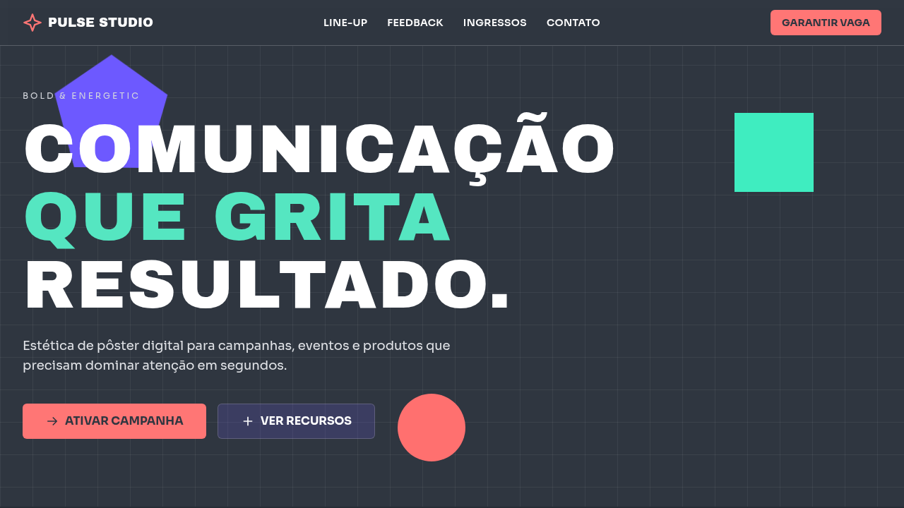
Bold & Energetic
Bold and energetic poster-style interface using 60/30/10 color balance. Ideal for design de pôsteres, eventos e festivais, campanhas promocionais, landing pages de lançamento, conteúdo social de alto impacto. AI-ready template.
Use case: Design de pôsteres, Eventos e festivais, Campanhas promocionais, Landing pages de lançamento, Conteúdo social de alto impacto
Historical Context
Influenciado pelo design de pôster contemporâneo e estética digital de alto contraste, prioriza ritmo visual, impacto imediato e leitura de informação crítica.
Technical Specs
Colors
Primary
Secondary
Effects
10%: Vivid Orange #FF7675 para chamada principal, data de evento e pontos críticos; composições diagonais, tipografia grande e transições energéticas (200-260ms)
Light/Dark
✓ Full / ✓ Full
CSS
background: #2F3640; color: #FFFFFF; --purple: #6C5CE7; --mint: #55E6C1; --accent: #FF7675; font-size: clamp(1rem, 1.2vw, 1.2rem); --display-size: clamp(2.2rem, 6vw, 5rem); transform: translate3d(0,0,0); transition: all 0.24s ease;
Variables
--color-base-60: #2F3640; --color-secondary-30-a: #6C5CE7; --color-secondary-30-b: #55E6C1; --color-accent-10: #FF7675; --radius-sharp: 6px; --shadow-poster: 0 10px 26px rgba(47,54,64,0.4); --tracking-wide: 0.02em;
Checklist
☐ Base #2F3640 dominante (60%), ☐ Roxo e menta em 30%, ☐ Laranja vibrante reservado a 10%, ☐ Hierarquia tipográfica agressiva, ☐ Composição geométrica de pôster, ☐ Responsivo mobile/desktop
DESIGN.md
Design System: Bold & Energetic
1. Visual Theme & Atmosphere
Bold and energetic poster-style interface using 60/30/10 color balance. Ideal for design de pôsteres, eventos e festivais, campanhas promocionais, landing pages de lançamento, conteúdo social de alto impacto. AI-ready template.
- Density: 5/10 — Balanced
- Variance: 4/10 — Moderate
- Motion: 1/10 — Static
2. Color Palette & Roles
- Dark Slate (#2F3640) — Dark surface, primary background
- Deep Purple (#6C5CE7) — Accent color, emphasis elements
- e Soft Mint (#55E6C1) — Extended palette, decorative use
3. Typography Rules
- Display / Hero: System UI stack (-apple-system, sans-serif) — Weight 700, tight tracking, used for headline impact
- Body: System UI stack (-apple-system, sans-serif) — Weight 400, 16px/1.6 line-height, max 72ch per line
- UI Labels / Captions: System UI stack (-apple-system, sans-serif) — 0.875rem, weight 500, slight letter-spacing
- Monospace: JetBrains Mono — Used for code, metadata, and technical values
Scale:
- Hero: clamp(2.5rem, 5vw, 4rem)
- H1: 2.25rem
- H2: 1.5rem
- Body: 1rem / 1.6
- Small: 0.875rem
4. Component Stylings
- Primary Button: Sharp edges (0px) shape. Accent color fill. Hover: 8% darken + subtle lift shadow. Active: -1px translate tactile press. Font weight 600. No outer glows.
- Secondary / Ghost Button: Outline variant. 1.5px border in muted color. Text in primary color. Hover: subtle background fill.
- Cards: Sharp edges (0px) corners. Surface background. Subtle shadow (0 2px 12px rgba(0,0,0,0.06)). 1px border stroke.
- Inputs: Label above input. 1px border stroke. Focus ring: 2px accent color offset 2px. Error text below in semantic red. No floating labels.
- Navigation: Primary surface background. Active item: accent color indicator. Font weight 500 when active.
- Skeletons: Shimmer animation matching component dimensions. No circular spinners.
- Empty States: Icon-based composition with descriptive text and action button.
5. Layout Principles
- Grid: CSS Grid primary. Max-width containment: 1280px centered with 1.5rem side padding.
- Spacing rhythm: Balanced. Base unit: 0.5rem (8px).
- Section vertical gaps: clamp(4rem, 8vw, 8rem).
- Hero layout: Split-screen (text left, visual right).
- Feature sections: Zig-zag alternating text+image rows. No 3-equal-columns.
- Mobile collapse: All multi-column layouts collapse below 768px. No horizontal overflow.
- z-index contract: base (0) / sticky-nav (100) / overlay (200) / modal (300) / toast (500).
6. Motion & Interaction
- Minimal motion design. Hover states use color transitions only (150ms).
- No entry animations. No page transitions. Instant, utilitarian feedback.
- Performance: No animation overhead. Static-first approach.
7. Anti-Patterns (Banned)
- No emojis in UI — use icon system only (Lucide, Heroicons)
- No pure black (#000000) — use off-black or charcoal variants
- No oversaturated accent colors (saturation cap: 80%)
- No 3-column equal-width feature layouts — use zig-zag or asymmetric grid
- No
h-screen— usemin-h-[100dvh] - No AI copywriting clichés: "Elevate", "Seamless", "Unleash", "Next-Gen"
- No broken external image links — use picsum.photos or inline SVG
- No generic lorem ipsum in demos
AI Prompt
Act as a Senior Frontend Engineer and Expert UI Designer. Your task is to code a complete Landing Page on the first attempt.
- Landing Page Theme:
- Sections to add:
Generate the final code immediately following these definitions:
Style
- Name: Bold & Energetic
- Type: Impactful, Dynamic, High-Energy, Poster-Driven
- Keywords: bold, energetic, poster design, high impact, geometric, expressive, youth culture, contrast, vibrant, event
- Era: Modern Digital Poster (2015+)
- Light/Dark: ✓ Full / ✓ Full
Color Palette
- Primary: 60%: Dark Slate #2F3640 para fundo sólido e contraste de alto impacto
- Secondary: 30%: Deep Purple #6C5CE7 e Soft Mint #55E6C1 para blocos visuais, tipografia de apoio e formas geométricas
Visual Effects
10%: Vivid Orange #FF7675 para chamada principal, data de evento e pontos críticos; composições diagonais, tipografia grande e transições energéticas (200-260ms)
AI Visual Direction
Create a bold and energetic poster-style interface using 60/30/10 color balance. Use 60% dark slate (#2F3640) as the grounding base, 30% deep purple (#6C5CE7) and soft mint (#55E6C1) for dynamic composition blocks, and 10% vivid orange (#FF7675) for the most important message (date, CTA, headline punch). Use oversized typography, geometric forms, and strong rhythm.
CSS Technical
background: #2F3640; color: #FFFFFF; --purple: #6C5CE7; --mint: #55E6C1; --accent: #FF7675; font-size: clamp(1rem, 1.2vw, 1.2rem); --display-size: clamp(2.2rem, 6vw, 5rem); transform: translate3d(0,0,0); transition: all 0.24s ease;Design System Variables
--color-base-60: #2F3640; --color-secondary-30-a: #6C5CE7; --color-secondary-30-b: #55E6C1; --color-accent-10: #FF7675; --radius-sharp: 6px; --shadow-poster: 0 10px 26px rgba(47,54,64,0.4); --tracking-wide: 0.02em;Implementation Checklist
- ☐ Base #2F3640 dominante (60%)
- ☐ Roxo e menta em 30%
- ☐ Laranja vibrante reservado a 10%
- ☐ Hierarquia tipográfica agressiva
- ☐ Composição geométrica de pôster
- ☐ Responsivo mobile/desktop
Execution Rules
- Strictly follow the defined visual style.
- Use high-quality inline SVG icons (Heroicons or Lucide style) — NEVER use emojis as icons.
- Add
cursor-pointerand smoothhoverstates (transition-all) on all interactive elements. - Required Page Structure:
- Navbar (Logo + Links + CTA)
- Hero Section (Impactful Headline + Subtitle + 2 buttons + 3D/Abstract visual element via CSS)
- Features (3 cards with icons)
- Testimonials (3 cards)
- Pricing (3 tiers, highlight the middle one)
- Final CTA
- Full Footer with social links, privacy policy, terms of use, contact and SEO links.
- All text content must be in English.
- The visual must be CLEARLY distinct — do not create a "default Bootstrap" design. Force the use of the provided design system variables.
- Use
<style>tags in the head for custom classes (especially for complex backdrop-filter effects and animations) that Tailwind CDN doesn't cover. - Full Responsiveness: Layout must adapt perfectly to Mobile, Tablet and Desktop (vertical stack on mobile).
- Include basic SEO, Viewport and Open Graph meta tags in
<head>. - Footer must contain: Copyright 2026, Secondary navigation links and Social media icons.
- Make the creative decisions needed to deliver the complete, functional result now.
Related
Last synced: 4/1/2026