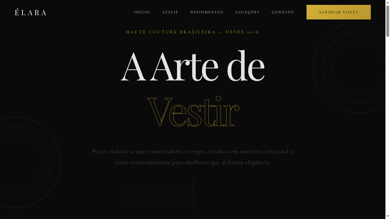
Luxury Typography
Luxury typography-focused landing page where type IS the design. Ideal for moda haute couture, embalagens premium, streetwear de luxo, capas de revistas. AI-ready template.
Use case: Moda haute couture, Embalagens premium, Streetwear de luxo, Capas de revistas
Historical Context
A tipografia de luxo tem raízes em tradições caligráficas antigas, evoluindo para typefaces personalizados que definem marcas de moda e editoriais premium no mundo contemporâneo.
Technical Specs
Colors
Primary
Secondary
Effects
Dramatic font-size contrasts (display: 8-12vw), ultra-thin to ultra-bold weight range (100-900), letter-spacing variations (-0.05em to 0.3em), text-stroke for outline typography, subtle gold shimmer on hover, smooth scroll-triggered text reveals
Light/Dark
✓ Full / ✓ Full
CSS
font-family: 'Playfair Display', 'Cormorant', serif, font-size: clamp(3rem, 10vw, 12rem) for display, font-weight: 100-900, letter-spacing: -0.05em to 0.3em, -webkit-text-stroke: 1px #D4AF37, color: #0A0A0A or #FFFFFF, line-height: 0.9-1.1 for display type
Variables
--color-black: #0A0A0A, --color-white: #FFFFFF, --color-gold: #D4AF37, --font-display: 'Playfair Display', --font-script: 'Cormorant', --display-size: clamp(3rem, 10vw, 12rem), --letter-spacing-tight: -0.05em, --letter-spacing-wide: 0.3em
Checklist
☐ Typography dominates the design, ☐ Dramatic size contrasts (display vs body), ☐ Weight range utilized (thin to bold), ☐ Gold accent color applied, ☐ Text-stroke outlines on key elements, ☐ Minimal imagery — type-first approach, ☐ Responsive typography with clamp()
DESIGN.md
Design System: Luxury Typography
1. Visual Theme & Atmosphere
Luxury typography-focused landing page where type IS the design. Ideal for moda haute couture, embalagens premium, streetwear de luxo, capas de revistas. AI-ready template.
- Density: 5/10 — Balanced
- Variance: 4/10 — Moderate
- Motion: 4/10 — Subtle
2. Color Palette & Roles
- Jet Black (#0A0A0A) — Dark surface, primary background
- Pure White (#FFFFFF) — Light surface, card backgrounds
- Champagne Gold (#D4AF37) — Premium accent, decorative highlights
- Charcoal (#333333) — Dark surface, primary background
- Platinum (#E5E4E2) — Extended palette, decorative use
- Blush (#F5E6E0) — Extended palette, decorative use
- Deep Burgundy (#4A0020) — Extended palette, decorative use
- Soft Ivory (#FAF0E6) — Secondary surface
3. Typography Rules
- Display / Hero: Playfair Display — Weight 700, tight tracking, used for headline impact
- Accent: Cormorant — Used for decorative or emphasis text
- Body: Playfair Display — Weight 400, 16px/1.6 line-height, max 72ch per line
- UI Labels / Captions: Playfair Display — 0.875rem, weight 500, slight letter-spacing
- Monospace: JetBrains Mono — Used for code, metadata, and technical values
Scale:
- Hero: clamp(2.5rem, 5vw, 4rem)
- H1: 2.25rem
- H2: 1.5rem
- Body: 1rem / 1.6
- Small: 0.875rem
4. Component Stylings
- Primary Button: Subtly rounded (0.5rem) shape. Accent color fill. Hover: 8% darken + subtle lift shadow. Active: -1px translate tactile press. Font weight 600. No outer glows.
- Secondary / Ghost Button: Outline variant. 1.5px border in muted color. Text in primary color. Hover: subtle background fill.
- Cards: Subtly rounded (0.5rem) corners. Surface background. Subtle shadow (0 2px 12px rgba(0,0,0,0.06)). 1px border stroke.
- Inputs: Label above input. 1px border stroke. Focus ring: 2px accent color offset 2px. Error text below in semantic red. No floating labels.
- Navigation: Primary surface background. Active item: accent color indicator. Font weight 500 when active.
- Skeletons: Shimmer animation matching component dimensions. No circular spinners.
- Empty States: Icon-based composition with descriptive text and action button.
5. Layout Principles
- Grid: CSS Grid primary. Max-width containment: 1280px centered with 1.5rem side padding.
- Spacing rhythm: Balanced. Base unit: 0.5rem (8px).
- Section vertical gaps: clamp(4rem, 8vw, 8rem).
- Hero layout: Split-screen (text left, visual right).
- Feature sections: Zig-zag alternating text+image rows. No 3-equal-columns.
- Mobile collapse: All multi-column layouts collapse below 768px. No horizontal overflow.
- z-index contract: base (0) / sticky-nav (100) / overlay (200) / modal (300) / toast (500).
6. Motion & Interaction
- Physics: Ease-out curves, 200-300ms duration. Smooth and predictable.
- Entry animations: Fade + translate-Y (16px → 0) over 420ms ease-out. Staggered cascades for lists: 80ms between items.
- Hover states: Subtle color shift + shadow adjustment over 200ms.
- Page transitions: Fade only (200ms).
- Performance: Only transform and opacity animated. No layout-triggering properties.
7. Anti-Patterns (Banned)
- No emojis in UI — use icon system only (Lucide, Heroicons)
- No pure black (#000000) — use off-black or charcoal variants
- No oversaturated accent colors (saturation cap: 80%)
- No 3-column equal-width feature layouts — use zig-zag or asymmetric grid
- No
h-screen— usemin-h-[100dvh] - No AI copywriting clichés: "Elevate", "Seamless", "Unleash", "Next-Gen"
- No broken external image links — use picsum.photos or inline SVG
- No generic lorem ipsum in demos
AI Prompt
Act as a Senior Frontend Engineer and Expert UI Designer. Your task is to code a complete Landing Page on the first attempt.
- Landing Page Theme:
- Sections to add:
Generate the final code immediately following these definitions:
Style
- Name: Luxury Typography
- Type: Refined, Calligraphic, Premium, Script-Based
- Keywords: Luxury typography, refined fonts, calligraphic scripts, elaborate ligatures, premium, haute couture, custom typefaces, elegant, fashion
- Era: Haute Couture & Fashion Editorial
- Light/Dark: ✓ Full / ✓ Full
Color Palette
- Primary: Jet Black #0A0A0A, Pure White #FFFFFF, Champagne Gold #D4AF37, Charcoal #333333
- Secondary: Platinum #E5E4E2, Blush #F5E6E0, Deep Burgundy #4A0020, Soft Ivory #FAF0E6
Visual Effects
Dramatic font-size contrasts (display: 8-12vw), ultra-thin to ultra-bold weight range (100-900), letter-spacing variations (-0.05em to 0.3em), text-stroke for outline typography, subtle gold shimmer on hover, smooth scroll-triggered text reveals
AI Visual Direction
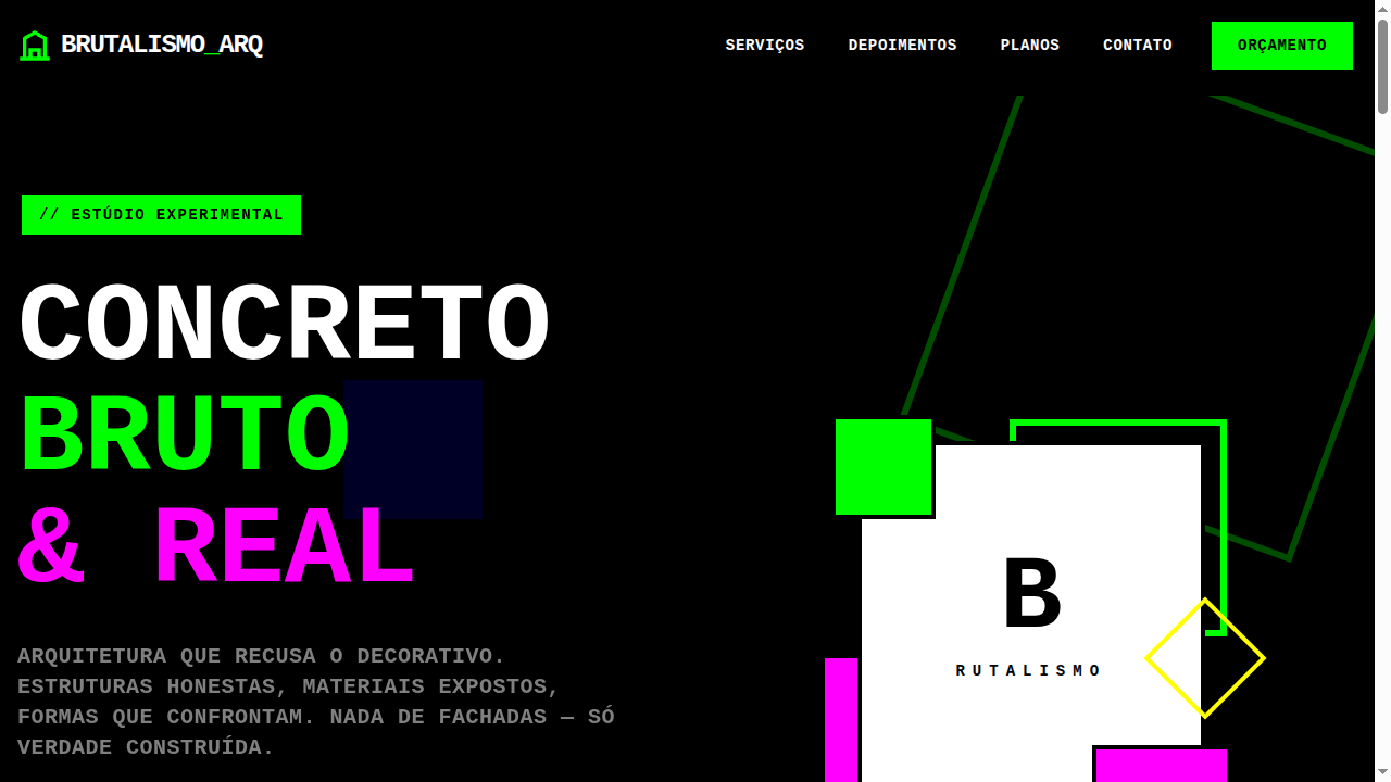
Design a luxury typography-focused landing page where type IS the design. Use dramatic font size contrasts (headlines 8-12vw), mix of ultra-thin and ultra-bold weights, calligraphic scripts with elaborate ligatures. Black, white and champagne gold palette. Minimal imagery — let typography dominate. Include text-stroke outlines, stacked type compositions, and elegant spacing.
CSS Technical
font-family: 'Playfair Display', 'Cormorant', serif, font-size: clamp(3rem, 10vw, 12rem) for display, font-weight: 100-900, letter-spacing: -0.05em to 0.3em, -webkit-text-stroke: 1px #D4AF37, color: #0A0A0A or #FFFFFF, line-height: 0.9-1.1 for display typeDesign System Variables
--color-black: #0A0A0A, --color-white: #FFFFFF, --color-gold: #D4AF37, --font-display: 'Playfair Display', --font-script: 'Cormorant', --display-size: clamp(3rem, 10vw, 12rem), --letter-spacing-tight: -0.05em, --letter-spacing-wide: 0.3emImplementation Checklist
- ☐ Typography dominates the design
- ☐ Dramatic size contrasts (display vs body)
- ☐ Weight range utilized (thin to bold)
- ☐ Gold accent color applied
- ☐ Text-stroke outlines on key elements
- ☐ Minimal imagery — type-first approach
- ☐ Responsive typography with clamp()
Execution Rules
- Strictly follow the defined visual style.
- Use high-quality inline SVG icons (Heroicons or Lucide style) — NEVER use emojis as icons.
- Add
cursor-pointerand smoothhoverstates (transition-all) on all interactive elements. - Required Page Structure:
- Navbar (Logo + Links + CTA)
- Hero Section (Impactful Headline + Subtitle + 2 buttons + 3D/Abstract visual element via CSS)
- Features (3 cards with icons)
- Testimonials (3 cards)
- Pricing (3 tiers, highlight the middle one)
- Final CTA
- Full Footer with social links, privacy policy, terms of use, contact and SEO links.
- All text content must be in English.
- The visual must be CLEARLY distinct — do not create a "default Bootstrap" design. Force the use of the provided design system variables.
- Use
<style>tags in the head for custom classes (especially for complex backdrop-filter effects and animations) that Tailwind CDN doesn't cover. - Full Responsiveness: Layout must adapt perfectly to Mobile, Tablet and Desktop (vertical stack on mobile).
- Include basic SEO, Viewport and Open Graph meta tags in
<head>. - Footer must contain: Copyright 2026, Secondary navigation links and Social media icons.
- Make the creative decisions needed to deliver the complete, functional result now.
Related
Last synced: 4/1/2026