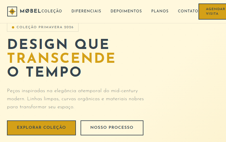
Mid-Century Modern
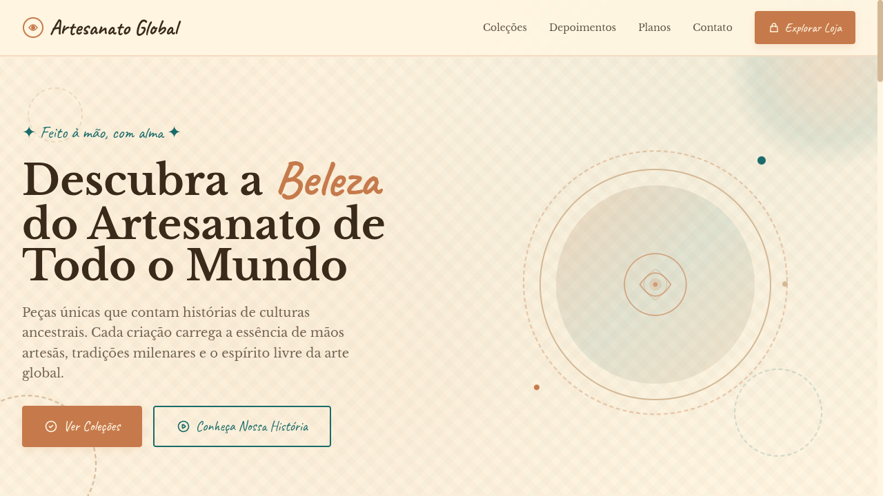
Mid-century modern landing page with clean lines, organic curves and muted vibrant colors from the 1950s. Ideal for branding de móveis, layouts de pôsteres retro, decoração de interiores, produtos lifestyle. AI-ready template.
Use case: Branding de móveis, Layouts de pôsteres retro, Decoração de interiores, Produtos lifestyle
Historical Context
O Mid-Century Modern (1940s-60s) combina linhas limpas com curvas orgânicas e alusões à Era Espacial. Designers como Eames e Saarinen criaram uma estética atemporal que ainda define interiores modernos.
Technical Specs
Colors
Primary
Secondary
Effects
Atomic-era starburst SVG decorations, organic boomerang/kidney shapes via clip-path, clean thin lines as dividers, muted color blocks, subtle retro texture overlays, smooth slide-in animations (400ms), tapered leg-inspired border details
Light/Dark
✓ Full / ✓ Full
CSS
font-family: 'Josefin Sans', sans-serif, background: #FFF8DC, color: #36454F, border: 2px solid #36454F, border-radius: 0px for sharp + 50% for organic shapes, clip-path: ellipse() for organic curves, box-shadow: 0 2px 8px rgba(0,0,0,0.08), letter-spacing: 0.08em, text-transform: uppercase for headings
Variables
--color-mustard: #D4A017, --color-teal: #008080, --color-orange: #CC5500, --color-cream: #FFF8DC, --color-charcoal: #36454F, --font-primary: 'Josefin Sans', --border: 2px solid #36454F, --spacing: 2rem, --letter-spacing: 0.08em
Checklist
☐ Muted vibrant color palette, ☐ Atomic starburst decorations, ☐ Organic boomerang/kidney shapes, ☐ Clean thin line dividers, ☐ Geometric sans-serif typography, ☐ Space Age retro atmosphere, ☐ Muted color blocks, ☐ Responsive with maintained retro elegance
DESIGN.md
Design System: Mid-Century Modern
1. Visual Theme & Atmosphere
Mid-century modern landing page with clean lines, organic curves and muted vibrant colors from the 1950s. Ideal for branding de móveis, layouts de pôsteres retro, decoração de interiores, produtos lifestyle. AI-ready template.
- Density: 3/10 — Airy
- Variance: 8/10 — Expressive
- Motion: 6/10 — Expressive
2. Color Palette & Roles
- Mustard Yellow (#D4A017) — Warning states, attention indicators
- Teal (#008080) — Accent highlight, links and focus states
- Burnt Orange (#CC5500) — Warm accent, call-to-action secondary
- Cream (#FFF8DC) — Light surface, card backgrounds
- Olive Green (#6B8E23) — Success states, positive indicators
- Dusty Pink (#D4A0A0) — Primary text color
- Charcoal (#36454F) — Deep contrast surface
- Warm Wood (#8B6914) — Extended palette, decorative use
3. Typography Rules
- Display / Hero: Josefin Sans — Weight 700, tight tracking, used for headline impact
- Body: Josefin Sans — Weight 400, 16px/1.6 line-height, max 72ch per line
- UI Labels / Captions: Josefin Sans — 0.875rem, weight 500, slight letter-spacing
- Monospace: JetBrains Mono — Used for code, metadata, and technical values
Scale:
- Hero: clamp(2.5rem, 5vw, 4rem)
- H1: 2.25rem
- H2: 1.5rem
- Body: 1rem / 1.6
- Small: 0.875rem
4. Component Stylings
- Primary Button: Sharp edges (0px) shape. Accent color fill. Hover: 8% darken + subtle lift shadow. Active: -1px translate tactile press. Font weight 600. No outer glows.
- Secondary / Ghost Button: Outline variant. 1.5px border in muted color. Text in primary color. Hover: subtle background fill.
- Cards: Sharp edges (0px) corners. Surface background. Subtle shadow (0 2px 12px rgba(0,0,0,0.06)). 1px border stroke.
- Inputs: Label above input. 1px border stroke. Focus ring: 2px accent color offset 2px. Error text below in semantic red. No floating labels.
- Navigation: Primary surface background. Active item: accent color indicator. Font weight 500 when active.
- Skeletons: Shimmer animation matching component dimensions. No circular spinners.
- Empty States: Icon-based composition with descriptive text and action button.
5. Layout Principles
- Grid: CSS Grid primary. Max-width containment: 1280px centered with 1.5rem side padding.
- Spacing rhythm: Balanced. Base unit: 0.5rem (8px).
- Section vertical gaps: clamp(4rem, 8vw, 8rem).
- Hero layout: Asymmetric composition.
- Feature sections: Asymmetric grid with varied card sizes. No 3-equal-columns.
- Mobile collapse: All multi-column layouts collapse below 768px. No horizontal overflow.
- z-index contract: base (0) / sticky-nav (100) / overlay (200) / modal (300) / toast (500).
6. Motion & Interaction
- Physics: Spring — stiffness 120, damping 20. Confident, weighted transitions.
- Entry animations: Fade + translate-Y (16px → 0) over 480ms ease-out. Staggered cascades for lists: 100ms between items.
- Hover states: Scale(1.03) + shadow lift over 200ms.
- Page transitions: Fade + slide (300ms).
- Performance: Only transform and opacity animated. No layout-triggering properties.
7. Anti-Patterns (Banned)
- No emojis in UI — use icon system only (Lucide, Heroicons)
- No pure black (#000000) — use off-black or charcoal variants
- No oversaturated accent colors (saturation cap: 80%)
- No 3-column equal-width feature layouts — use zig-zag or asymmetric grid
- No
h-screen— usemin-h-[100dvh] - No AI copywriting clichés: "Elevate", "Seamless", "Unleash", "Next-Gen"
- No broken external image links — use picsum.photos or inline SVG
- No generic lorem ipsum in demos
AI Prompt
Act as a Senior Frontend Engineer and Expert UI Designer. Your task is to code a complete Landing Page on the first attempt.
- Landing Page Theme:
- Sections to add:
Generate the final code immediately following these definitions:
Style
- Name: Mid-Century Modern
- Type: Clean Lines, Organic Curves, Muted Vibrant, Space Age
- Keywords: Mid-century modern, clean lines, sleek silhouettes, organic curves, Space Age, 1950s, muted vibrant, retro, atomic, Eames
- Era: 1940s-1960s Mid-Century Design
- Light/Dark: ✓ Full / ✓ Full
Color Palette
- Primary: Mustard Yellow #D4A017, Teal #008080, Burnt Orange #CC5500, Cream #FFF8DC
- Secondary: Olive Green #6B8E23, Dusty Pink #D4A0A0, Charcoal #36454F, Warm Wood #8B6914
Visual Effects
Atomic-era starburst SVG decorations, organic boomerang/kidney shapes via clip-path, clean thin lines as dividers, muted color blocks, subtle retro texture overlays, smooth slide-in animations (400ms), tapered leg-inspired border details
AI Visual Direction
Design a mid-century modern landing page with clean lines, organic curves and muted vibrant colors from the 1950s. Use mustard yellow, teal, burnt orange, cream. Apply atomic starburst SVG decorations, organic boomerang shapes via clip-path, clean thin dividers, muted color blocks, retro texture overlays. Typography should be clean geometric sans-serif. Space Age retro elegance with Eames-inspired organic curves.
CSS Technical
font-family: 'Josefin Sans', sans-serif, background: #FFF8DC, color: #36454F, border: 2px solid #36454F, border-radius: 0px for sharp + 50% for organic shapes, clip-path: ellipse() for organic curves, box-shadow: 0 2px 8px rgba(0,0,0,0.08), letter-spacing: 0.08em, text-transform: uppercase for headingsDesign System Variables
--color-mustard: #D4A017, --color-teal: #008080, --color-orange: #CC5500, --color-cream: #FFF8DC, --color-charcoal: #36454F, --font-primary: 'Josefin Sans', --border: 2px solid #36454F, --spacing: 2rem, --letter-spacing: 0.08emImplementation Checklist
- ☐ Muted vibrant color palette
- ☐ Atomic starburst decorations
- ☐ Organic boomerang/kidney shapes
- ☐ Clean thin line dividers
- ☐ Geometric sans-serif typography
- ☐ Space Age retro atmosphere
- ☐ Muted color blocks
- ☐ Responsive with maintained retro elegance
Execution Rules
- Strictly follow the defined visual style.
- Use high-quality inline SVG icons (Heroicons or Lucide style) — NEVER use emojis as icons.
- Add
cursor-pointerand smoothhoverstates (transition-all) on all interactive elements. - Required Page Structure:
- Navbar (Logo + Links + CTA)
- Hero Section (Impactful Headline + Subtitle + 2 buttons + 3D/Abstract visual element via CSS)
- Features (3 cards with icons)
- Testimonials (3 cards)
- Pricing (3 tiers, highlight the middle one)
- Final CTA
- Full Footer with social links, privacy policy, terms of use, contact and SEO links.
- All text content must be in English.
- The visual must be CLEARLY distinct — do not create a "default Bootstrap" design. Force the use of the provided design system variables.
- Use
<style>tags in the head for custom classes (especially for complex backdrop-filter effects and animations) that Tailwind CDN doesn't cover. - Full Responsiveness: Layout must adapt perfectly to Mobile, Tablet and Desktop (vertical stack on mobile).
- Include basic SEO, Viewport and Open Graph meta tags in
<head>. - Footer must contain: Copyright 2026, Secondary navigation links and Social media icons.
- Make the creative decisions needed to deliver the complete, functional result now.
Related
Last synced: 4/1/2026