Synapse Dark Hero
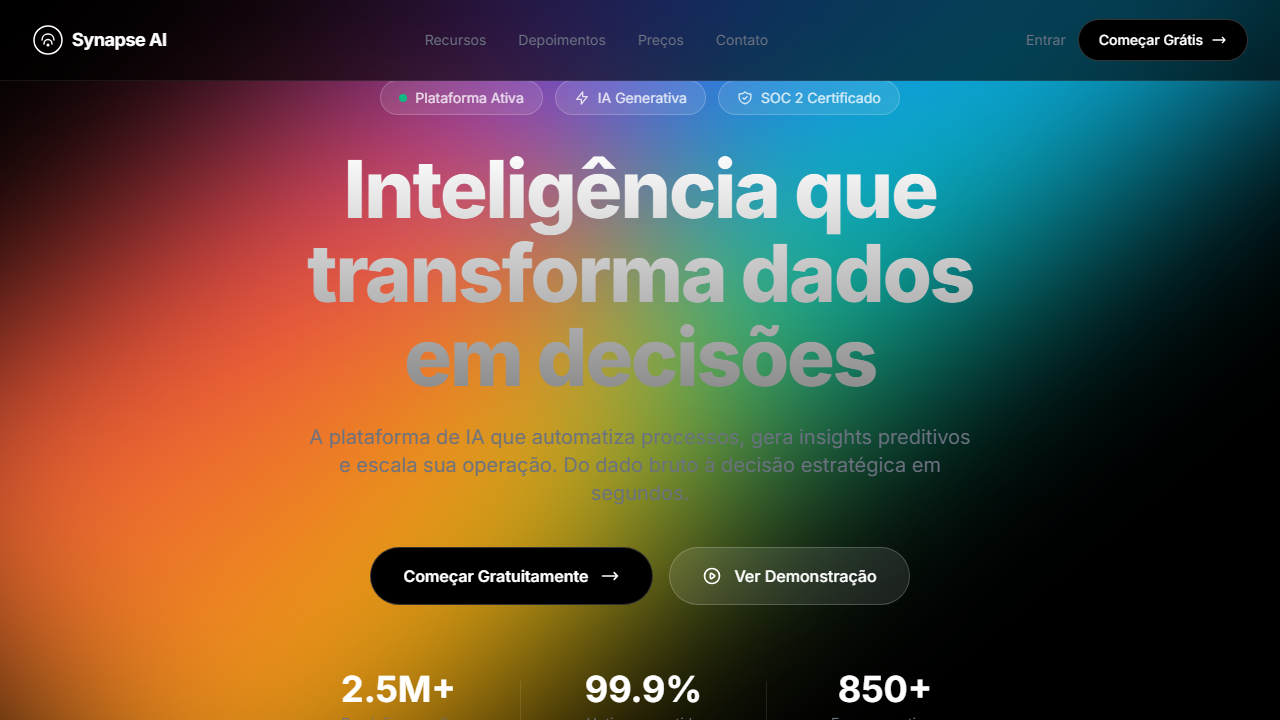
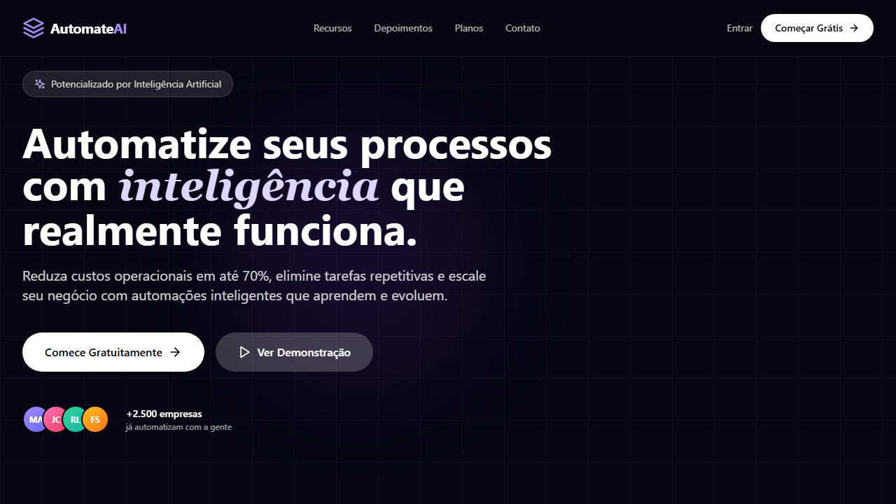
Pure black SaaS hero with HLS video at 100% opacity no overlay, positioned at height 80vh and absolute bottom-[35vh]. Ideal for saas de inovação, plataformas de ai, ferramentas enterprise, startups de tecnologia. AI-ready template.
Use case: SaaS de inovação, Plataformas de AI, Ferramentas enterprise, Startups de tecnologia
Historical Context
Representa o pico da estética dark SaaS com vídeo flutuante e glassmorphism, popularizada por empresas como Linear, Vercel e Raycast.
Technical Specs
Colors
Primary
Secondary
Effects
VÍDEO: Stream HLS curto (~5s loop) com visual abstrato minimalista. Formas geométricas ou partículas sutis em movimento sobre fundo escuro. Aspect ratio ~16:9 (276x160px storyboard). Exibido em opacity 100% sem overlay, posicionado com height 80vh e absolute bottom-[35vh], flutuando atrás do conteúdo de texto. O vídeo cria profundidade visual sem competir com o conteúdo. | EFEITOS CSS: Fundo preto puro com vídeo HLS (opacity 100%, sem overlay) posicionado em height 80vh e bottom-[35vh] flutuando atrás do texto, navbar fixa com blur glassmorphism, 3 badges glassmorphism em row, headline massiva (~80px) com animação fade-in-up, botões sólido preto com borda branca e glass transparente, logo marquee estático grayscale opacity-40, animações staggered via Framer Motion
Light/Dark
✗ Not Recommended / ✓ Full
CSS
background: #000000, video: HLS opacity-100 h-[80vh] absolute bottom-[35vh], backdrop-filter: blur(12px), background: rgba(255,255,255,0.1), font-size: ~80px, animation: staggered fade-in-up, filter: grayscale(1) opacity(0.4), border: 1px solid rgba(255,255,255,0.2)
Variables
--bg-primary: #000000, --text-primary: #FFFFFF, --text-muted: #6B7280, --glass-bg: rgba(255,255,255,0.1), --glass-border: rgba(255,255,255,0.2), --video-height: 80vh, --video-bottom: 35vh, --headline-size: 80px, --logo-opacity: 0.4
Checklist
☐ Fundo preto puro com vídeo HLS sem overlay, ☐ Vídeo h-80vh bottom-35vh, ☐ Navbar fixa blur glass, ☐ 3 badges glassmorphism, ☐ Headline ~80px fade-in-up, ☐ Botão preto + glass transparente, ☐ Logo marquee grayscale, ☐ Animações staggered, ☐ Responsivo
DESIGN.md
Design System: Synapse Dark Hero
1. Visual Theme & Atmosphere
Pure black SaaS hero with HLS video at 100% opacity no overlay, positioned at height 80vh and absolute bottom-[35vh]. Ideal for saas de inovação, plataformas de ai, ferramentas enterprise, startups de tecnologia. AI-ready template.
- Density: 5/10 — Balanced
- Variance: 4/10 — Moderate
- Motion: 8/10 — Cinematic
2. Color Palette & Roles
- Preto Puro (#000000) — Dark surface, primary background
- Branco (#FFFFFF) — Light surface, card backgrounds
- Cinza Gradiente from (#FFFFFF) — Secondary text, borders, muted elements
- to (#888888) — Supporting palette color
- Cinza Muted (#6B7280) — Secondary text, borders, muted elements
- Preto Botão (#000000) — Deep contrast surface
- Vidro Badge (rgba(255,255,255,0.1)) — Extended palette, decorative use
- Borda Gradiente (rgba(255,255,255,0.3)) — Extended palette, decorative use
- Borda Branca (rgba(255,255,255,0.2)) — Extended palette, decorative use
3. Typography Rules
- Display / Hero: System UI stack (-apple-system, sans-serif) — Weight 700, tight tracking, used for headline impact
- Body: System UI stack (-apple-system, sans-serif) — Weight 400, 16px/1.6 line-height, max 72ch per line
- UI Labels / Captions: System UI stack (-apple-system, sans-serif) — 0.875rem, weight 500, slight letter-spacing
- Monospace: JetBrains Mono — Used for code, metadata, and technical values
Scale:
- Hero: clamp(2.5rem, 5vw, 4rem)
- H1: 2.25rem
- H2: 1.5rem
- Body: 1rem / 1.6
- Small: 0.875rem
4. Component Stylings
- Primary Button: Subtly rounded (0.5rem) shape. Accent color fill. Hover: 8% darken + subtle lift shadow. Active: -1px translate tactile press. Font weight 600. No outer glows.
- Secondary / Ghost Button: Outline variant. 1.5px border in muted color. Text in primary color. Hover: subtle background fill.
- Cards: Subtly rounded (0.5rem) corners. Surface background. Subtle shadow (0 2px 12px rgba(0,0,0,0.06)). 1px border stroke.
- Inputs: Label above input. 1px border stroke. Focus ring: 2px accent color offset 2px. Error text below in semantic red. No floating labels.
- Navigation: Primary surface background. Active item: accent color indicator. Font weight 500 when active.
- Skeletons: Shimmer animation matching component dimensions. No circular spinners.
- Empty States: Icon-based composition with descriptive text and action button.
5. Layout Principles
- Grid: CSS Grid primary. Max-width containment: 1280px centered with 1.5rem side padding.
- Spacing rhythm: Balanced. Base unit: 0.5rem (8px).
- Section vertical gaps: clamp(4rem, 8vw, 8rem).
- Hero layout: Split-screen (text left, visual right).
- Feature sections: Zig-zag alternating text+image rows. No 3-equal-columns.
- Mobile collapse: All multi-column layouts collapse below 768px. No horizontal overflow.
- z-index contract: base (0) / sticky-nav (100) / overlay (200) / modal (300) / toast (500).
6. Motion & Interaction
- Physics: Spring — stiffness 120, damping 20. Confident, weighted transitions.
- Entry animations: Fade + translate-Y (16px → 0) over 540ms ease-out. Staggered cascades for lists: 120ms between items.
- Hover states: Scale(1.03) + shadow lift over 200ms.
- Page transitions: Fade + slide (300ms).
- Performance: Only transform and opacity animated. No layout-triggering properties.
7. Anti-Patterns (Banned)
- No emojis in UI — use icon system only (Lucide, Heroicons)
- No pure black (#000000) — use off-black or charcoal variants
- No oversaturated accent colors (saturation cap: 80%)
- No 3-column equal-width feature layouts — use zig-zag or asymmetric grid
- No
h-screen— usemin-h-[100dvh] - No AI copywriting clichés: "Elevate", "Seamless", "Unleash", "Next-Gen"
- No broken external image links — use picsum.photos or inline SVG
- No generic lorem ipsum in demos
AI Prompt
Act as a Senior Frontend Engineer and Expert UI Designer. Your task is to code a complete Landing Page on the first attempt.
- Landing Page Theme:
- Sections to add:
Generate the final code immediately following these definitions:
Style
- Name: Synapse Dark Hero
- Type: SaaS, Pure Black, Glass Badges, HLS Video, Staggered Motion
- Keywords: SaaS, preto puro, glass badges, HLS video, staggered animations, gradient border, logo marquee, Framer Motion, navbar blur, innovation
- Era: 2024-2026 SaaS Dark Premium
- Light/Dark: ✗ Not Recommended / ✓ Full
Color Palette
- Primary: Preto Puro #000000, Branco #FFFFFF, Cinza Gradiente from #FFFFFF to #888888, Cinza Muted #6B7280
- Secondary: Vidro Badge rgba(255,255,255,0.1), Borda Gradiente rgba(255,255,255,0.3), Preto Botão #000000, Borda Branca rgba(255,255,255,0.2)
Visual Effects
VÍDEO: Stream HLS curto (~5s loop) com visual abstrato minimalista. Formas geométricas ou partículas sutis em movimento sobre fundo escuro. Aspect ratio ~16:9 (276x160px storyboard). Exibido em opacity 100% sem overlay, posicionado com height 80vh e absolute bottom-[35vh], flutuando atrás do conteúdo de texto. O vídeo cria profundidade visual sem competir com o conteúdo. | EFEITOS CSS: Fundo preto puro com vídeo HLS (opacity 100%, sem overlay) posicionado em height 80vh e bottom-[35vh] flutuando atrás do texto, navbar fixa com blur glassmorphism, 3 badges glassmorphism em row, headline massiva (~80px) com animação fade-in-up, botões sólido preto com borda branca e glass transparente, logo marquee estático grayscale opacity-40, animações staggered via Framer Motion
AI Visual Direction
Design a pure black SaaS hero with HLS video at 100% opacity no overlay, positioned at height 80vh and absolute bottom-[35vh]. Fixed navbar with blur glass. Row of 3 glassmorphism badges. Massive headline ~80px with fade-in-up. Solid black CTA with white border and transparent glass secondary. Static grayscale logo marquee at 40% opacity. Staggered entrance animations via Framer Motion.
CSS Technical
background: #000000, video: HLS opacity-100 h-[80vh] absolute bottom-[35vh], backdrop-filter: blur(12px), background: rgba(255,255,255,0.1), font-size: ~80px, animation: staggered fade-in-up, filter: grayscale(1) opacity(0.4), border: 1px solid rgba(255,255,255,0.2)Design System Variables
--bg-primary: #000000, --text-primary: #FFFFFF, --text-muted: #6B7280, --glass-bg: rgba(255,255,255,0.1), --glass-border: rgba(255,255,255,0.2), --video-height: 80vh, --video-bottom: 35vh, --headline-size: 80px, --logo-opacity: 0.4Implementation Checklist
- ☐ Fundo preto puro com vídeo HLS sem overlay
- ☐ Vídeo h-80vh bottom-35vh
- ☐ Navbar fixa blur glass
- ☐ 3 badges glassmorphism
- ☐ Headline ~80px fade-in-up
- ☐ Botão preto + glass transparente
- ☐ Logo marquee grayscale
- ☐ Animações staggered
- ☐ Responsivo
Execution Rules
- Strictly follow the defined visual style.
- Use high-quality inline SVG icons (Heroicons or Lucide style) — NEVER use emojis as icons.
- Add
cursor-pointerand smoothhoverstates (transition-all) on all interactive elements. - Required Page Structure:
- Navbar (Logo + Links + CTA)
- Hero Section (Impactful Headline + Subtitle + 2 buttons + 3D/Abstract visual element via CSS)
- Features (3 cards with icons)
- Testimonials (3 cards)
- Pricing (3 tiers, highlight the middle one)
- Final CTA
- Full Footer with social links, privacy policy, terms of use, contact and SEO links.
- All text content must be in English.
- The visual must be CLEARLY distinct — do not create a "default Bootstrap" design. Force the use of the provided design system variables.
- Use
<style>tags in the head for custom classes (especially for complex backdrop-filter effects and animations) that Tailwind CDN doesn't cover. - Full Responsiveness: Layout must adapt perfectly to Mobile, Tablet and Desktop (vertical stack on mobile).
- Include basic SEO, Viewport and Open Graph meta tags in
<head>. - Footer must contain: Copyright 2026, Secondary navigation links and Social media icons.
- Make the creative decisions needed to deliver the complete, functional result now.
Related
Last synced: 4/1/2026