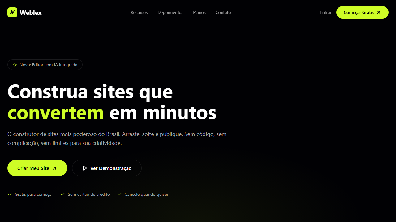
Weblex Dark Hero
Dark hero with full-screen video with seamless loop transition via requestAnimationFrame opacity. Ideal for website builders, plataformas no-code, ferramentas de criação de sites, landing pages de produto. AI-ready template.
Use case: Website builders, Plataformas no-code, Ferramentas de criação de sites, Landing pages de produto
Historical Context
Destaca-se pela técnica avançada de loop seamless do vídeo via requestAnimationFrame e pelo posicionamento bottom-aligned, criando experiência cinematográfica imersiva.
Technical Specs
Colors
Effects
VÍDEO: Vídeo abstrato com movimento fluido e suave em tons escuros. Formas orgânicas ou gradientes em transição contínua, criando atmosfera moderna e tecnológica. Sem overlay escuro (opacity total). Implementa transição de loop seamless: fade-out para preto 1.5s antes do fim do vídeo e fade-in no primeiro 1s do restart, controlado via requestAnimationFrame para suavidade perfeita. | EFEITOS CSS: Vídeo de fundo tela cheia com transição de loop seamless: fade-out para preto 1.5s antes do fim via requestAnimationFrame, fade-in no primeiro 1s do restart, sem overlay escuro, conteúdo alinhado ao bottom com 100px bottom padding e max-width 603px, navbar transparente total, badge pill com borda, headline 62px line-height 1.1, botão primário verde lima com ArrowUpRight e secundário branco
Light/Dark
✗ Not Recommended / ✓ Full
CSS
video: autoplay loop muted with rAF fade transition, --background: 240 67% 1%, --primary: 73 98% 57%, font-size: 62px / 48px / 36px, line-height: 1.1, padding-bottom: 100px, max-width: 603px, border-radius: 9999px, navbar: transparent
Variables
--background: 240 67% 1%, --foreground: 0 0% 100%, --primary: 73 98% 57%, --primary-foreground: 240 67% 1%, --secondary: 0 0% 100%, --muted: 240 10% 12%, --muted-foreground: 0 0% 82% / 0.8, --border: 0 0% 100% / 0.1, --headline-size: 62px
Checklist
☐ Vídeo tela cheia com loop fade seamless via rAF, ☐ Sem overlay escuro, ☐ Navbar transparente total, ☐ Conteúdo bottom-aligned 100px, ☐ Badge pill com borda, ☐ Headline 62px, ☐ Botão verde lima ArrowUpRight, ☐ Botão secundário branco, ☐ CSS variables HSL, ☐ Responsivo 3 breakpoints
DESIGN.md
Design System: Weblex Dark Hero
1. Visual Theme & Atmosphere
Dark hero with full-screen video with seamless loop transition via requestAnimationFrame opacity. Ideal for website builders, plataformas no-code, ferramentas de criação de sites, landing pages de produto. AI-ready template.
- Density: 5/10 — Balanced
- Variance: 4/10 — Moderate
- Motion: 6/10 — Expressive
2. Color Palette & Roles
- Palette derived from style keywords and era context
3. Typography Rules
- Display / Hero: System UI stack (-apple-system, sans-serif) — Weight 700, tight tracking, used for headline impact
- Body: System UI stack (-apple-system, sans-serif) — Weight 400, 16px/1.6 line-height, max 72ch per line
- UI Labels / Captions: System UI stack (-apple-system, sans-serif) — 0.875rem, weight 500, slight letter-spacing
- Monospace: JetBrains Mono — Used for code, metadata, and technical values
Scale:
- Hero: clamp(2.5rem, 5vw, 4rem)
- H1: 2.25rem
- H2: 1.5rem
- Body: 1rem / 1.6
- Small: 0.875rem
4. Component Stylings
- Primary Button: Pill-shaped (9999px) shape. Accent color fill. Hover: 8% darken + subtle lift shadow. Active: -1px translate tactile press. Font weight 600. No outer glows.
- Secondary / Ghost Button: Outline variant. 1.5px border in muted color. Text in primary color. Hover: subtle background fill.
- Cards: Pill-shaped (9999px) corners. Surface background. Subtle shadow (0 2px 12px rgba(0,0,0,0.06)). 1px border stroke.
- Inputs: Label above input. 1px border stroke. Focus ring: 2px accent color offset 2px. Error text below in semantic red. No floating labels.
- Navigation: Primary surface background. Active item: accent color indicator. Font weight 500 when active.
- Skeletons: Shimmer animation matching component dimensions. No circular spinners.
- Empty States: Icon-based composition with descriptive text and action button.
5. Layout Principles
- Grid: CSS Grid primary. Max-width containment: 1280px centered with 1.5rem side padding.
- Spacing rhythm: Balanced. Base unit: 0.5rem (8px).
- Section vertical gaps: clamp(4rem, 8vw, 8rem).
- Hero layout: Split-screen (text left, visual right).
- Feature sections: Zig-zag alternating text+image rows. No 3-equal-columns.
- Mobile collapse: All multi-column layouts collapse below 768px. No horizontal overflow.
- z-index contract: base (0) / sticky-nav (100) / overlay (200) / modal (300) / toast (500).
6. Motion & Interaction
- Physics: Spring — stiffness 120, damping 20. Confident, weighted transitions.
- Entry animations: Fade + translate-Y (16px → 0) over 480ms ease-out. Staggered cascades for lists: 100ms between items.
- Hover states: Scale(1.03) + shadow lift over 200ms.
- Page transitions: Fade + slide (300ms).
- Performance: Only transform and opacity animated. No layout-triggering properties.
7. Anti-Patterns (Banned)
- No emojis in UI — use icon system only (Lucide, Heroicons)
- No pure white (#FFFFFF) backgrounds — use off-white or dark surfaces
- No oversaturated accent colors (saturation cap: 80%)
- No 3-column equal-width feature layouts — use zig-zag or asymmetric grid
- No
h-screen— usemin-h-[100dvh] - No AI copywriting clichés: "Elevate", "Seamless", "Unleash", "Next-Gen"
- No broken external image links — use picsum.photos or inline SVG
- No generic lorem ipsum in demos
AI Prompt
Act as a Senior Frontend Engineer and Expert UI Designer. Your task is to code a complete Landing Page on the first attempt.
- Landing Page Theme:
- Sections to add:
Generate the final code immediately following these definitions:
Style
- Name: Weblex Dark Hero
- Type: Landing Page, Lime Green Accent, Video Loop Fade, CSS Variables HSL, Bottom-Aligned Content
- Keywords: landing page, lime green, vídeo loop fade, CSS variables HSL, bottom-aligned, requestAnimationFrame, dark mode, ArrowUpRight, pill buttons, website builder
- Era: 2024-2026 Website Builder Landing
- Light/Dark: ✗ Not Recommended / ✓ Full
Color Palette
- Primary: Preto Fundo hsl(240,67%,1%), Branco hsl(0,0%,100%), Verde Lima hsl(73,98%,57%), Muted hsl(240,10%,12%)
- Secondary: Muted Foreground hsla(0,0%,82%,0.8), Borda hsla(0,0%,100%,0.1), Branco Secundário hsl(0,0%,100%), Preto Texto hsl(240,67%,1%)
Visual Effects
VÍDEO: Vídeo abstrato com movimento fluido e suave em tons escuros. Formas orgânicas ou gradientes em transição contínua, criando atmosfera moderna e tecnológica. Sem overlay escuro (opacity total). Implementa transição de loop seamless: fade-out para preto 1.5s antes do fim do vídeo e fade-in no primeiro 1s do restart, controlado via requestAnimationFrame para suavidade perfeita. | EFEITOS CSS: Vídeo de fundo tela cheia com transição de loop seamless: fade-out para preto 1.5s antes do fim via requestAnimationFrame, fade-in no primeiro 1s do restart, sem overlay escuro, conteúdo alinhado ao bottom com 100px bottom padding e max-width 603px, navbar transparente total, badge pill com borda, headline 62px line-height 1.1, botão primário verde lima com ArrowUpRight e secundário branco
AI Visual Direction
Design a dark hero with full-screen video with seamless loop transition via requestAnimationFrame opacity. No dark overlay. Fully transparent navbar. Content bottom-aligned 100px padding, max-width 603px centered. Pill badge with border. Headline 62px line-height 1.1. Primary lime green CTA with ArrowUpRight and secondary white button. HSL CSS variables.
CSS Technical
video: autoplay loop muted with rAF fade transition, --background: 240 67% 1%, --primary: 73 98% 57%, font-size: 62px / 48px / 36px, line-height: 1.1, padding-bottom: 100px, max-width: 603px, border-radius: 9999px, navbar: transparentDesign System Variables
--background: 240 67% 1%, --foreground: 0 0% 100%, --primary: 73 98% 57%, --primary-foreground: 240 67% 1%, --secondary: 0 0% 100%, --muted: 240 10% 12%, --muted-foreground: 0 0% 82% / 0.8, --border: 0 0% 100% / 0.1, --headline-size: 62pxImplementation Checklist
- ☐ Vídeo tela cheia com loop fade seamless via rAF
- ☐ Sem overlay escuro
- ☐ Navbar transparente total
- ☐ Conteúdo bottom-aligned 100px
- ☐ Badge pill com borda
- ☐ Headline 62px
- ☐ Botão verde lima ArrowUpRight
- ☐ Botão secundário branco
- ☐ CSS variables HSL
- ☐ Responsivo 3 breakpoints
Execution Rules
- Strictly follow the defined visual style.
- Use high-quality inline SVG icons (Heroicons or Lucide style) — NEVER use emojis as icons.
- Add
cursor-pointerand smoothhoverstates (transition-all) on all interactive elements. - Required Page Structure:
- Navbar (Logo + Links + CTA)
- Hero Section (Impactful Headline + Subtitle + 2 buttons + 3D/Abstract visual element via CSS)
- Features (3 cards with icons)
- Testimonials (3 cards)
- Pricing (3 tiers, highlight the middle one)
- Final CTA
- Full Footer with social links, privacy policy, terms of use, contact and SEO links.
- All text content must be in English.
- The visual must be CLEARLY distinct — do not create a "default Bootstrap" design. Force the use of the provided design system variables.
- Use
<style>tags in the head for custom classes (especially for complex backdrop-filter effects and animations) that Tailwind CDN doesn't cover. - Full Responsiveness: Layout must adapt perfectly to Mobile, Tablet and Desktop (vertical stack on mobile).
- Include basic SEO, Viewport and Open Graph meta tags in
<head>. - Footer must contain: Copyright 2026, Secondary navigation links and Social media icons.
- Make the creative decisions needed to deliver the complete, functional result now.
Related
Last synced: 4/1/2026