Aurora UI
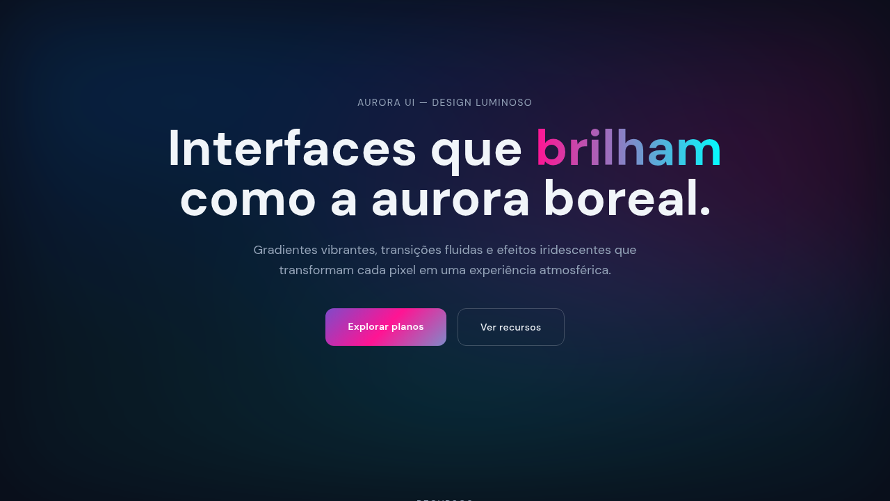
Gradientes fluxo animado, efeito Northern Lights, cores complementares. Interface luminosa e atmosférica. Prompt para gradientes dinâmicos.
Uso: SaaS premium, Creative tools, Agência moderna, Brand exclusiva
Contexto Histórico
Mesh gradients (2021+) e CSS Houdini trazem animações fluidas tipo Northern Lights. Popular em SaaS premium e creative tools.
Quando Usar
Gradientes aurora sinalizam premium quando são contextuais — uma hero section respirando devagar, a borda de um card capturando luz no hover. Funcionam para produtos SaaS cobrando $50+/mês, ferramentas criativas que precisam parecer vivas, e marcas se posicionando contra concorrentes enterprise entediantes. Falham espetacularmente quando jogados em tudo. Se seu gradiente não serve à hierarquia ou ao mood, é decoração fingindo ser design. Pule em páginas com muito conteúdo, dashboards, ou qualquer coisa onde o usuário precisa focar. Um momento aurora por viewport. Essa é a regra.
Princípios de Design
- Lento ganha do rápido — ciclos de animação abaixo de 6 segundos parecem ansiosos; mire em loops de 8-15 segundos que respiram em vez de pulsar
- Limite sua paleta a 3-4 cores máximo por mesh; mais cria lama, não magia
- Ancore gradientes ao propósito do layout — backgrounds estabelecem mood, glows de borda criam profundidade, nunca ambos simultaneamente
- Performance é inegociável: use animações CSS @property em vez de JavaScript, will-change com parcimônia, e mate animações fora do viewport com IntersectionObserver
- Acessibilidade de contraste primeiro — garanta que texto sobre gradientes mantém o mínimo WCAG AA testando contra o ponto mais claro do ciclo de animação, não apenas o frame estático
DESIGN.md
---
version: "alpha"
name: "Aurora UI"
description: "Gradientes fluxo animado, efeito Northern Lights, cores complementares. Interface luminosa e atmosférica. Prompt para gradientes dinâmicos."
colors:
  primary: "#0080FF"
  secondary: "#FF1493"
  tertiary: "#00FFFF"

typography:
  h1:
    fontFamily: -apple-system, sans-serif
    fontSize: 2.25rem
    fontWeight: 700
  body-md:
    fontFamily: -apple-system, sans-serif
    fontSize: 1rem
    fontWeight: 400
  label-caps:
    fontFamily: -apple-system, sans-serif
    fontSize: 0.75rem
    fontWeight: 500
components:
  button-primary:
    backgroundColor: "{colors.primary}"
    padding: 12px
---

## Overview

Gradientes fluxo animado, efeito Northern Lights, cores complementares. Interface luminosa e atmosférica. Prompt para gradientes dinâmicos. Mesh gradients (2021+) e CSS Houdini trazem animações fluidas tipo Northern Lights. Popular em SaaS premium e creative tools.

- Density: 5/10 — Balanced
- Variance: 4/10 — Moderate
- Motion: 6/10 — Expressive

- **Style:** Ethereal, Gradient, Premium, Animated
- **Keywords:** Vibrant gradients, smooth blend, Northern Lights effect, mesh gradient, luminous, atmospheric, abstract
- **Era:** 2020s Modern
- **Light/Dark:** ✓ Full / ✓ Full

## Colors

- **Electric Blue** (#0080FF) — Accent highlight, links and focus states
- **Magenta** (#FF1493) — Decorative accent, highlight elements
- **Cyan** (#00FFFF) — Accent highlight, links and focus states

## Typography

- **Display / Hero:** System UI stack (-apple-system, sans-serif) — Weight 700, tight tracking, used for headline impact
- **Body:** System UI stack (-apple-system, sans-serif) — Weight 400, 16px/1.6 line-height, max 72ch per line
- **UI Labels / Captions:** System UI stack (-apple-system, sans-serif) — 0.875rem, weight 500, slight letter-spacing
- **Monospace:** JetBrains Mono — Used for code, metadata, and technical values

Scale:
- Hero: clamp(2.5rem, 5vw, 4rem)
- H1: 2.25rem
- H2: 1.5rem
- Body: 1rem / 1.6
- Small: 0.875rem

## Layout

- **Grid:** CSS Grid primary. Max-width containment: 1280px centered with 1.5rem side padding.
- **Spacing rhythm:** Balanced. Base unit: 0.5rem (8px).
- **Section vertical gaps:** clamp(4rem, 8vw, 8rem).
- **Hero layout:** Split-screen (text left, visual right).
- **Feature sections:** Zig-zag alternating text+image rows. No 3-equal-columns.
- **Mobile collapse:** All multi-column layouts collapse below 768px. No horizontal overflow.
- **z-index contract:** base (0) / sticky-nav (100) / overlay (200) / modal (300) / toast (500).

## Elevation & Depth

Large flowing CSS/SVG gradients, subtle 8-12s animations, depth via color layering, smooth morph

- **Physics:** Spring — stiffness 120, damping 20. Confident, weighted transitions.
- **Entry animations:** Fade + translate-Y (16px → 0) over 480ms ease-out. Staggered cascades for lists: 100ms between items.
- **Hover states:** Scale(1.03) + shadow lift over 200ms.
- **Page transitions:** Fade + slide (300ms).
- **Performance:** Only transform and opacity animated. No layout-triggering properties.


## Shapes

Base corner radius: 4px. See rounded tokens in front matter for the full scale.
## Components

- **Primary Button:** Moderately rounded (0.75rem) shape. Accent color fill. Hover: 8% darken + subtle lift shadow. Active: -1px translate tactile press. Font weight 600. No outer glows.
- **Secondary / Ghost Button:** Outline variant. 1.5px border in muted color. Text in primary color. Hover: subtle background fill.
- **Cards:** Moderately rounded (0.75rem) corners. Surface background. Subtle shadow (0 2px 12px rgba(0,0,0,0.06)). 1px border stroke.
- **Inputs:** Label above input. 1px border stroke. Focus ring: 2px accent color offset 2px. Error text below in semantic red. No floating labels.
- **Navigation:** Primary surface background. Active item: accent color indicator. Font weight 500 when active.
- **Skeletons:** Shimmer animation matching component dimensions. No circular spinners.
- **Empty States:** Icon-based composition with descriptive text and action button.

## Do's and Don'ts

- No emojis in UI — use icon system only (Lucide, Heroicons)
- No pure black (#000000) — use off-black or charcoal variants
- No oversaturated accent colors (saturation cap: 80%)
- No 3-column equal-width feature layouts — use zig-zag or asymmetric grid
- No `h-screen` — use `min-h-[100dvh]`
- No AI copywriting clichés: "Elevate", "Seamless", "Unleash", "Next-Gen"
- No broken external image links — use picsum.photos or inline SVG
- No generic lorem ipsum in demos

- Do Mesh/flowing gradients applied
- Do 8-12s animation loop
- Do Complementary colors used
- Do Smooth color transitions
- Do Iridescent effect subtle
- Do Text contrast verified

## Use Case

SaaS premium, Creative tools, Agência moderna, Brand exclusiva
Especificações Técnicas
CSS
background: conic-gradient or radial-gradient with multiple stops, animation: @keyframes gradient (8-12s), background-size: 200% 200%, filter: saturate(1.2), blend-mode: screen or multiply
Variáveis
--gradient-colors: complementary pairs, --animation-duration: 8-12s, --blend-mode: screen, --color-saturation: 1.2, --effect: iridescent, --loop-smooth: true
Checklist
☐ Mesh/flowing gradients applied, ☐ 8-12s animation loop, ☐ Complementary colors used, ☐ Smooth color transitions, ☐ Iridescent effect subtle, ☐ Text contrast verified
Cores
Primárias
Efeitos
Large flowing CSS/SVG gradients, subtle 8-12s animations, depth via color layering, smooth morph
Light/Dark
✓ Full / ✓ Full
Prompt para AI
Atue como um Engenheiro Frontend Sênior e UI Designer Especialista.
Sua tarefa é codificar uma Landing Page completa na primeira tentativa.
- Tema da Landing Page: <INSIRA O TEMA>
- Seções a adicionar: <INSIRA AS SEÇÕES>

Gere o código final imediatamente seguindo estas definições:

## Estilo

- **Nome:** Aurora UI
- **Tipo:** Ethereal, Gradient, Premium, Animated
- **Keywords:** Vibrant gradients, smooth blend, Northern Lights effect, mesh gradient, luminous, atmospheric, abstract
- **Era:** 2020s Modern
- **Light/Dark:** ✓ Full / ✓ Full

## Paleta de Cores

- **Primárias:** Complementary: Blue-Orange, Purple-Yellow, Electric Blue #0080FF, Magenta #FF1493, Cyan #00FFFF
- **Secundárias:** Smooth transitions (Blue→Purple→Pink→Teal), iridescent effects, blend modes (screen, multiply)

## Efeitos Visuais

Large flowing CSS/SVG gradients, subtle 8-12s animations, depth via color layering, smooth morph

## Direção Visual para IA

Create a vibrant gradient interface inspired by Northern Lights with mesh gradients, smooth color blends, flowing animations. Use complementary color pairs (blue-orange, purple-yellow), flowing background gradients, subtle continuous animations (8-12s loops), iridescent effects.

## CSS Technical

```css
background: conic-gradient or radial-gradient with multiple stops, animation: @keyframes gradient (8-12s), background-size: 200% 200%, filter: saturate(1.2), blend-mode: screen or multiply
```

## Design System Variables

```css
--gradient-colors: complementary pairs, --animation-duration: 8-12s, --blend-mode: screen, --color-saturation: 1.2, --effect: iridescent, --loop-smooth: true
```

## Checklist de Implementação

- ☐ Mesh/flowing gradients applied
- ☐ 8-12s animation loop
- ☐ Complementary colors used
- ☐ Smooth color transitions
- ☐ Iridescent effect subtle
- ☐ Text contrast verified

## Regras de Execução

1. Siga fielmente o estilo visual determinado.
2. Use ícones SVG inline de alta qualidade (estilo Heroicons ou Lucide) — PROIBIDO usar emojis como ícones.
3. Adicione `cursor-pointer` e estados de `hover` suaves (transition-all) em todos os elementos interativos.
4. Estrutura Obrigatória da Página:
   - Navbar (Logo + Links + CTA)
   - Hero Section (Headline impactante + Subtitle + 2 botões + Elemento visual 3D/Abstrato via CSS)
   - Features (3 cards com ícones)
   - Testimonials (3 cards)
   - Pricing (3 tiers, destaque no central)
   - CTA Final
   - Footer completo com redes sociais, política de privacidade, termos de uso, contato e links SEO.
5. Todo o conteúdo textual deve ser em Português Brasileiro (PT-BR).
6. O visual deve ser CLARAMENTE distinto — não crie um design "padrão Bootstrap". Force o uso das variáveis de design system fornecidas.
7. Use tags `<style>` no head para classes personalizadas (especialmente para os efeitos complexos de backdrop-filter e animações) que o Tailwind via CDN não cobrir.
8. Responsividade Total: O layout deve se adaptar perfeitamente a Mobile, Tablet e Desktop (Stack vertical no mobile).
9. Inclua meta tags básicas de SEO, Viewport e Open Graph no `<head>`.
10. Footer deve conter: Copyright 2026, Links de navegação secundária e Ícones de redes sociais.
11. Assuma as decisões criativas necessárias para entregar o resultado completo e funcional agora.
Relacionados
Última sincronização: 01/04/2026