Biennale Yellow
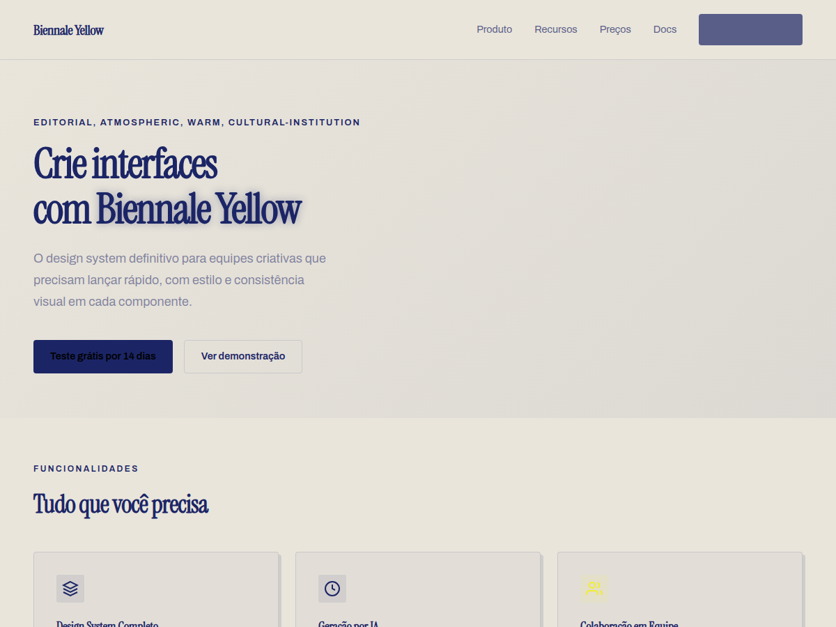
Biennale Yellow — Solar yellow on warm parchment with deep indigo serif and atmospheric sun-glow gradients. Tipografia Instrument Serif. warm parchment ground with a signature solar-yellow accent, deep indigo navy ink. Ideal para exhibition or biennale, arts institution programme, design or typography conference. Prompt pronto para IA generativa.
Uso: Exposições e bienais, Programas culturais, Conferências de design, Publicações literárias, Relatório anual de estúdio, Anúncios de museu
Contexto Histórico
Tradição editorial holandesa (The Dutch Style), com influências de museus europeus como Stedelijk e Van Abbemuseum. Amarelo solar como assinatura — um clássico do design de identidade cultural.
Quando Usar
Deploy when the brief demands cultural authority without institutional stuffiness. Art biennales, design festivals, experimental publications, and cultural events that need to announce themselves from across the room. This system works when your client has curatorial ambition and the confidence to let typography do heavy structural work. Avoid if the content is secondary to branding — Biennale Yellow demands that the editorial layer leads. Not for corporate cultural sponsorship decks. For institutions that commission, not just exhibit.
Princípios de Design
- Yellow is ground, not accent — build typographic systems that live inside the color field rather than floating above it
- Commission or select typefaces with visible authorship; default grotesks betray the experimental premise immediately
- Hierarchy through scale extremes and spatial tension, never through color variation alone — if you need a second color to create hierarchy, the typography isn't working hard enough
- Embrace the Dutch editorial grid as scaffolding, then violate it with intention — every break should feel like a curatorial decision, not a mistake
- Treat white space as exhibition architecture: it frames, it paces, it breathes — but it never apologizes for the density surrounding it
Especificações Técnicas
Cores
Primárias
Secundárias
Efeitos
display font Instrument Serif for hero headlines, smooth hover transitions (200-250ms), subtle lift shadows, sun-glow radial gradients at corners, atmospheric depth
Light/Dark
✓ Full / ✗ None
Relacionados

Última sincronização: 06/05/2026