Claymorphism
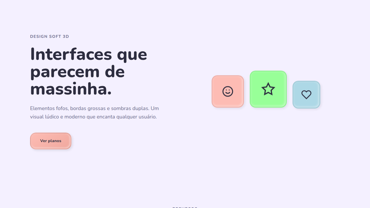
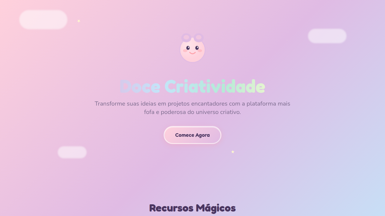
Design brinquedo, bubbly, pastéis suaves e bordas chunky. Ideal para apps infantis e creative tools. Prompt playful.
Uso: Apps infantis, Creative tools, Educação, Jogos interativos
Contexto Histórico
2021+ movimento ludic design, inspirado em Clay.io e Adobe XD. Rejeita corporate severity — celebra diversão, bubbly, toy-like.
Quando Usar
Claymorphism funciona quando seu público espera encantamento acima de eficiência. Apps infantis, plataformas de aprendizado gamificado, ferramentas criativas onde a interface em si deveria parecer um brinquedo. Sinaliza acessibilidade e baixo risco. Mas cuidado: aplicado no contexto errado, soa condescendente. Um app bancário com botões 3D fofinhos diz aos usuários que você não leva o dinheiro deles a sério. O mesmo vale para ferramentas de produtividade onde velocidade importa mais que charme. A linha entre lúdico e infantilizante é mais fina do que a maioria dos designers pensa.
Princípios de Design
- Exagere o border-radius além do que parece 'correto'. Claymorphism vive na faixa de 20-40px onde formas começam a parecer infladas em vez de meramente arredondadas.
- Use sombras coloridas e difusas em vez de cinzas neutros. Um card rosa recebe uma sombra rosa mais profunda. Isso vende a ilusão de objeto 3D sem fotorrealismo.
- Mantenha cores de superfície na faixa pastel-a-saturado. Claymorphism morre em backgrounds escuros porque a dimensionalidade suave precisa de luz para respirar.
- Adicione micro-animações com easing de overshoot (spring physics). Elementos clay estáticos parecem plástico morto. Um leve bounce na interação vende a maciez.
- Mantenha padding e espaçamento generosos. Layouts apertados matam a estética inflada instantaneamente. Cada elemento precisa de espaço para parecer fofinho.
DESIGN.md
---
version: "alpha"
name: "Claymorphism"
description: "Design brinquedo, bubbly, pastéis suaves e bordas chunky. Ideal para apps infantis e creative tools. Prompt playful."
colors:
  primary: "#FDBCB4"
  secondary: "#ADD8E6"
  tertiary: "#98FF98"
  neutral: "#E6E6FA"

typography:
  h1:
    fontFamily: -apple-system, sans-serif
    fontSize: 2.25rem
    fontWeight: 700
  body-md:
    fontFamily: -apple-system, sans-serif
    fontSize: 1rem
    fontWeight: 400
  label-caps:
    fontFamily: -apple-system, sans-serif
    fontSize: 0.75rem
    fontWeight: 500
rounded:
  sm: 20px
  md: 40px
  lg: 60px
components:
  button-primary:
    backgroundColor: "{colors.primary}"
    textColor: "{colors.neutral}"
    rounded: "{rounded.sm}"
    padding: 12px
---

## Overview

Design brinquedo, bubbly, pastéis suaves e bordas chunky. Ideal para apps infantis e creative tools. Prompt playful. 2021+ movimento ludic design, inspirado em Clay.io e Adobe XD. Rejeita corporate severity — celebra diversão, bubbly, toy-like.

- Density: 5/10 — Balanced
- Variance: 4/10 — Moderate
- Motion: 8/10 — Cinematic

- **Style:** Soft, Playful, Rounded, Colorful
- **Keywords:** Soft 3D, chunky, playful, toy-like, bubbly, thick borders (3-4px), double shadows, rounded (16-24px)
- **Era:** 2020s Modern
- **Light/Dark:** ✓ Full / ◐ Partial

## Colors

- **Soft Peach** (#FDBCB4) — Primary surface or dominant color
- **Baby Blue** (#ADD8E6) — Accent highlight, links and focus states
- **Mint** (#98FF98) — Supporting palette color
- **Lilac** (#E6E6FA) — Supporting palette color

## Typography

- **Display / Hero:** System UI stack (-apple-system, sans-serif) — Weight 700, tight tracking, used for headline impact
- **Body:** System UI stack (-apple-system, sans-serif) — Weight 400, 16px/1.6 line-height, max 72ch per line
- **UI Labels / Captions:** System UI stack (-apple-system, sans-serif) — 0.875rem, weight 500, slight letter-spacing
- **Monospace:** JetBrains Mono — Used for code, metadata, and technical values

Scale:
- Hero: clamp(2.5rem, 5vw, 4rem)
- H1: 2.25rem
- H2: 1.5rem
- Body: 1rem / 1.6
- Small: 0.875rem

## Layout

- **Grid:** CSS Grid primary. Max-width containment: 1280px centered with 1.5rem side padding.
- **Spacing rhythm:** Balanced. Base unit: 0.5rem (8px).
- **Section vertical gaps:** clamp(4rem, 8vw, 8rem).
- **Hero layout:** Split-screen (text left, visual right).
- **Feature sections:** Zig-zag alternating text+image rows. No 3-equal-columns.
- **Mobile collapse:** All multi-column layouts collapse below 768px. No horizontal overflow.
- **z-index contract:** base (0) / sticky-nav (100) / overlay (200) / modal (300) / toast (500).

## Elevation & Depth

Inner+outer shadows (subtle, no hard lines), soft press (200ms ease-out), fluffy elements, smooth transitions

- **Physics:** Spring — stiffness 120, damping 20. Confident, weighted transitions.
- **Entry animations:** Fade + translate-Y (16px → 0) over 540ms ease-out. Staggered cascades for lists: 120ms between items.
- **Hover states:** Scale(1.03) + shadow lift over 200ms.
- **Page transitions:** Fade + slide (300ms).
- **Performance:** Only transform and opacity animated. No layout-triggering properties.

## Shapes

Base corner radius: 20px. See rounded tokens in front matter for the full scale.

## Components

- **Primary Button:** Generously rounded (1.5rem) shape. Accent color fill. Hover: 8% darken + subtle lift shadow. Active: -1px translate tactile press. Font weight 600. No outer glows.
- **Secondary / Ghost Button:** Outline variant. 1.5px border in muted color. Text in primary color. Hover: subtle background fill.
- **Cards:** Generously rounded (1.5rem) corners. Surface background. Subtle shadow (0 2px 12px rgba(0,0,0,0.06)). 1px border stroke.
- **Inputs:** Label above input. 1px border stroke. Focus ring: 2px accent color offset 2px. Error text below in semantic red. No floating labels.
- **Navigation:** Primary surface background. Active item: accent color indicator. Font weight 500 when active.
- **Skeletons:** Shimmer animation matching component dimensions. No circular spinners.
- **Empty States:** Icon-based composition with descriptive text and action button.

## Do's and Don'ts

- No emojis in UI — use icon system only (Lucide, Heroicons)
- No pure black (#000000) — use off-black or charcoal variants
- No oversaturated accent colors (saturation cap: 80%)
- No 3-column equal-width feature layouts — use zig-zag or asymmetric grid
- No `h-screen` — use `min-h-[100dvh]`
- No AI copywriting clichés: "Elevate", "Seamless", "Unleash", "Next-Gen"
- No broken external image links — use picsum.photos or inline SVG
- No generic lorem ipsum in demos

- Do Border-radius 16-24px
- Do Thick borders 3-4px
- Do Double shadows (inner+outer)
- Do Pastel colors used
- Do Soft bounce animations
- Do Playful interactions

## Use Case

Apps infantis, Creative tools, Educação, Jogos interativos
Especificações Técnicas
CSS
border-radius: 16-24px, border: 3-4px solid, box-shadow: inset -2px -2px 8px, 4px 4px 8px, background: pastel-gradient, animation: soft bounce (cubic-bezier 0.34, 1.56)
Variáveis
--border-radius: 20px, --border-width: 3-4px, --shadow-inner: inset -2px -2px 8px, --shadow-outer: 4px 4px 8px, --color-palette: pastels, --animation: bounce
Checklist
☐ Border-radius 16-24px, ☐ Thick borders 3-4px, ☐ Double shadows (inner+outer), ☐ Pastel colors used, ☐ Soft bounce animations, ☐ Playful interactions
Cores
Primárias
Efeitos
Inner+outer shadows (subtle, no hard lines), soft press (200ms ease-out), fluffy elements, smooth transitions
Light/Dark
✓ Full / ◐ Partial
Prompt para AI
Atue como um Engenheiro Frontend Sênior e UI Designer Especialista.
Sua tarefa é codificar uma Landing Page completa na primeira tentativa.
- Tema da Landing Page: <INSIRA O TEMA>
- Seções a adicionar: <INSIRA AS SEÇÕES>

Gere o código final imediatamente seguindo estas definições:

## Estilo

- **Nome:** Claymorphism
- **Tipo:** Soft, Playful, Rounded, Colorful
- **Keywords:** Soft 3D, chunky, playful, toy-like, bubbly, thick borders (3-4px), double shadows, rounded (16-24px)
- **Era:** 2020s Modern
- **Light/Dark:** ✓ Full / ◐ Partial

## Paleta de Cores

- **Primárias:** Pastel: Soft Peach #FDBCB4, Baby Blue #ADD8E6, Mint #98FF98, Lilac #E6E6FA, light BG
- **Secundárias:** Soft gradients (pastel-to-pastel), light/dark variations (20-30%), gradient subtle

## Efeitos Visuais

Inner+outer shadows (subtle, no hard lines), soft press (200ms ease-out), fluffy elements, smooth transitions

## Direção Visual para IA

Design a playful, toy-like interface with soft 3D, chunky elements, bubbly aesthetic, rounded edges (16-24px), thick borders (3-4px), double shadows (inner + outer), pastel colors, smooth animations. Perfect for children's apps and creative tools.

## CSS Technical

```css
border-radius: 16-24px, border: 3-4px solid, box-shadow: inset -2px -2px 8px, 4px 4px 8px, background: pastel-gradient, animation: soft bounce (cubic-bezier 0.34, 1.56)
```

## Design System Variables

```css
--border-radius: 20px, --border-width: 3-4px, --shadow-inner: inset -2px -2px 8px, --shadow-outer: 4px 4px 8px, --color-palette: pastels, --animation: bounce
```

## Checklist de Implementação

- ☐ Border-radius 16-24px
- ☐ Thick borders 3-4px
- ☐ Double shadows (inner+outer)
- ☐ Pastel colors used
- ☐ Soft bounce animations
- ☐ Playful interactions

## Regras de Execução

1. Siga fielmente o estilo visual determinado.
2. Use ícones SVG inline de alta qualidade (estilo Heroicons ou Lucide) — PROIBIDO usar emojis como ícones.
3. Adicione `cursor-pointer` e estados de `hover` suaves (transition-all) em todos os elementos interativos.
4. Estrutura Obrigatória da Página:
   - Navbar (Logo + Links + CTA)
   - Hero Section (Headline impactante + Subtitle + 2 botões + Elemento visual 3D/Abstrato via CSS)
   - Features (3 cards com ícones)
   - Testimonials (3 cards)
   - Pricing (3 tiers, destaque no central)
   - CTA Final
   - Footer completo com redes sociais, política de privacidade, termos de uso, contato e links SEO.
5. Todo o conteúdo textual deve ser em Português Brasileiro (PT-BR).
6. O visual deve ser CLARAMENTE distinto — não crie um design "padrão Bootstrap". Force o uso das variáveis de design system fornecidas.
7. Use tags `<style>` no head para classes personalizadas (especialmente para os efeitos complexos de backdrop-filter e animações) que o Tailwind via CDN não cobrir.
8. Responsividade Total: O layout deve se adaptar perfeitamente a Mobile, Tablet e Desktop (Stack vertical no mobile).
9. Inclua meta tags básicas de SEO, Viewport e Open Graph no `<head>`.
10. Footer deve conter: Copyright 2026, Links de navegação secundária e Ícones de redes sociais.
11. Assuma as decisões criativas necessárias para entregar o resultado completo e funcional agora.
Relacionados
Última sincronização: 01/04/2026