Duotone
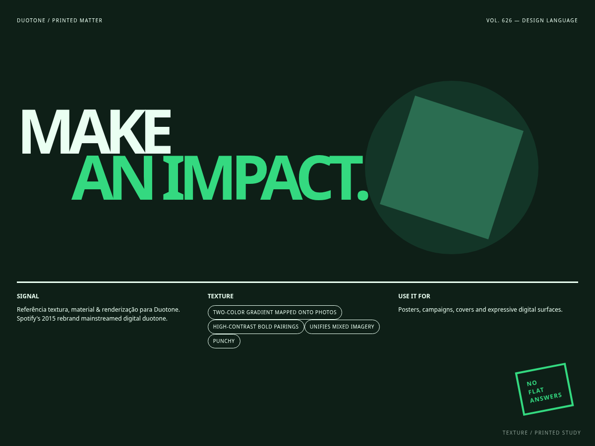
Referência textura, material & renderização para Duotone. Spotify's 2015 rebrand mainstreamed digital duotone.
Uso: shell de aplicação com navegação e cartões; Two-color gradient mapped onto photos; High-contrast bold pairings
Contexto Histórico
Spotify's 2015 rebrand mainstreamed digital duotone. Exemplo: Spotify 2015 identity; festival branding..
Fonte e proveniência
Importado de ara-mkr/claude-artisan · MIT · commit ae6d3ad · 2026-08-30
DESIGN.md
---
version: "alpha"
name: "Duotone"
description: "Sistema visual Duotone, traduzido do catálogo Claude Artisan para uso em produtos digitais. Two-color gradient mapped onto photos; High-contrast bold pairings"
colors:
  primary: "#34d980"
  background: "#0e1f17"
  surface: "#133527"
  text: "#eafff2"
  accent: "#ff3e6c"
  on-primary: "#000000"
  on-surface: "#FFFFFF"
  on-accent: "#000000"
typography:
  h1:
    fontFamily: "'Gotham', 'Circular', system-ui, sans-serif"
    fontSize: "4rem"
    fontWeight: "700"
    lineHeight: "1.05"
  body-md:
    fontFamily: "'Circular', 'Helvetica Neue', system-ui, sans-serif"
    fontSize: "1rem"
    fontWeight: "400"
    lineHeight: "1.6"
  label-caps:
    fontFamily: "'Circular', 'Helvetica Neue', system-ui, sans-serif"
    fontSize: "0.75rem"
    fontWeight: "600"
    letterSpacing: "0.06em"
rounded:
  sm: "4px"
  md: "8px"
  lg: "12px"
spacing:
  sm: "8px"
  md: "16px"
  lg: "32px"
components:
  button-primary:
    backgroundColor: "{colors.primary}"
    textColor: "{colors.on-primary}"
    rounded: "{rounded.md}"
    padding: "16px"
  button-secondary:
    backgroundColor: "{colors.accent}"
    textColor: "{colors.on-accent}"
    rounded: "{rounded.md}"
    padding: "16px"
  card:
    backgroundColor: "{colors.surface}"
    textColor: "{colors.on-surface}"
    rounded: "{rounded.lg}"
    padding: "24px"
  page:
    backgroundColor: "{colors.background}"
    textColor: "{colors.text}"
    padding: "16px"
---
## Overview

Sistema visual Duotone, traduzido do catálogo Claude Artisan para uso em produtos digitais. Two-color gradient mapped onto photos; High-contrast bold pairings

- **Categoria:** Textura, material & renderização
- **Era:** Print heritage → 2015 web
- **Origem:** Spotify's 2015 rebrand mainstreamed digital duotone.
- **Exemplo:** Spotify 2015 identity; festival branding.
- **Base estrutural:** shell de aplicação com navegação e cartões

**Traços definidores:**
- Two-color gradient mapped onto photos
- High-contrast bold pairings
- Unifies mixed imagery
- Punchy, modern, brand-forward

## Colors

- **bg** — #0e1f17
- **surface** — #133527
- **surface-strong** — #1a4732
- **border** — #2fae74
- **text** — #eafff2
- **text-muted** — #9fe3bd
- **primary** — #34d980
- **accent** — #ff3e6c
- **tone-shadow** — #0e1f17
- **tone-highlight** — #ff3e6c

## Typography

- Display: 'Gotham', 'Circular', system-ui, sans-serif
- Corpo: 'Circular', 'Helvetica Neue', system-ui, sans-serif
- Mono: ui-monospace, monospace

## Layout

- shell de aplicação com navegação e cartões
- Use uma grade responsiva e preserve a hierarquia de conteúdo.
- Colapse colunas abaixo de 768px sem overflow horizontal.

## Elevation & Depth

- Two-color gradient mapped onto photos; High-contrast bold pairings; Unifies mixed imagery; Punchy, modern, brand-forward; sombras e elevação

## Shapes

- Raios: 4px, 8px, 12px.

## Components

- Botões mantêm foco visível e estados hover/pressed previsíveis.
- Cartões usam a superfície e a escala de raios definidas nos tokens.
- Formulários exibem labels persistentes, erro textual e foco por teclado.

## Do's and Don'ts

- Faça: respeite os tokens e a composição estrutural indicada.
- Faça: mantenha contraste WCAG AA e `prefers-reduced-motion`.
- Evite: usar o estilo como decoração sem hierarquia funcional.
Especificações Técnicas
CSS
/* Duotone — design tokens */
/* Print heritage → 2015 web | Spotify's 2015 rebrand mainstreamed digital duotone, condensed */
:root {
  /* color */
  --color-bg: #0e1f17;
  --color-surface: #133527;
  --color-surface-strong: #1a4732;
  --color-border: #2fae74;
  --color-text: #eafff2;
  --color-text-muted: #9fe3bd;
  --color-primary: #34d980;
  --color-accent: #ff3e6c;
  --tone-shadow: #0e1f17;
  --tone-highlight: #ff3e6c;
  /* radius */
  --radius-sm: 4px;
  --radius-md: 8px;
  --radius-lg: 12px;
  --radius-pill: 999px;
  /* shadow */
  --shadow-sm: 0 2px 8px rgba(0,0,0,0.3);
  --shadow-md: 0 6px 20px rgba(0,0,0,0.4);
  --shadow-lg: 0 16px 40px rgba(0,0,0,0.5);
  /* font */
  --font-sans: 'Circular', 'Helvetica Neue', system-ui, sans-serif;
  --font-display: 'Gotham', 'Circular', system-ui, sans-serif;
  --font-mono: ui-monospace, monospace;
  /* text */
  --text-xs: 0.75rem;
  --text-sm: 0.875rem;
  --text-base: 1rem;
  --text-lg: 1.125rem;
  --text-xl: 1.375rem;
  --text-2xl: 1.75rem;
  --text-3xl: 2.25rem;
  --text-4xl: 3rem;
  --text-5xl: 4rem;
  /* space */
  --space-1: 4px;
  --space-2: 8px;
  --space-3: 12px;
  --space-4: 16px;
  --space-6: 24px;
  --space-8: 32px;
  --space-12: 48px;
  --space-16: 64px;
  --space-24: 96px;
  /* ease */
  --ease-standard: cubic-bezier(0.2, 0, 0, 1);
  /* extra: signature = two-color duotone gradient mapped across every surface (shadow→highlight ramp) */
  --duotone-ramp: linear-gradient(135deg, var(--tone-shadow) 0%, var(--color-primary) 55%, var(--tone-highlight) 130%);
  --duotone-wash: linear-gradient(180deg, rgba(52,217,128,0.16), rgba(255,62,108,0.10));
}

/* ============================================================
   Base component classes — Duotone
   Signature move: a single two-color gradient ramp (shadow → primary →
   highlight) is reused as the page background, the primary button fill,
   and a wash overlay on cards/nav — unifying every surface in one bitone.
   ============================================================ */
body { margin: 0; color: var(--color-text); font-family: var(--font-sans); background: var(--duotone-ramp); background-attachment: fixed; min-height: 100vh; }
.nav { display: flex; gap: var(--space-4); align-items: center; padding: var(--space-3) var(--space-6);
  background: var(--color-surface); background-image: var(--duotone-wash); border-radius: var(--radius-lg); box-shadow: var(--shadow-sm); }
.btn { font: 700 var(--text-base)/1 var(--font-sans); color: var(--color-text);
  background: var(--color-surface-strong); border: 1px solid var(--color-border); border-radius: var(--radius-pill);
  padding: var(--space-3) var(--space-6); cursor: pointer; transition: transform .2s var(--ease-standard), box-shadow .2s var(--ease-standard); }
.btn:hover { transform: translateY(-1px); box-shadow: var(--shadow-sm); }
.btn:active { transform: translateY(0); }
.btn:focus-visible { outline: 2px solid var(--color-text); outline-offset: 2px; }
.btn[disabled] { opacity: .5; cursor: not-allowed; }
.btn--primary { background: var(--duotone-ramp); color: #0e1f17; border-color: transparent; font-weight: 800; }
.card { background: var(--color-surface); background-image: var(--duotone-wash); border-radius: var(--radius-lg);
  border: 1px solid var(--color-border); box-shadow: var(--shadow-md); padding: var(--space-6); }
.input { width: 100%; box-sizing: border-box; font: var(--text-base) var(--font-sans); color: var(--color-text);
  background: var(--color-surface-strong); border: 1px solid var(--color-border); border-radius: var(--radius-md);
  padding: var(--space-3) var(--space-4); }
.input::placeholder { color: var(--color-text-muted); }
.input:focus { outline: none; border-color: var(--color-accent); box-shadow: 0 0 0 3px color-mix(in srgb, var(--color-accent) 25%, transparent); }
.badge { display: inline-flex; align-items: center; gap: .4em; font: 700 var(--text-xs) var(--font-sans);
  color: #0e1f17; background: var(--duotone-ramp); border-radius: var(--radius-pill); padding: .3em .8em; }
@media (prefers-reduced-motion: reduce) { .btn { transition: none; } .btn:hover { transform: none; } }


/* Especificação de referência: references/00-flagship-implementation-specs/duotone.md */
Variáveis
--bg: #0e1f17, --fg: #eafff2, --accent: #34d980, --surface: #133527, --radius: 8px, --spacing: 16px, --font-display: 'Gotham', 'Circular', system-ui, sans-serif, --font-body: 'Circular', 'Helvetica Neue', system-ui, sans-serif
Checklist
Contraste WCAG AA; foco visível; navegação por teclado; estados hover/pressed; responsividade; prefers-reduced-motion; Tailwind v4 via @theme.
Cores
Primárias
Secundárias
Efeitos
Two-color gradient mapped onto photos, High-contrast bold pairings, Unifies mixed imagery, Punchy, modern, brand-forward, shadow
Light/Dark
Fonte não declara modos; validar em light e dark antes de publicar
Prompt para AI
Atue como um Engenheiro Frontend Sênior e UI Designer Especialista.
Sua tarefa é codificar uma Landing Page completa na primeira tentativa.
- Tema da Landing Page: <INSIRA O TEMA>
- Seções a adicionar: <INSIRA AS SEÇÕES>

Gere o código final imediatamente seguindo estas definições:

## Estilo

- **Nome:** Duotone
- **Tipo:** claude-artisan/texture
- **Keywords:** Duotone, two-tone, bitone, Two-color gradient mapped onto photos, High-contrast bold pairings, Unifies mixed imagery, Punchy, modern, brand-forward, texture
- **Era:** Print heritage → 2015 web
- **Light/Dark:** Fonte não declara modos; validar em light e dark antes de publicar

## Paleta de Cores

- **Primárias:** bg: #0e1f17, surface: #133527, surface-strong: #1a4732, border: #2fae74
- **Secundárias:** text: #eafff2, text-muted: #9fe3bd, primary: #34d980, accent: #ff3e6c, tone-shadow: #0e1f17, tone-highlight: #ff3e6c

## Efeitos Visuais

Two-color gradient mapped onto photos, High-contrast bold pairings, Unifies mixed imagery, Punchy, modern, brand-forward, shadow

## Direção Visual para IA

Duotone, Two-color gradient mapped onto photos, High-contrast bold pairings, Unifies mixed imagery, Punchy, modern, brand-forward, Spotify 2015 identity; festival branding.

## CSS Technical

```css
/* Duotone — design tokens */
/* Print heritage → 2015 web | Spotify's 2015 rebrand mainstreamed digital duotone, condensed */
:root {
  /* color */
  --color-bg: #0e1f17;
  --color-surface: #133527;
  --color-surface-strong: #1a4732;
  --color-border: #2fae74;
  --color-text: #eafff2;
  --color-text-muted: #9fe3bd;
  --color-primary: #34d980;
  --color-accent: #ff3e6c;
  --tone-shadow: #0e1f17;
  --tone-highlight: #ff3e6c;
  /* radius */
  --radius-sm: 4px;
  --radius-md: 8px;
  --radius-lg: 12px;
  --radius-pill: 999px;
  /* shadow */
  --shadow-sm: 0 2px 8px rgba(0,0,0,0.3);
  --shadow-md: 0 6px 20px rgba(0,0,0,0.4);
  --shadow-lg: 0 16px 40px rgba(0,0,0,0.5);
  /* font */
  --font-sans: 'Circular', 'Helvetica Neue', system-ui, sans-serif;
  --font-display: 'Gotham', 'Circular', system-ui, sans-serif;
  --font-mono: ui-monospace, monospace;
  /* text */
  --text-xs: 0.75rem;
  --text-sm: 0.875rem;
  --text-base: 1rem;
  --text-lg: 1.125rem;
  --text-xl: 1.375rem;
  --text-2xl: 1.75rem;
  --text-3xl: 2.25rem;
  --text-4xl: 3rem;
  --text-5xl: 4rem;
  /* space */
  --space-1: 4px;
  --space-2: 8px;
  --space-3: 12px;
  --space-4: 16px;
  --space-6: 24px;
  --space-8: 32px;
  --space-12: 48px;
  --space-16: 64px;
  --space-24: 96px;
  /* ease */
  --ease-standard: cubic-bezier(0.2, 0, 0, 1);
  /* extra: signature = two-color duotone gradient mapped across every surface (shadow→highlight ramp) */
  --duotone-ramp: linear-gradient(135deg, var(--tone-shadow) 0%, var(--color-primary) 55%, var(--tone-highlight) 130%);
  --duotone-wash: linear-gradient(180deg, rgba(52,217,128,0.16), rgba(255,62,108,0.10));
}

/* ============================================================
   Base component classes — Duotone
   Signature move: a single two-color gradient ramp (shadow → primary →
   highlight) is reused as the page background, the primary button fill,
   and a wash overlay on cards/nav — unifying every surface in one bitone.
   ============================================================ */
body { margin: 0; color: var(--color-text); font-family: var(--font-sans); background: var(--duotone-ramp); background-attachment: fixed; min-height: 100vh; }
.nav { display: flex; gap: var(--space-4); align-items: center; padding: var(--space-3) var(--space-6);
  background: var(--color-surface); background-image: var(--duotone-wash); border-radius: var(--radius-lg); box-shadow: var(--shadow-sm); }
.btn { font: 700 var(--text-base)/1 var(--font-sans); color: var(--color-text);
  background: var(--color-surface-strong); border: 1px solid var(--color-border); border-radius: var(--radius-pill);
  padding: var(--space-3) var(--space-6); cursor: pointer; transition: transform .2s var(--ease-standard), box-shadow .2s var(--ease-standard); }
.btn:hover { transform: translateY(-1px); box-shadow: var(--shadow-sm); }
.btn:active { transform: translateY(0); }
.btn:focus-visible { outline: 2px solid var(--color-text); outline-offset: 2px; }
.btn[disabled] { opacity: .5; cursor: not-allowed; }
.btn--primary { background: var(--duotone-ramp); color: #0e1f17; border-color: transparent; font-weight: 800; }
.card { background: var(--color-surface); background-image: var(--duotone-wash); border-radius: var(--radius-lg);
  border: 1px solid var(--color-border); box-shadow: var(--shadow-md); padding: var(--space-6); }
.input { width: 100%; box-sizing: border-box; font: var(--text-base) var(--font-sans); color: var(--color-text);
  background: var(--color-surface-strong); border: 1px solid var(--color-border); border-radius: var(--radius-md);
  padding: var(--space-3) var(--space-4); }
.input::placeholder { color: var(--color-text-muted); }
.input:focus { outline: none; border-color: var(--color-accent); box-shadow: 0 0 0 3px color-mix(in srgb, var(--color-accent) 25%, transparent); }
.badge { display: inline-flex; align-items: center; gap: .4em; font: 700 var(--text-xs) var(--font-sans);
  color: #0e1f17; background: var(--duotone-ramp); border-radius: var(--radius-pill); padding: .3em .8em; }
@media (prefers-reduced-motion: reduce) { .btn { transition: none; } .btn:hover { transform: none; } }


/* Especificação de referência: references/00-flagship-implementation-specs/duotone.md */
```

## Design System Variables

```css
--bg: #0e1f17, --fg: #eafff2, --accent: #34d980, --surface: #133527, --radius: 8px, --spacing: 16px, --font-display: 'Gotham', 'Circular', system-ui, sans-serif, --font-body: 'Circular', 'Helvetica Neue', system-ui, sans-serif
```

## Checklist de Implementação

- Contraste WCAG AA; foco visível; navegação por teclado; estados hover/pressed; responsividade; prefers-reduced-motion; Tailwind v4 via @theme.

## Regras de Execução

1. Siga fielmente o estilo visual determinado.
2. Use ícones SVG inline de alta qualidade (estilo Heroicons ou Lucide) — PROIBIDO usar emojis como ícones.
3. Adicione `cursor-pointer` e estados de `hover` suaves (transition-all) em todos os elementos interativos.
4. Estrutura Obrigatória da Página:
   - Navbar (Logo + Links + CTA)
   - Hero Section (Headline impactante + Subtitle + 2 botões + Elemento visual 3D/Abstrato via CSS)
   - Features (3 cards com ícones)
   - Testimonials (3 cards)
   - Pricing (3 tiers, destaque no central)
   - CTA Final
   - Footer completo com redes sociais, política de privacidade, termos de uso, contato e links SEO.
5. Todo o conteúdo textual deve ser em Português Brasileiro (PT-BR).
6. O visual deve ser CLARAMENTE distinto — não crie um design "padrão Bootstrap". Force o uso das variáveis de design system fornecidas.
7. Use tags `<style>` no head para classes personalizadas (especialmente para os efeitos complexos de backdrop-filter e animações) que o Tailwind via CDN não cobrir.
8. Responsividade Total: O layout deve se adaptar perfeitamente a Mobile, Tablet e Desktop (Stack vertical no mobile).
9. Inclua meta tags básicas de SEO, Viewport e Open Graph no `<head>`.
10. Footer deve conter: Copyright 2026, Links de navegação secundária e Ícones de redes sociais.
11. Assuma as decisões criativas necessárias para entregar o resultado completo e funcional agora.Relacionados
Última sincronização: 30/08/2026