Soft Editorial
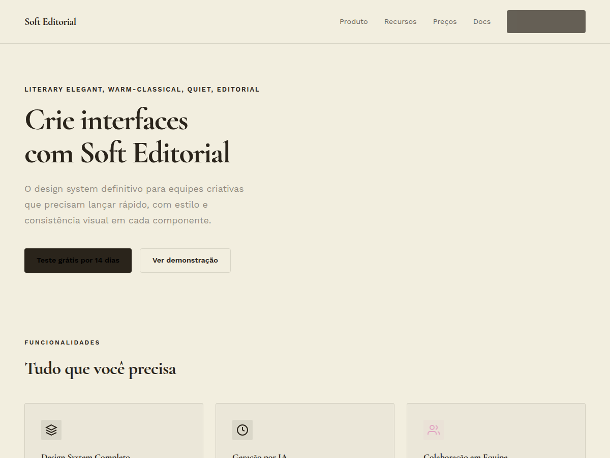
Soft Editorial — Cormorant Garamond serif on warm paper with sage, blush, and lemon accents. Tipografia Cormorant Garamond. warm paper canvas with deep ink type, accented by soft pink, lemon, blush, and s. Ideal para editorial feature, longform brand story, gallery or museum. Prompt pronto para IA generativa.
Uso: editorial feature, longform brand story, gallery or museum, literary pitch, Entregável consultivo, wedding / lifestyle media
Contexto Histórico
Elegância literária quente — Cormorant Garamond, papel marfim, acentos em sálvia/blush/limão. Influência de publicações de estilo de vida premium e editorial de casamentos.
Quando Usar
Use este sistema quando a marca sussurra em vez de gritar. Editorial de lifestyle, plataformas de wellness, hotelaria boutique, beleza limpa, slow fashion — qualquer lugar onde a audiência espera bom gosto sobre volume. Funciona quando conteúdo é liderado por imagem e long-form, onde a tipografia precisa parecer inevitável, não projetada. Evite para qualquer coisa que exija densidade, urgência ou energia masculina. Essa paleta e pareamento tipográfico colapsam sob interfaces pesadas de informação.
Princípios de Design
- Deixe a serif carregar autoridade — coloque Cormorant em tamanhos display (48px+) e nunca abaixo de 18px no body; combine com uma sans neutra para UI chrome, nunca deixe duas serifs competirem na mesma spread.
- Papel quente como fundação, não branco — use off-white (#FAF8F5 ou mais quente) como canvas; branco puro cria tensão clínica que briga com a paleta orgânica de sage, blush e limão.
- Cor como gramática de acento — sage para containers e divisores, blush para estados interativos, limão com parcimônia como destaque editorial; nunca preencha grandes áreas com cor saturada, deixe espaço negativo dominar.
- Ritmo vertical generoso sobre grids apertados — line-height de 1.6–1.8 para body, espaçamento de seção que pareça virar página de revista; densidade é inimiga desta estética.
- Fotografia dita o layout, não o inverso — projete o grid ao redor de imagens editoriais; crops devem parecer intencionais e cinematográficos, nunca constrangidos por estruturas rígidas de colunas.
DESIGN.md
---
version: "alpha"
name: "Soft Editorial"
description: "Soft Editorial — Cormorant Garamond serif on warm paper with sage, blush, and lemon accents. Tipografia Cormorant Garamond. warm paper canvas with deep ink type, accented by soft pink, lemon, blush, and s. Ideal para editorial feature, longform brand story, gallery or museum. Prompt pronto para IA generativa."
colors:
  primary: "#F2EEDF"
  secondary: "#2A241B"
  tertiary: "#E1A4C2"
  neutral: "#D6DD63"
  surface: "#E8C9B6"
  accent: "#B7C7A8"
typography:
  h1:
    fontFamily: Cormorant Garamond
    fontSize: 2.5rem
    fontWeight: 700
  body-md:
    fontFamily: Cormorant Garamond
    fontSize: 1rem
    fontWeight: 400
spacing:
  sm: 2.0rem
  md: 4.0rem
  lg: 8.0rem
components:
  button-primary:
    backgroundColor: "{colors.primary}"
    textColor: "{colors.neutral}"
    padding: 12px
---

## Overview

Soft Editorial — Cormorant Garamond serif on warm paper with sage, blush, and lemon accents. Tipografia Cormorant Garamond. warm paper canvas with deep ink type, accented by soft pink, lemon, blush, and s. Ideal para editorial feature, longform brand story, gallery or museum. Prompt pronto para IA generativa.

- Density: 2/10 — Airy
- Variance: 8/10 — Complex
- Motion: 2/10 — Minimal

- **Style:** Literary Elegant, Warm-Classical, Quiet, Editorial
- **Keywords:** Cormorant Garamond, warm paper, sage blush lemon, literary, elegant, quiet, Sunday supplement
- **Era:** 2010s Editorial
- **Light/Dark:** ✓ Full / ✗ None

## Colors

- **Paper** (#F2EEDF) — Primary surface or dominant color
- **Ink** (#2A241B) — Accent highlight, links and focus states
- **Pink** (#E1A4C2) — Secondary accent
- **Lemon** (#D6DD63) — Accent color, emphasis elements
- **Blush** (#E8C9B6) — Extended palette, decorative use
- **Sage** (#B7C7A8) — Background alternate

## Typography

- **Display / Hero:** Cormorant Garamond — Weight 700, tight tracking, used for headline impact
- **Body:** Work Sans — Weight 400, 16px/1.6 line-height, max 72ch per line
- **UI Labels / Captions:** Work Sans — 0.875rem, weight 500, slight letter-spacing
- **Monospace:** JetBrains Mono — Used for code, metadata, and technical values

Scale:
- Hero: clamp(2.5rem, 5vw, 4rem)
- H1: 2.25rem
- H2: 1.5rem
- Body: 1rem / 1.6
- Small: 0.875rem

## Layout

- **Grid:** CSS Grid primary. Max-width containment: 1280px centered with 1.5rem side padding.
- **Spacing rhythm:** Balanced. Base unit: 0.5rem (8px).
- **Section vertical gaps:** clamp(4rem, 8vw, 8rem).
- **Hero layout:** Split-screen (text left, visual right).
- **Feature sections:** Zig-zag alternating text+image rows. No 3-equal-columns.
- **Mobile collapse:** All multi-column layouts collapse below 768px. No horizontal overflow.
- **z-index contract:** base (0) / sticky-nav (100) / overlay (200) / modal (300) / toast (500).

## Elevation & Depth

display font Cormorant Garamond for hero headlines, subtle hover (opacity 0.8, 200ms), refined focus rings, Cormorant Garamond serifs on warm paper, sage/blush/lemon block accents, generous whitespace, clamp(4rem,8vw,8rem) section gaps

- **Physics:** Ease-out curves, 200-300ms duration. Smooth and predictable.
- **Entry animations:** Fade + translate-Y (16px → 0) over 420ms ease-out. Staggered cascades for lists: 80ms between items.
- **Hover states:** Subtle color shift + shadow adjustment over 200ms.
- **Page transitions:** Fade only (200ms).
- **Performance:** Only transform and opacity animated. No layout-triggering properties.

## Shapes

Base corner radius: 4px. See rounded tokens in front matter for the full scale.

## Components

- **Primary Button:** 4px border-radius. Accent color fill. Hover: 8% darken + subtle lift shadow. Active: -1px translate tactile press. Font weight 600. No outer glows.
- **Secondary / Ghost Button:** Outline variant. 1.5px border in muted color. Text in primary color. Hover: subtle background fill.
- **Cards:** 4px corners. Surface background. Subtle shadow (0 2px 12px rgba(0,0,0,0.06)). 1px border stroke.
- **Inputs:** Label above input. 1px border stroke. Focus ring: 2px accent color offset 2px. Error text below in semantic red. No floating labels.
- **Navigation:** Primary surface background. Active item: accent color indicator. Font weight 500 when active.
- **Skeletons:** Shimmer animation matching component dimensions. No circular spinners.
- **Empty States:** Icon-based composition with descriptive text and action button.

## Do's and Don'ts

- No emojis in UI — use icon system only (Lucide, Heroicons)
- No pure black (#000000) — use off-black or charcoal variants
- No oversaturated accent colors (saturation cap: 80%)
- No 3-column equal-width feature layouts — use zig-zag or asymmetric grid
- No `h-screen` — use `min-h-[100dvh]`
- No AI copywriting clichés: "Elevate", "Seamless", "Unleash", "Next-Gen"
- No broken external image links — use picsum.photos or inline SVG
- No generic lorem ipsum in demos

- Do Cormorant Garamond display font loaded via Google Fonts
- Do Color palette variables applied consistently
- Do Typography scale: hero clamp(2.5rem,5vw,4rem)
- Do H1 2.25rem
- Do body 1rem/1.6
- Do WCAG AA contrast ratio verified (4.5:1 body text)
- Do Serif typography hierarchy clear (display vs body)
- Do Whitespace generous — section gaps ≥ 5rem
- Do Mobile responsive layout (stack below 768px)

## Use Case

editorial feature, longform brand story, gallery or museum, literary pitch, Entregável consultivo, wedding / lifestyle media
Especificações Técnicas
CSS
font-family: 'Cormorant Garamond', serif; background: #F5F0E5; color: #2A2018; --sage: #7A9A7A; --blush: #E8B0A8; --lemon: #E8D870; font-size: 1.125rem
Variáveis
--bg: #F2EEDF, --fg: #2A241B, --accent: #2A241B, --font-display: 'Cormorant Garamond', --font-body: 'Work Sans', --radius: 4px, --spacing: 2rem
Checklist
☐ Cormorant Garamond display font loaded via Google Fonts, ☐ Color palette variables applied consistently, ☐ Typography scale: hero clamp(2.5rem,5vw,4rem), H1 2.25rem, body 1rem/1.6, ☐ WCAG AA contrast ratio verified (4.5:1 body text), ☐ Serif typography hierarchy clear (display vs body), ☐ Whitespace generous — section gaps ≥ 5rem, ☐ Mobile responsive layout (stack below 768px)
Cores
Primárias
Secundárias
Efeitos
display font Cormorant Garamond for hero headlines, subtle hover (opacity 0.8, 200ms), refined focus rings, Cormorant Garamond serifs on warm paper, sage/blush/lemon block accents, generous whitespace, clamp(4rem,8vw,8rem) section gaps
Light/Dark
✓ Full / ✗ None
Prompt para AI
Atue como um Engenheiro Frontend Sênior e UI Designer Especialista.
Sua tarefa é codificar uma Landing Page completa na primeira tentativa.
- Tema da Landing Page: <INSIRA O TEMA>
- Seções a adicionar: <INSIRA AS SEÇÕES>

Gere o código final imediatamente seguindo estas definições:

## Estilo

- **Nome:** Soft Editorial
- **Tipo:** Literary Elegant, Warm-Classical, Quiet, Editorial
- **Keywords:** Cormorant Garamond, warm paper, sage blush lemon, literary, elegant, quiet, Sunday supplement
- **Era:** 2010s Editorial
- **Light/Dark:** ✓ Full / ✗ None

## Paleta de Cores

- **Primárias:** Paper #F2EEDF, Ink #2A241B, Pink #E1A4C2
- **Secundárias:** Lemon #D6DD63, Blush #E8C9B6, Sage #B7C7A8

## Efeitos Visuais

display font Cormorant Garamond for hero headlines, subtle hover (opacity 0.8, 200ms), refined focus rings, Cormorant Garamond serifs on warm paper, sage/blush/lemon block accents, generous whitespace, clamp(4rem,8vw,8rem) section gaps

## Direção Visual para IA

Design a literary warm editorial layout on ivory paper. Use: Cormorant Garamond for all headlines, sage (#7A9A7A), blush (#E8B0A8), lemon (#E8D870) as gentle block accents, warm parchment background, generous line-height (1.7), minimal decoration. Sunday-supplement warmth.

## CSS Technical

```css
font-family: 'Cormorant Garamond', serif; background: #F5F0E5; color: #2A2018; --sage: #7A9A7A; --blush: #E8B0A8; --lemon: #E8D870; font-size: 1.125rem
```

## Design System Variables

```css
--bg: #F2EEDF, --fg: #2A241B, --accent: #2A241B, --font-display: 'Cormorant Garamond', --font-body: 'Work Sans', --radius: 4px, --spacing: 2rem
```

## Checklist de Implementação

- ☐ Cormorant Garamond display font loaded via Google Fonts
- ☐ Color palette variables applied consistently
- ☐ Typography scale: hero clamp(2.5rem,5vw,4rem)
- H1 2.25rem
- body 1rem/1.6
- ☐ WCAG AA contrast ratio verified (4.5:1 body text)
- ☐ Serif typography hierarchy clear (display vs body)
- ☐ Whitespace generous — section gaps ≥ 5rem
- ☐ Mobile responsive layout (stack below 768px)

## Regras de Execução

1. Siga fielmente o estilo visual determinado.
2. Use ícones SVG inline de alta qualidade (estilo Heroicons ou Lucide) — PROIBIDO usar emojis como ícones.
3. Adicione `cursor-pointer` e estados de `hover` suaves (transition-all) em todos os elementos interativos.
4. Estrutura Obrigatória da Página:
   - Navbar (Logo + Links + CTA)
   - Hero Section (Headline impactante + Subtitle + 2 botões + Elemento visual 3D/Abstrato via CSS)
   - Features (3 cards com ícones)
   - Testimonials (3 cards)
   - Pricing (3 tiers, destaque no central)
   - CTA Final
   - Footer completo com redes sociais, política de privacidade, termos de uso, contato e links SEO.
5. Todo o conteúdo textual deve ser em Português Brasileiro (PT-BR).
6. O visual deve ser CLARAMENTE distinto — não crie um design "padrão Bootstrap". Force o uso das variáveis de design system fornecidas.
7. Use tags `<style>` no head para classes personalizadas (especialmente para os efeitos complexos de backdrop-filter e animações) que o Tailwind via CDN não cobrir.
8. Responsividade Total: O layout deve se adaptar perfeitamente a Mobile, Tablet e Desktop (Stack vertical no mobile).
9. Inclua meta tags básicas de SEO, Viewport e Open Graph no `<head>`.
10. Footer deve conter: Copyright 2026, Links de navegação secundária e Ícones de redes sociais.
11. Assuma as decisões criativas necessárias para entregar o resultado completo e funcional agora.
Relacionados
Última sincronização: 06/05/2026