Grove
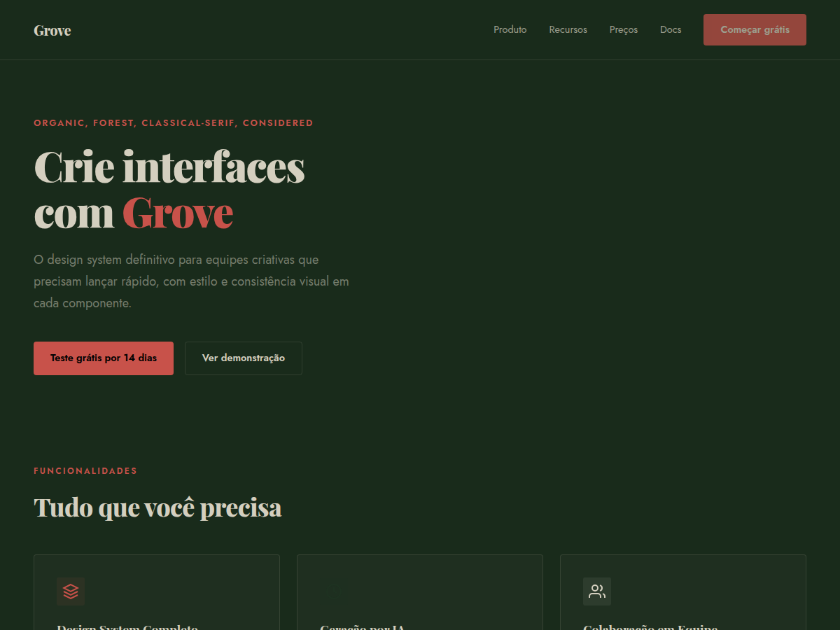
Grove — Forest-green canvas with cream type, classical Playfair serifs, and a single rust accent. Tipografia Playfair Display. deep forest green canvas with warm bone type and a single rust-red accent. Ideal para sustainability brand, wellness brand, outdoor / nature product. Prompt pronto para IA generativa.
Uso: Marca de sustentabilidade, Marca wellness, Produto outdoor / natureza, Vinícola ou restaurante, literary or arts deck, Entregável consultivo, Deck bilíngue EN/CN
Contexto Histórico
Identidade visual de marcas sustentáveis e produtos naturais premium. Verde floresta como plano de fundo total — raro e marcante. Influência de marcas como Aesop, KeVita e vinícolas artesanais.
Quando Usar
Reach for Grove when the brand has substance behind its sustainability claims — certifications, supply chain transparency, actual dirt under its fingernails. It's wrong for greenwashing. The Playfair serif demands content density: long-form storytelling, ingredient provenance, founder narratives. Works beautifully for DTC organic goods, outdoor heritage brands, regenerative agriculture, botanical skincare with real formulation stories. Avoid if the product is purely digital or the brand voice is playful — Grove is serious without being stern.
Princípios de Design
- Let texture do the talking — linen backgrounds, grain overlays, and paper-like surfaces over flat minimalism. The palette needs materiality to breathe.
- Playfair owns the hierarchy. Use it for headlines and pull quotes only. Pair with a humanist sans-serif for body text — never let the serif compete with itself at small sizes.
- Rust is seasoning, not the main course. Deploy it for CTAs, accent borders, and hover states. More than 15% coverage and the palette tips from earthy to aggressive.
- Embrace asymmetry and generous whitespace. Nature doesn't center-align. Let compositions feel found rather than constructed — offset grids, ragged edges, breathing room.
- Photography should feel documentary, not aspirational. Overcast light, imperfect produce, hands in soil. The design system falls apart the moment you introduce stock-photo sunshine.
Especificações Técnicas
Cores
Primárias
Secundárias
Efeitos
display font Playfair Display for hero headlines, subtle hover (opacity 0.8, 200ms), refined focus rings, alternating light/dark sections for rhythm, forest-green full-bleed hero, rust accent rule lines, cream text
Light/Dark
✓ Full / ◐ Partial
Relacionados


Última sincronização: 06/05/2026