Kinetic Typography
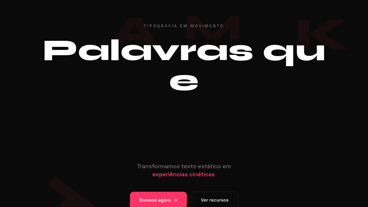
Kinetic Typography — Design general com motion text, animated type, moving letters. Template e prompt pronto para IA.
Uso: Landing pages, SaaS
Contexto Histórico
Estilo Kinetic Typography representa uma tendência moderna em design UI/UX web com foco em general.
Quando Usar
Quando as palavras SÃO a experiência. Homepages de agência onde a voz da marca precisa atingir fisicamente. Peças de portfólio onde demonstração de craft importa mais que densidade de informação. Sites de música e entretenimento onde energia supera legibilidade. Lançamentos de marca onde uma frase única precisa pousar com peso cinematográfico. Pule inteiramente para páginas com conteúdo pesado, documentação, ou qualquer lugar onde usuários precisam realmente ler rápido. Tipo cinético é uma declaração — não uma utilidade.
Princípios de Design
- Legibilidade sobrevive ao motion — se não dá pra ler no meio da animação, a animação falhou. Cada frame deve produzir palavras reconhecíveis.
- Timing é significado — uma revelação lenta implica gravidade, um snap-in implica confiança. Não anime em velocidades arbitrárias. Escolha duração como escolhe uma typeface.
- Uma técnica por viewport — stagger OU escala OU path. Combinar múltiplos efeitos cinéticos cria ruído, não sofisticação. Contenção separa craft de caos.
- Respeite o contrato do scroll — se texto anima no scroll, o usuário deve se sentir no controle. Animações vinculadas ao scrub parecem intencionais. Animações autoplay no meio do scroll parecem interrupções.
- Performance é inegociável — anime apenas transform e opacity. Uma animação de texto travada é pior que texto estático. 60fps ou não lance.
DESIGN.md
---
version: "alpha"
name: "Kinetic Typography"
description: "Kinetic Typography — Design general com motion text, animated type, moving letters. Template e prompt pronto para IA."
colors:
  primary: "#1A1A1A"
  secondary: "#4A4A4A"
  tertiary: "#0066FF"
  neutral: "#FFFFFF"
typography:
  h1:
    fontFamily: System UI stack
    fontSize: 2.25rem
    fontWeight: 700
  body-md:
    fontFamily: System UI stack
    fontSize: 1rem
    fontWeight: 400
  label-caps:
    fontFamily: System UI stack
    fontSize: 0.75rem
    fontWeight: 500
---

## Overview

Kinetic Typography — Design general com motion text, animated type, moving letters. Template e prompt pronto para IA. Estilo Kinetic Typography representa uma tendência moderna em design UI/UX web com foco em general.

- Density: 5/10 — Balanced
- Variance: 4/10 — Moderate
- Motion: 6/10 — Expressive

- **Style:** Typographic, Animated, Expressive, Dynamic
- **Keywords:** Motion text, animated type, moving letters, dynamic, typing effect, morphing, scroll-triggered text
- **Era:** 2020s Modern
- **Light/Dark:** ✓ Full / ✓ Full

## Colors

- Palette derived from style keywords and era context

## Typography

- **Display / Hero:** System UI stack (-apple-system, sans-serif) — Weight 700, tight tracking, used for headline impact
- **Body:** System UI stack (-apple-system, sans-serif) — Weight 400, 16px/1.6 line-height, max 72ch per line
- **UI Labels / Captions:** System UI stack (-apple-system, sans-serif) — 0.875rem, weight 500, slight letter-spacing
- **Monospace:** JetBrains Mono — Used for code, metadata, and technical values

Scale:
- Hero: clamp(2.5rem, 5vw, 4rem)
- H1: 2.25rem
- H2: 1.5rem
- Body: 1rem / 1.6
- Small: 0.875rem

## Layout

- **Grid:** CSS Grid primary. Max-width containment: 1280px centered with 1.5rem side padding.
- **Spacing rhythm:** Balanced. Base unit: 0.5rem (8px).
- **Section vertical gaps:** clamp(4rem, 8vw, 8rem).
- **Hero layout:** Split-screen (text left, visual right).
- **Feature sections:** Zig-zag alternating text+image rows. No 3-equal-columns.
- **Mobile collapse:** All multi-column layouts collapse below 768px. No horizontal overflow.
- **z-index contract:** base (0) / sticky-nav (100) / overlay (200) / modal (300) / toast (500).

## Elevation & Depth

@keyframes text animation, typing effect, background-clip: text, GSAP ScrollTrigger, split text

- **Physics:** Spring — stiffness 120, damping 20. Confident, weighted transitions.
- **Entry animations:** Fade + translate-Y (16px → 0) over 480ms ease-out. Staggered cascades for lists: 100ms between items.
- **Hover states:** Scale(1.03) + shadow lift over 200ms.
- **Page transitions:** Fade + slide (300ms).
- **Performance:** Only transform and opacity animated. No layout-triggering properties.

## Shapes

Base corner radius: 8px. See rounded tokens in front matter for the full scale.

## Components

- **Primary Button:** Subtly rounded (0.5rem) shape. Accent color fill. Hover: 8% darken + subtle lift shadow. Active: -1px translate tactile press. Font weight 600. No outer glows.
- **Secondary / Ghost Button:** Outline variant. 1.5px border in muted color. Text in primary color. Hover: subtle background fill.
- **Cards:** Subtly rounded (0.5rem) corners. Surface background. Subtle shadow (0 2px 12px rgba(0,0,0,0.06)). 1px border stroke.
- **Inputs:** Label above input. 1px border stroke. Focus ring: 2px accent color offset 2px. Error text below in semantic red. No floating labels.
- **Navigation:** Primary surface background. Active item: accent color indicator. Font weight 500 when active.
- **Skeletons:** Shimmer animation matching component dimensions. No circular spinners.
- **Empty States:** Icon-based composition with descriptive text and action button.

## Do's and Don'ts

- No emojis in UI — use icon system only (Lucide, Heroicons)
- No pure black (#000000) — use off-black or charcoal variants
- No oversaturated accent colors (saturation cap: 80%)
- No 3-column equal-width feature layouts — use zig-zag or asymmetric grid
- No `h-screen` — use `min-h-[100dvh]`
- No AI copywriting clichés: "Elevate", "Seamless", "Unleash", "Next-Gen"
- No broken external image links — use picsum.photos or inline SVG
- No generic lorem ipsum in demos

- Do Text animations smooth
- Do Prefers-reduced-motion respected
- Do Fallback for no-JS
- Do Mobile performance ok
- Do Typing effect timed
- Do Scroll triggers work

## Use Case

Landing pages, SaaS
Especificações Técnicas
CSS
@keyframes for text animation, background-clip: text, GSAP SplitText, typing effect (steps()), transform on letters, scroll-triggered (Intersection Observer), variable fonts for morphing
Variáveis
--text-animation-duration: 1s, --letter-delay: 0.05s, --typing-speed: 100ms, --gradient-text: linear-gradient(90deg, #color1, #color2), --morph-duration: 0.5s
Checklist
☐ Text animations smooth, ☐ Prefers-reduced-motion respected, ☐ Fallback for no-JS, ☐ Mobile performance ok, ☐ Typing effect timed, ☐ Scroll triggers work
Cores
Efeitos
@keyframes text animation, typing effect, background-clip: text, GSAP ScrollTrigger, split text
Light/Dark
✓ Full / ✓ Full
Prompt para AI
Atue como um Engenheiro Frontend Sênior e UI Designer Especialista.
Sua tarefa é codificar uma Landing Page completa na primeira tentativa.
- Tema da Landing Page: <INSIRA O TEMA>
- Seções a adicionar: <INSIRA AS SEÇÕES>

Gere o código final imediatamente seguindo estas definições:

## Estilo

- **Nome:** Kinetic Typography
- **Tipo:** Typographic, Animated, Expressive, Dynamic
- **Keywords:** Motion text, animated type, moving letters, dynamic, typing effect, morphing, scroll-triggered text
- **Era:** 2020s Modern
- **Light/Dark:** ✓ Full / ✓ Full

## Paleta de Cores

- **Primárias:** Flexible - high contrast recommended, bold colors for emphasis, animation-friendly palette
- **Secundárias:** Accent colors for emphasis, transition colors, gradient text fills

## Efeitos Visuais

@keyframes text animation, typing effect, background-clip: text, GSAP ScrollTrigger, split text

## Direção Visual para IA

Design with kinetic typography. Use: animated text, scroll-triggered reveals, typing effects, letter-by-letter animations, morphing text, gradient text fills, oversized hero text, text as the main visual element.

## CSS Technical

```css
@keyframes for text animation, background-clip: text, GSAP SplitText, typing effect (steps()), transform on letters, scroll-triggered (Intersection Observer), variable fonts for morphing
```

## Design System Variables

```css
--text-animation-duration: 1s, --letter-delay: 0.05s, --typing-speed: 100ms, --gradient-text: linear-gradient(90deg, #color1, #color2), --morph-duration: 0.5s
```

## Checklist de Implementação

- ☐ Text animations smooth
- ☐ Prefers-reduced-motion respected
- ☐ Fallback for no-JS
- ☐ Mobile performance ok
- ☐ Typing effect timed
- ☐ Scroll triggers work

## Regras de Execução

1. Siga fielmente o estilo visual determinado.
2. Use ícones SVG inline de alta qualidade (estilo Heroicons ou Lucide) — PROIBIDO usar emojis como ícones.
3. Adicione `cursor-pointer` e estados de `hover` suaves (transition-all) em todos os elementos interativos.
4. Estrutura Obrigatória da Página:
   - Navbar (Logo + Links + CTA)
   - Hero Section (Headline impactante + Subtitle + 2 botões + Elemento visual 3D/Abstrato via CSS)
   - Features (3 cards com ícones)
   - Testimonials (3 cards)
   - Pricing (3 tiers, destaque no central)
   - CTA Final
   - Footer completo com redes sociais, política de privacidade, termos de uso, contato e links SEO.
5. Todo o conteúdo textual deve ser em Português Brasileiro (PT-BR).
6. O visual deve ser CLARAMENTE distinto — não crie um design "padrão Bootstrap". Force o uso das variáveis de design system fornecidas.
7. Use tags `<style>` no head para classes personalizadas (especialmente para os efeitos complexos de backdrop-filter e animações) que o Tailwind via CDN não cobrir.
8. Responsividade Total: O layout deve se adaptar perfeitamente a Mobile, Tablet e Desktop (Stack vertical no mobile).
9. Inclua meta tags básicas de SEO, Viewport e Open Graph no `<head>`.
10. Footer deve conter: Copyright 2026, Links de navegação secundária e Ícones de redes sociais.
11. Assuma as decisões criativas necessárias para entregar o resultado completo e funcional agora.
Relacionados
Última sincronização: 01/04/2026