Mixed Media
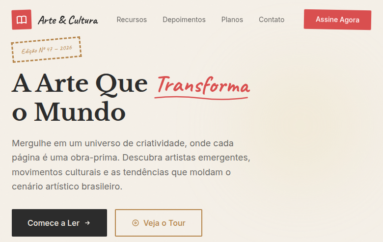
Estilo Mídia Mista combinando pintura, fotografia e colagem em composições ecléticas com camadas e justaposições inesperadas. Ideal para revistas, capas de álbuns e publicidade.
Uso: Spreads de revistas, Capas de álbuns, Publicidade criativa, Portfólios artísticos
Contexto Histórico
A Mídia Mista combina múltiplos meios artísticos (pintura, fotografia, colagem) numa composição unificada. De Picasso a artistas digitais contemporâneos, celebra a justaposição e a experimentação.
Quando Usar
Quando o briefing demanda crueza, personalidade ou credibilidade cultural que trabalho vetorial polido não consegue entregar. Mixed media brilha para agências criativas construindo sistemas de identidade que precisam parecer artesanais, plataformas de arte showcasing processo sobre produto, marcas experimentais rejeitando esterilidade corporativa, e zines ou publicações independentes onde imperfeição é o contrato estético com o leitor. Se sua audiência valoriza autenticidade acima de limpeza, essa é sua linguagem.
Princípios de Design
- Abrace tensão material — deixe fotografia discutir com pintura, deixe textura de papel interromper gradientes digitais. A fricção é o design.
- Sobreponha com intenção, não decoração. Cada elemento colado deve merecer seu lugar por contraste, narrativa ou necessidade composicional.
- Preserve artefatos analógicos — marcas de scanner, bordas rasgadas, sangramento de tinta, grão. Essas imperfeições carregam mais informação do que qualquer filtro pode simular.
- Estabeleça hierarquia tonal apesar do caos. Mixed media sem pontos focais claros é só bagunça. Desordem controlada exige mais disciplina que minimalismo.
- Deixe espaço negativo respirar entre zonas densas de colagem. O olho precisa de paradas de descanso — silêncio torna o ruído legível.
DESIGN.md
---
version: "alpha"
name: "Mixed Media"
description: "Estilo Mídia Mista combinando pintura, fotografia e colagem em composições ecléticas com camadas e justaposições inesperadas. Ideal para revistas, capas de álbuns e publicidade."
colors:
  primary: "#B5854B"
  secondary: "#F5F0E8"
  tertiary: "#2C2C2C"
  neutral: "#D94F4F"
  surface: "#E8D5A0"
  accent: "#2C3E6B"
typography:
  h1:
    fontFamily: mixed (
    fontSize: 2.5rem
    fontWeight: 700
  body-md:
    fontFamily: mixed (
    fontSize: 1rem
    fontWeight: 400
spacing:
  sm: 1.5rem
  md: 3.0rem
  lg: 6.0rem
components:
  button-primary:
    backgroundColor: "{colors.primary}"
    textColor: "{colors.neutral}"
    padding: 12px
---

## Overview

Estilo Mídia Mista combinando pintura, fotografia e colagem em composições ecléticas com camadas e justaposições inesperadas. Ideal para revistas, capas de álbuns e publicidade. A Mídia Mista combina múltiplos meios artísticos (pintura, fotografia, colagem) numa composição unificada. De Picasso a artistas digitais contemporâneos, celebra a justaposição e a experimentação.

- Density: 5/10 — Balanced
- Variance: 8/10 — Expressive
- Motion: 4/10 — Subtle

- **Style:** Collage, Multi-Medium, Layered, Eclectic
- **Keywords:** Mixed media, collage, painting, photography, layered, juxtaposition, eclectic, unexpected, multi-medium, textured, artistic
- **Era:** 20th Century Collage Art to Modern Digital
- **Light/Dark:** ✓ Full / ◐ Partial

## Colors

- **Kraft Brown** (#B5854B) — Primary surface or dominant color
- **Off-White** (#F5F0E8) — Light surface, card backgrounds
- **Charcoal** (#2C2C2C) — Dark surface, primary background
- **Accent Red** (#D94F4F) — Primary accent, CTAs and interactive elements
- **Tape Yellow** (#E8D5A0) — Warning states, attention indicators
- **Ink Blue** (#2C3E6B) — Primary text color
- **Torn Paper White** (#FAFAF5) — Secondary surface
- **Marker Green** (#4CAF50) — Success states, positive indicators

## Typography

- **Display / Hero:** Libre Baskerville — Weight 700, tight tracking, used for headline impact
- **Accent:** Caveat — Used for decorative or emphasis text
- **Body:** Libre Baskerville — Weight 400, 16px/1.6 line-height, max 72ch per line
- **UI Labels / Captions:** Libre Baskerville — 0.875rem, weight 500, slight letter-spacing
- **Monospace:** JetBrains Mono — Used for code, metadata, and technical values

Scale:
- Hero: clamp(2.5rem, 5vw, 4rem)
- H1: 2.25rem
- H2: 1.5rem
- Body: 1rem / 1.6
- Small: 0.875rem

## Layout

- **Grid:** CSS Grid primary. Max-width containment: 1280px centered with 1.5rem side padding.
- **Spacing rhythm:** Balanced. Base unit: 0.5rem (8px).
- **Section vertical gaps:** clamp(4rem, 8vw, 8rem).
- **Hero layout:** Asymmetric composition.
- **Feature sections:** Asymmetric grid with varied card sizes. No 3-equal-columns.
- **Mobile collapse:** All multi-column layouts collapse below 768px. No horizontal overflow.
- **z-index contract:** base (0) / sticky-nav (100) / overlay (200) / modal (300) / toast (500).

## Elevation & Depth

Layered overlapping elements with z-index stacking, torn paper edge effects via clip-path, tape/pin decorative SVG elements, mixed texture backgrounds (paper, canvas, photo), collage-style asymmetric layouts, washi tape borders, slight rotation on layered elements

- **Physics:** Ease-out curves, 200-300ms duration. Smooth and predictable.
- **Entry animations:** Fade + translate-Y (16px → 0) over 420ms ease-out. Staggered cascades for lists: 80ms between items.
- **Hover states:** Subtle color shift + shadow adjustment over 200ms.
- **Page transitions:** Fade only (200ms).
- **Performance:** Only transform and opacity animated. No layout-triggering properties.

## Shapes

Base corner radius: 24px. See rounded tokens in front matter for the full scale.

## Components

- **Primary Button:** Generously rounded (1.5rem) shape. Accent color fill. Hover: 8% darken + subtle lift shadow. Active: -1px translate tactile press. Font weight 600. No outer glows.
- **Secondary / Ghost Button:** Outline variant. 1.5px border in muted color. Text in primary color. Hover: subtle background fill.
- **Cards:** Generously rounded (1.5rem) corners. Surface background. Subtle shadow (0 2px 12px rgba(0,0,0,0.06)). 1px border stroke.
- **Inputs:** Label above input. 1px border stroke. Focus ring: 2px accent color offset 2px. Error text below in semantic red. No floating labels.
- **Navigation:** Primary surface background. Active item: accent color indicator. Font weight 500 when active.
- **Skeletons:** Shimmer animation matching component dimensions. No circular spinners.
- **Empty States:** Icon-based composition with descriptive text and action button.

## Do's and Don'ts

- No emojis in UI — use icon system only (Lucide, Heroicons)
- No pure black (#000000) — use off-black or charcoal variants
- No oversaturated accent colors (saturation cap: 80%)
- No 3-column equal-width feature layouts — use zig-zag or asymmetric grid
- No `h-screen` — use `min-h-[100dvh]`
- No AI copywriting clichés: "Elevate", "Seamless", "Unleash", "Next-Gen"
- No broken external image links — use picsum.photos or inline SVG
- No generic lorem ipsum in demos

- Do Layered overlapping elements
- Do Torn paper edge effects
- Do Tape/pin decorative elements
- Do Mixed texture backgrounds
- Do Asymmetric collage layout
- Do Mixed typography styles
- Do Eclectic artistic atmosphere
- Do Responsive with maintained collage feel

## Use Case

Spreads de revistas, Capas de álbuns, Publicidade criativa, Portfólios artísticos
Especificações Técnicas
CSS
font-family: mixed ('Libre Baskerville', 'Caveat', 'Inter'), background: #F5F0E8 with paper texture, color: #2C2C2C, clip-path: polygon() for torn edges, transform: rotate(-2deg to 3deg), z-index layering, box-shadow: 2px 2px 5px rgba(0,0,0,0.1), border: none (use tape/pin decorations)Variáveis
--color-kraft: #B5854B, --color-paper: #F5F0E8, --color-charcoal: #2C2C2C, --color-accent: #D94F4F, --font-serif: 'Libre Baskerville', --font-handwritten: 'Caveat', --font-sans: 'Inter', --rotation-range: -2deg to 3deg, --spacing: 1.5rem
Checklist
☐ Layered overlapping elements, ☐ Torn paper edge effects, ☐ Tape/pin decorative elements, ☐ Mixed texture backgrounds, ☐ Asymmetric collage layout, ☐ Mixed typography styles, ☐ Eclectic artistic atmosphere, ☐ Responsive with maintained collage feel
Cores
Primárias
Secundárias
Efeitos
Layered overlapping elements with z-index stacking, torn paper edge effects via clip-path, tape/pin decorative SVG elements, mixed texture backgrounds (paper, canvas, photo), collage-style asymmetric layouts, washi tape borders, slight rotation on layered elements
Light/Dark
✓ Full / ◐ Partial
Prompt para AI
Atue como um Engenheiro Frontend Sênior e UI Designer Especialista.
Sua tarefa é codificar uma Landing Page completa na primeira tentativa.
- Tema da Landing Page: <INSIRA O TEMA>
- Seções a adicionar: <INSIRA AS SEÇÕES>

Gere o código final imediatamente seguindo estas definições:

## Estilo

- **Nome:** Mixed Media
- **Tipo:** Collage, Multi-Medium, Layered, Eclectic
- **Keywords:** Mixed media, collage, painting, photography, layered, juxtaposition, eclectic, unexpected, multi-medium, textured, artistic
- **Era:** 20th Century Collage Art to Modern Digital
- **Light/Dark:** ✓ Full / ◐ Partial

## Paleta de Cores

- **Primárias:** Kraft Brown #B5854B, Off-White #F5F0E8, Charcoal #2C2C2C, Accent Red #D94F4F
- **Secundárias:** Tape Yellow #E8D5A0, Ink Blue #2C3E6B, Torn Paper White #FAFAF5, Marker Green #4CAF50

## Efeitos Visuais

Layered overlapping elements with z-index stacking, torn paper edge effects via clip-path, tape/pin decorative SVG elements, mixed texture backgrounds (paper, canvas, photo), collage-style asymmetric layouts, washi tape borders, slight rotation on layered elements

## Direção Visual para IA

Design a mixed media landing page combining collage, painting and photography aesthetics. Use kraft brown, off-white, charcoal with accent red. Apply layered overlapping elements, torn paper edge clip-paths, tape/pin SVG decorations, mixed texture backgrounds (paper, canvas), asymmetric collage layouts, washi tape borders. Typography should mix handwritten, serif and sans-serif. Eclectic, textured, artistically layered.

## CSS Technical

```css
font-family: mixed ('Libre Baskerville', 'Caveat', 'Inter'), background: #F5F0E8 with paper texture, color: #2C2C2C, clip-path: polygon() for torn edges, transform: rotate(-2deg to 3deg), z-index layering, box-shadow: 2px 2px 5px rgba(0,0,0,0.1), border: none (use tape/pin decorations)
```

## Design System Variables

```css
--color-kraft: #B5854B, --color-paper: #F5F0E8, --color-charcoal: #2C2C2C, --color-accent: #D94F4F, --font-serif: 'Libre Baskerville', --font-handwritten: 'Caveat', --font-sans: 'Inter', --rotation-range: -2deg to 3deg, --spacing: 1.5rem
```

## Checklist de Implementação

- ☐ Layered overlapping elements
- ☐ Torn paper edge effects
- ☐ Tape/pin decorative elements
- ☐ Mixed texture backgrounds
- ☐ Asymmetric collage layout
- ☐ Mixed typography styles
- ☐ Eclectic artistic atmosphere
- ☐ Responsive with maintained collage feel

## Regras de Execução

1. Siga fielmente o estilo visual determinado.
2. Use ícones SVG inline de alta qualidade (estilo Heroicons ou Lucide) — PROIBIDO usar emojis como ícones.
3. Adicione `cursor-pointer` e estados de `hover` suaves (transition-all) em todos os elementos interativos.
4. Estrutura Obrigatória da Página:
   - Navbar (Logo + Links + CTA)
   - Hero Section (Headline impactante + Subtitle + 2 botões + Elemento visual 3D/Abstrato via CSS)
   - Features (3 cards com ícones)
   - Testimonials (3 cards)
   - Pricing (3 tiers, destaque no central)
   - CTA Final
   - Footer completo com redes sociais, política de privacidade, termos de uso, contato e links SEO.
5. Todo o conteúdo textual deve ser em Português Brasileiro (PT-BR).
6. O visual deve ser CLARAMENTE distinto — não crie um design "padrão Bootstrap". Force o uso das variáveis de design system fornecidas.
7. Use tags `<style>` no head para classes personalizadas (especialmente para os efeitos complexos de backdrop-filter e animações) que o Tailwind via CDN não cobrir.
8. Responsividade Total: O layout deve se adaptar perfeitamente a Mobile, Tablet e Desktop (Stack vertical no mobile).
9. Inclua meta tags básicas de SEO, Viewport e Open Graph no `<head>`.
10. Footer deve conter: Copyright 2026, Links de navegação secundária e Ícones de redes sociais.
11. Assuma as decisões criativas necessárias para entregar o resultado completo e funcional agora.Relacionados
Última sincronização: 01/04/2026