Pin & Paper
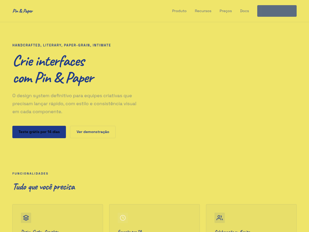
Pin & Paper — Yellow paper with safety-pin illustrations, ink-blue handwritten Caveat, paper-grain texture. Tipografia Caveat. saturated yellow paper, soft cream alternate, deep ink-blue type, plus rust red,. Ideal para research findings with personality, qualitative report, founder reflection. Prompt pronto para IA generativa.
Uso: research findings with personality, qualitative report, founder reflection, creator essay deck, workshop debrief
Contexto Histórico
Estética de diário e zine handmade — papel amarelado, grampos de metal, caligrafia Caveat. Muito usado em research qualitativo, portfolios literários e workshops criativos.
Quando Usar
When your brand needs to feel made-by-hands rather than manufactured. This system works for independent makers, zine publishers, DIY workshops, handmade product lines, and any project where polish would actually undermine credibility. Deploy it when your audience values authenticity over refinement — when they'd rather see the process than the production value. It falls apart instantly if applied to corporate contexts or anything requiring institutional authority. Know your audience: this speaks to people who shop at independent bookstores, not department stores.
Princípios de Design
- Imperfection is intentional — uneven baselines, visible paper texture, and wobbly linework aren't bugs, they're the entire point. Never correct what should feel human.
- Constraint breeds character — limit your palette to what a single-color risograph or photocopier could produce. If you can't imagine making it at a copy shop at 2am, simplify further.
- The pin is structural, not decorative — every safety-pin illustration should imply it's holding something together. It connects, fastens, repairs. Use it where elements actually join.
- Paper is the first layer, not the background — treat grain, fold marks, and edge wear as active design elements that occupy visual hierarchy alongside type and illustration.
- Handwriting carries voice — Caveat or any handwritten face should read like someone's actual notes. Vary weight and size like a person would. The moment it looks typeset, you've lost the plot.
Especificações Técnicas
Cores
Primárias
Secundárias
Efeitos
display font Caveat for hero headlines, subtle hover (opacity 0.8, 200ms), refined focus rings, safety-pin SVG illustrations, paper-grain CSS texture, Caveat handwriting
Light/Dark
✓ Full / ✗ None
Relacionados
Última sincronização: 06/05/2026