Tactile Digital / Deformable UI
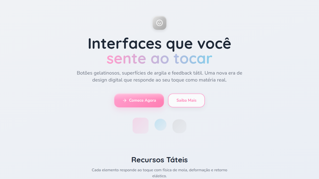
Tactile Digital / Deformable UI — Design general com jelly buttons, chrome, clay. Template e prompt pronto para IA.
Uso: Landing pages, SaaS
Contexto Histórico
Estilo Tactile Digital / Deformable UI representa uma tendência moderna em design UI/UX web com foco em general.
Quando Usar
Use UI deformável quando seu produto se beneficia de parecer vivo sob o dedo. Apps mobile onde touch é primário. Jogos que recompensam interação com feedback sensorial. Produtos infantis onde descoberta importa mais que eficiência. Marcas lúdicas que querem sinalizar calor em vez de polimento corporativo. Pule para dashboards densos em dados, ferramentas enterprise ou qualquer lugar onde carga cognitiva já está alta. Squish funciona quando o usuário tem permissão para brincar.
Princípios de Design
- Física acima de decoração — cada deformação implica massa, elasticidade e gravidade. Se espreme, deve voltar com dinâmicas de mola críveis.
- Pareamento háptico-visual — motion deve espelhar o que os dedos do usuário sentem. Um tap que dispara vibração merece uma compressão visual no mesmo milissegundo.
- Contenção na quantidade de superfícies — um ou dois elementos macios por view. Quando tudo balança, nada comunica prioridade.
- Consistência de material — escolha uma metáfora (gelatina, argila, chrome, espuma) e se comprometa. Misturar materiais num componente quebra a ilusão instantaneamente.
- Performance é a textura — um botão gelatina que perde frames parece quebrado, não lúdico. 60fps é inegociável. Reduza geometria antes de reduzir encantamento.
DESIGN.md
---
version: "alpha"
name: "Tactile Digital / Deformable UI"
description: "Tactile Digital / Deformable UI — Design general com jelly buttons, chrome, clay. Template e prompt pronto para IA."
colors:
  primary: "#C0C0C0"
  secondary: "#FF9ECD"
  tertiary: "#87CEEB"
typography:
  h1:
    fontFamily: System UI stack
    fontSize: 2.25rem
    fontWeight: 700
  body-md:
    fontFamily: System UI stack
    fontSize: 1rem
    fontWeight: 400
  label-caps:
    fontFamily: System UI stack
    fontSize: 0.75rem
    fontWeight: 500
components:
  button-primary:
    backgroundColor: "{colors.primary}"
    padding: 12px
---

## Overview

Tactile Digital / Deformable UI — Design general com jelly buttons, chrome, clay. Template e prompt pronto para IA. Estilo Tactile Digital / Deformable UI representa uma tendência moderna em design UI/UX web com foco em general.

- Density: 5/10 — Balanced
- Variance: 4/10 — Moderate
- Motion: 4/10 — Subtle

- **Style:** Tactile, Deformable, Interactive, Playful
- **Keywords:** Jelly buttons, chrome, clay, squishy, deformable, bouncy, physical, tactile feedback, press response
- **Era:** 2025+ Tactile Era
- **Light/Dark:** ✓ Full / ✓ Full

## Colors

- **Chrome Silver** (#C0C0C0) — Primary surface or dominant color
- **Jelly Pink** (#FF9ECD) — Primary text color
- **Soft Blue** (#87CEEB) — Accent highlight, links and focus states

## Typography

- **Display / Hero:** System UI stack (-apple-system, sans-serif) — Weight 700, tight tracking, used for headline impact
- **Body:** System UI stack (-apple-system, sans-serif) — Weight 400, 16px/1.6 line-height, max 72ch per line
- **UI Labels / Captions:** System UI stack (-apple-system, sans-serif) — 0.875rem, weight 500, slight letter-spacing
- **Monospace:** JetBrains Mono — Used for code, metadata, and technical values

Scale:
- Hero: clamp(2.5rem, 5vw, 4rem)
- H1: 2.25rem
- H2: 1.5rem
- Body: 1rem / 1.6
- Small: 0.875rem

## Layout

- **Grid:** CSS Grid primary. Max-width containment: 1280px centered with 1.5rem side padding.
- **Spacing rhythm:** Balanced. Base unit: 0.5rem (8px).
- **Section vertical gaps:** clamp(4rem, 8vw, 8rem).
- **Hero layout:** Split-screen (text left, visual right).
- **Feature sections:** Zig-zag alternating text+image rows. No 3-equal-columns.
- **Mobile collapse:** All multi-column layouts collapse below 768px. No horizontal overflow.
- **z-index contract:** base (0) / sticky-nav (100) / overlay (200) / modal (300) / toast (500).

## Elevation & Depth

Press deformation (scale + squish), bounce-back (cubic-bezier), material response, haptic-like feedback, spring physics

- **Physics:** Ease-out curves, 200-300ms duration. Smooth and predictable.
- **Entry animations:** Fade + translate-Y (16px → 0) over 420ms ease-out. Staggered cascades for lists: 80ms between items.
- **Hover states:** Subtle color shift + shadow adjustment over 200ms.
- **Page transitions:** Fade only (200ms).
- **Performance:** Only transform and opacity animated. No layout-triggering properties.

## Shapes

Base corner radius: 8px. See rounded tokens in front matter for the full scale.

## Components

- **Primary Button:** Subtly rounded (0.5rem) shape. Accent color fill. Hover: 8% darken + subtle lift shadow. Active: -1px translate tactile press. Font weight 600. No outer glows.
- **Secondary / Ghost Button:** Outline variant. 1.5px border in muted color. Text in primary color. Hover: subtle background fill.
- **Cards:** Subtly rounded (0.5rem) corners. Surface background. Subtle shadow (0 2px 12px rgba(0,0,0,0.06)). 1px border stroke.
- **Inputs:** Label above input. 1px border stroke. Focus ring: 2px accent color offset 2px. Error text below in semantic red. No floating labels.
- **Navigation:** Primary surface background. Active item: accent color indicator. Font weight 500 when active.
- **Skeletons:** Shimmer animation matching component dimensions. No circular spinners.
- **Empty States:** Icon-based composition with descriptive text and action button.

## Do's and Don'ts

- No emojis in UI — use icon system only (Lucide, Heroicons)
- No pure black (#000000) — use off-black or charcoal variants
- No oversaturated accent colors (saturation cap: 80%)
- No 3-column equal-width feature layouts — use zig-zag or asymmetric grid
- No `h-screen` — use `min-h-[100dvh]`
- No AI copywriting clichés: "Elevate", "Seamless", "Unleash", "Next-Gen"
- No broken external image links — use picsum.photos or inline SVG
- No generic lorem ipsum in demos

- Do Press effect visible
- Do Bounce-back smooth
- Do Material feels tactile
- Do Spring physics tuned
- Do Mobile touch responsive
- Do Reduced motion option

## Use Case

Landing pages, SaaS
Especificações Técnicas
CSS
transform: scale(0.95) on active, animation: bounce (cubic-bezier(0.34, 1.56, 0.64, 1)), box-shadow: inset for press, filter: brightness on press, spring physics (react-spring/framer-motion)
Variáveis
--press-scale: 0.95, --bounce-duration: 400ms, --spring-stiffness: 300, --spring-damping: 20, --material-glossy: linear-gradient(135deg, white 0%, transparent 60%), --depth-shadow: 0 10px 30px rgba(0,0,0,0.2)
Checklist
☐ Press effect visible, ☐ Bounce-back smooth, ☐ Material feels tactile, ☐ Spring physics tuned, ☐ Mobile touch responsive, ☐ Reduced motion option
Cores
Primárias
Efeitos
Press deformation (scale + squish), bounce-back (cubic-bezier), material response, haptic-like feedback, spring physics
Light/Dark
✓ Full / ✓ Full
Prompt para AI
Atue como um Engenheiro Frontend Sênior e UI Designer Especialista.
Sua tarefa é codificar uma Landing Page completa na primeira tentativa.
- Tema da Landing Page: <INSIRA O TEMA>
- Seções a adicionar: <INSIRA AS SEÇÕES>

Gere o código final imediatamente seguindo estas definições:

## Estilo

- **Nome:** Tactile Digital / Deformable UI
- **Tipo:** Tactile, Deformable, Interactive, Playful
- **Keywords:** Jelly buttons, chrome, clay, squishy, deformable, bouncy, physical, tactile feedback, press response
- **Era:** 2025+ Tactile Era
- **Light/Dark:** ✓ Full / ✓ Full

## Paleta de Cores

- **Primárias:** Gradient metallics, Chrome Silver #C0C0C0, Jelly Pink #FF9ECD, Soft Blue #87CEEB
- **Secundárias:** Glossy highlights, shadow depth, reflection effects, material-specific colors

## Efeitos Visuais

Press deformation (scale + squish), bounce-back (cubic-bezier), material response, haptic-like feedback, spring physics

## Direção Visual para IA

Design a tactile deformable interface. Use: jelly/squishy buttons, press deformation effect, bounce-back animations, chrome/clay materials, spring physics, haptic-like feedback, material response, 3D depth on interaction.

## CSS Technical

```css
transform: scale(0.95) on active, animation: bounce (cubic-bezier(0.34, 1.56, 0.64, 1)), box-shadow: inset for press, filter: brightness on press, spring physics (react-spring/framer-motion)
```

## Design System Variables

```css
--press-scale: 0.95, --bounce-duration: 400ms, --spring-stiffness: 300, --spring-damping: 20, --material-glossy: linear-gradient(135deg, white 0%, transparent 60%), --depth-shadow: 0 10px 30px rgba(0,0,0,0.2)
```

## Checklist de Implementação

- ☐ Press effect visible
- ☐ Bounce-back smooth
- ☐ Material feels tactile
- ☐ Spring physics tuned
- ☐ Mobile touch responsive
- ☐ Reduced motion option

## Regras de Execução

1. Siga fielmente o estilo visual determinado.
2. Use ícones SVG inline de alta qualidade (estilo Heroicons ou Lucide) — PROIBIDO usar emojis como ícones.
3. Adicione `cursor-pointer` e estados de `hover` suaves (transition-all) em todos os elementos interativos.
4. Estrutura Obrigatória da Página:
   - Navbar (Logo + Links + CTA)
   - Hero Section (Headline impactante + Subtitle + 2 botões + Elemento visual 3D/Abstrato via CSS)
   - Features (3 cards com ícones)
   - Testimonials (3 cards)
   - Pricing (3 tiers, destaque no central)
   - CTA Final
   - Footer completo com redes sociais, política de privacidade, termos de uso, contato e links SEO.
5. Todo o conteúdo textual deve ser em Português Brasileiro (PT-BR).
6. O visual deve ser CLARAMENTE distinto — não crie um design "padrão Bootstrap". Force o uso das variáveis de design system fornecidas.
7. Use tags `<style>` no head para classes personalizadas (especialmente para os efeitos complexos de backdrop-filter e animações) que o Tailwind via CDN não cobrir.
8. Responsividade Total: O layout deve se adaptar perfeitamente a Mobile, Tablet e Desktop (Stack vertical no mobile).
9. Inclua meta tags básicas de SEO, Viewport e Open Graph no `<head>`.
10. Footer deve conter: Copyright 2026, Links de navegação secundária e Ícones de redes sociais.
11. Assuma as decisões criativas necessárias para entregar o resultado completo e funcional agora.
Relacionados
Última sincronização: 01/04/2026