Blueprint / Engineering
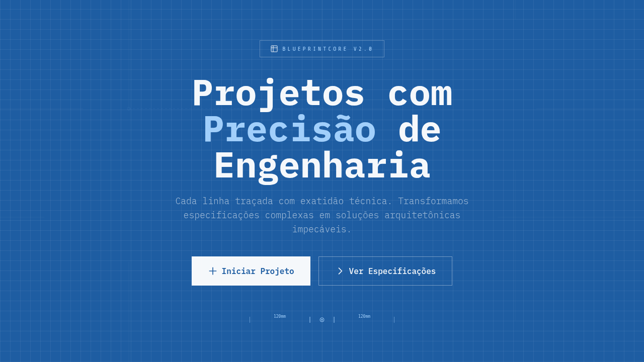
Blueprint / Engineering — Design general com technical blueprint, white lines on blue, dimension markers. Template e prompt pronto para IA.
Uso: Landing pages, SaaS
Contexto Histórico
Estilo Blueprint / Engineering representa uma tendência moderna em design UI/UX web com foco em general.
Quando Usar
Use quando seu produto vive no espaço entre ideia e coisa construída. Escritórios de arquitetura, obviamente. Consultorias de engenharia. Construction tech. Mas também startups de hardware mostrando internos, ferramentas de desenvolvedor expondo arquitetura de sistema, ou qualquer marca que quer dizer "somos rigorosos" sem dizer num headline. Funciona melhor quando existe complexidade real para revelar — não como decoração em algo simples. O estilo cai por terra se não há nada por baixo dele.
Princípios de Design
- Peso de linha é sua única hierarquia — use sem piedade. Geometria primária pesada, anotações leves, grid quase invisível.
- Mantenha a paleta cianótipo como restrição, não sugestão. Backgrounds azul da Prússia com linework branco e cyan pálido. No momento que adiciona um terceiro matiz, saiu do idioma.
- Marcadores de dimensão e callouts devem referenciar medidas ou specs reais. Anotações decorativas que apontam para nada destroem a credibilidade que o estilo empresta.
- Visibilidade do grid importa. Deixe o sistema de coordenadas subjacente transparecer — reforça precisão e dá ao olho uma estrutura de descanso sob o conteúdo.
- Abrace espaço negativo como território não-construído. Blueprints respiram porque nem tudo está desenhado ainda. Resista à vontade de preencher cada quadrante.
DESIGN.md
---
version: "alpha"
name: "Blueprint / Engineering"
description: "Blueprint / Engineering — Design general com technical blueprint, white lines on blue, dimension markers. Template e prompt pronto para IA."
colors:
  primary: "#1E5DA2"
  secondary: "#FFFFFF"
  tertiary: "#A8D5FF"
  neutral: "#5B9BD5"
  surface: "#2E4053"
  accent: "#E8E8E8"
typography:
  h1:
    fontFamily: monospace/technical
    fontSize: 2.25rem
    fontWeight: 700
  body-md:
    fontFamily: monospace/technical
    fontSize: 1rem
    fontWeight: 400
  label-caps:
    fontFamily: monospace/technical
    fontSize: 0.75rem
    fontWeight: 500
components:
  button-primary:
    backgroundColor: "{colors.primary}"
    textColor: "{colors.neutral}"
    padding: 12px
---

## Overview

Blueprint / Engineering — Design general com technical blueprint, white lines on blue, dimension markers. Template e prompt pronto para IA. Estilo Blueprint / Engineering representa uma tendência moderna em design UI/UX web com foco em general.

- Density: 7/10 — Compact
- Variance: 2/10 — Structured
- Motion: 6/10 — Expressive

- **Style:** Technical, Precise, Blueprint, Engineering
- **Keywords:** Technical blueprint, white lines on blue, dimension markers, architectural symbols, drafting grid, semi-circular timeline, engineering precision
- **Era:** Technical Engineering
- **Light/Dark:** ✓ Full / ✓ Full

## Colors

- **Blueprint Blue** (#1E5DA2) — Accent highlight, links and focus states
- **White Lines** (#FFFFFF) — Light surface, card backgrounds
- **Light Blue** (#A8D5FF) — Accent highlight, links and focus states
- **Steel Blue** (#5B9BD5) — Accent highlight, links and focus states
- **Dark Slate** (#2E4053) — Deep contrast surface
- **Light Grey** (#E8E8E8) — Secondary text, borders, muted elements

## Typography

- **Display / Hero:** monospace/technical — Weight 700, tight tracking, used for headline impact
- **Body:** monospace/technical — Weight 400, 16px/1.6 line-height, max 72ch per line
- **UI Labels / Captions:** monospace/technical — 0.875rem, weight 500, slight letter-spacing
- **Monospace:** monospace/technical — Used for code, metadata, and technical values

Scale:
- Hero: clamp(2.5rem, 5vw, 4rem)
- H1: 2.25rem
- H2: 1.5rem
- Body: 1rem / 1.6
- Small: 0.875rem

## Layout

- **Grid:** CSS Grid primary. Max-width containment: 1280px centered with 1.5rem side padding.
- **Spacing rhythm:** Balanced. Base unit: 0.5rem (8px).
- **Section vertical gaps:** clamp(4rem, 8vw, 8rem).
- **Hero layout:** Split-screen (text left, visual right).
- **Feature sections:** Zig-zag alternating text+image rows. No 3-equal-columns.
- **Mobile collapse:** All multi-column layouts collapse below 768px. No horizontal overflow.
- **z-index contract:** base (0) / sticky-nav (100) / overlay (200) / modal (300) / toast (500).

## Elevation & Depth

Flat uniform technical lighting, line drawing animations (stroke-dasharray), dimension marker reveals, grid fade-in, technical precision transitions

- **Physics:** Spring — stiffness 120, damping 20. Confident, weighted transitions.
- **Entry animations:** Fade + translate-Y (16px → 0) over 480ms ease-out. Staggered cascades for lists: 100ms between items.
- **Hover states:** Scale(1.03) + shadow lift over 200ms.
- **Page transitions:** Fade + slide (300ms).
- **Performance:** Only transform and opacity animated. No layout-triggering properties.

## Shapes

Base corner radius: 8px. See rounded tokens in front matter for the full scale.

## Components

- **Primary Button:** Subtly rounded (0.5rem) shape. Accent color fill. Hover: 8% darken + subtle lift shadow. Active: -1px translate tactile press. Font weight 600. No outer glows.
- **Secondary / Ghost Button:** Outline variant. 1.5px border in muted color. Text in primary color. Hover: subtle background fill.
- **Cards:** Subtly rounded (0.5rem) corners. Surface background. Subtle shadow (0 2px 12px rgba(0,0,0,0.06)). 1px border stroke.
- **Inputs:** Label above input. 1px border stroke. Focus ring: 2px accent color offset 2px. Error text below in semantic red. No floating labels.
- **Navigation:** Primary surface background. Active item: accent color indicator. Font weight 500 when active.
- **Skeletons:** Shimmer animation matching component dimensions. No circular spinners.
- **Empty States:** Icon-based composition with descriptive text and action button.

## Do's and Don'ts

- No emojis in UI — use icon system only (Lucide, Heroicons)
- No pure black (#000000) — use off-black or charcoal variants
- No oversaturated accent colors (saturation cap: 80%)
- No 3-column equal-width feature layouts — use zig-zag or asymmetric grid
- No `h-screen` — use `min-h-[100dvh]`
- No AI copywriting clichés: "Elevate", "Seamless", "Unleash", "Next-Gen"
- No broken external image links — use picsum.photos or inline SVG
- No generic lorem ipsum in demos

- Do Blueprint blue background
- Do White technical lines
- Do Grid overlay visible
- Do Dimension markers
- Do Engineering precision
- Do Technical typography

## Use Case

Landing pages, SaaS
Especificações Técnicas
CSS
background: #1E5DA2 with grid overlay, color: #FFFFFF, border: 1px solid white, font-family: monospace/technical, SVG for technical drawings, stroke-dasharray for line animation, grid: repeating-linear-gradient
Variáveis
--blueprint-blue: #1E5DA2, --line-white: #FFFFFF, --light-blue: #A8D5FF, --grid-spacing: 20px, --line-width: 1px, --font-technical: monospace
Checklist
☐ Blueprint blue background, ☐ White technical lines, ☐ Grid overlay visible, ☐ Dimension markers, ☐ Engineering precision, ☐ Technical typography
Cores
Primárias
Secundárias
Efeitos
Flat uniform technical lighting, line drawing animations (stroke-dasharray), dimension marker reveals, grid fade-in, technical precision transitions
Light/Dark
✓ Full / ✓ Full
Prompt para AI
Atue como um Engenheiro Frontend Sênior e UI Designer Especialista.
Sua tarefa é codificar uma Landing Page completa na primeira tentativa.
- Tema da Landing Page: <INSIRA O TEMA>
- Seções a adicionar: <INSIRA AS SEÇÕES>

Gere o código final imediatamente seguindo estas definições:

## Estilo

- **Nome:** Blueprint / Engineering
- **Tipo:** Technical, Precise, Blueprint, Engineering
- **Keywords:** Technical blueprint, white lines on blue, dimension markers, architectural symbols, drafting grid, semi-circular timeline, engineering precision
- **Era:** Technical Engineering
- **Light/Dark:** ✓ Full / ✓ Full

## Paleta de Cores

- **Primárias:** Blueprint Blue #1E5DA2, White Lines #FFFFFF, Light Blue #A8D5FF, Steel Blue #5B9BD5
- **Secundárias:** Dark Slate #2E4053, Light Grey #E8E8E8, technical line colors, grid overlay

## Efeitos Visuais

Flat uniform technical lighting, line drawing animations (stroke-dasharray), dimension marker reveals, grid fade-in, technical precision transitions

## Direção Visual para IA

Design a blueprint engineering interface. Use: blueprint blue background (#1E5DA2), white technical lines, drafting grid overlay, dimension markers, architectural symbols, engineering precision, semi-circular timeline arcs, flat vector iconography.

## CSS Technical

```css
background: #1E5DA2 with grid overlay, color: #FFFFFF, border: 1px solid white, font-family: monospace/technical, SVG for technical drawings, stroke-dasharray for line animation, grid: repeating-linear-gradient
```

## Design System Variables

```css
--blueprint-blue: #1E5DA2, --line-white: #FFFFFF, --light-blue: #A8D5FF, --grid-spacing: 20px, --line-width: 1px, --font-technical: monospace
```

## Checklist de Implementação

- ☐ Blueprint blue background
- ☐ White technical lines
- ☐ Grid overlay visible
- ☐ Dimension markers
- ☐ Engineering precision
- ☐ Technical typography

## Regras de Execução

1. Siga fielmente o estilo visual determinado.
2. Use ícones SVG inline de alta qualidade (estilo Heroicons ou Lucide) — PROIBIDO usar emojis como ícones.
3. Adicione `cursor-pointer` e estados de `hover` suaves (transition-all) em todos os elementos interativos.
4. Estrutura Obrigatória da Página:
   - Navbar (Logo + Links + CTA)
   - Hero Section (Headline impactante + Subtitle + 2 botões + Elemento visual 3D/Abstrato via CSS)
   - Features (3 cards com ícones)
   - Testimonials (3 cards)
   - Pricing (3 tiers, destaque no central)
   - CTA Final
   - Footer completo com redes sociais, política de privacidade, termos de uso, contato e links SEO.
5. Todo o conteúdo textual deve ser em Português Brasileiro (PT-BR).
6. O visual deve ser CLARAMENTE distinto — não crie um design "padrão Bootstrap". Force o uso das variáveis de design system fornecidas.
7. Use tags `<style>` no head para classes personalizadas (especialmente para os efeitos complexos de backdrop-filter e animações) que o Tailwind via CDN não cobrir.
8. Responsividade Total: O layout deve se adaptar perfeitamente a Mobile, Tablet e Desktop (Stack vertical no mobile).
9. Inclua meta tags básicas de SEO, Viewport e Open Graph no `<head>`.
10. Footer deve conter: Copyright 2026, Links de navegação secundária e Ícones de redes sociais.
11. Assuma as decisões criativas necessárias para entregar o resultado completo e funcional agora.
Relacionados
Última sincronização: 01/04/2026