Neo-Grid Bold
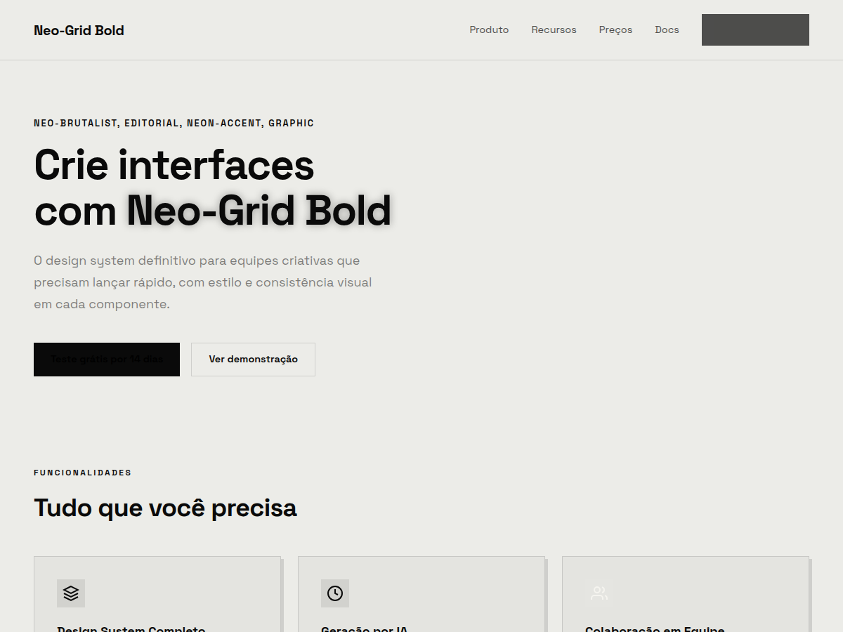
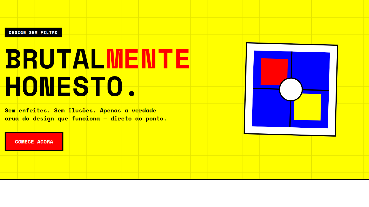
Neo-Grid Bold — Editorial neo-brutalism with a single neon yellow accent on off-white paper. Tipografia Space Grotesk. off-white paper background, ink black, signature neon yellow accent used sparing. Ideal para product launch, design review, founder pitch. Prompt pronto para IA generativa.
Uso: product launch, design review, founder pitch, brand deck, consulting findings, conference talk
Contexto Histórico
Neo-brutalismo editorial — amarelo neon como único acento sobre papel off-white. Influência de designers como Stefan Sagmeister e publicações de design contemporâneo.
Quando Usar
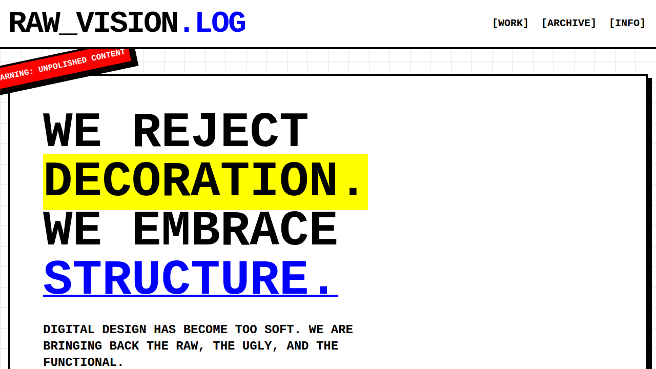
When your client's brand needs to scream in a room full of whispers. Neo-Grid Bold works for creative studios launching portfolios, experimental product brands that want zero confusion about their positioning, and any startup whose founders said "we are NOT doing another gradient mesh hero." It falls apart for healthcare, finance, or anything requiring trust signals over personality. This is a system for brands that already have conviction — it won't manufacture it for you.
Princípios de Design
- Structure is the rebellion — the thick grid isn't decoration, it's the entire point. Every element earns its cell or it doesn't exist.
- Neon yellow is structural, never decorative — use it to define boundaries, highlight active states, and create visual load-bearing walls. Never as a "fun accent."
- Typography at architectural scale — Bebas Neue set large enough to feel like signage, not headlines. If it could fit on a building facade, you're in the right range.
- No comfort radius — zero border-radius, no easing on transitions, no soft anything. Corners are sharp because decisions should be too.
- Density over whitespace — neo-brutalism earns its impact through compression. Pack the grid tight, let elements breathe only through border thickness, not empty space.
Especificações Técnicas
Cores
Primárias
Secundárias
Efeitos
display font Space Grotesk for hero headlines, smooth hover transitions (200-250ms), subtle lift shadows, neon-yellow single accent on off-white, thick border columns, high-contrast stats, dense grid, compact 1.2rem gaps
Light/Dark
✓ Full / ✗ None
Relacionados
Última sincronização: 06/05/2026